cruciFICTION
A Cruciform Kaleidoscope
- 90
- Posts
- 13
- Years
- Brisbane
- Seen Jul 12, 2021
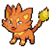
Although I like this, I have to say that the colours look waaaay too unsaturated. It almost looks semi-sepia in green. And I'm not sure if Chamelica's tail looks like it quite fits onto his ass properly.Hi guys :3
![[PokeCommunity.com] Pokémon: Imperial Sky](https://img825.imageshack.us/img825/7513/chamelicaischosen.png "[PokeCommunity.com] Pokémon: Imperial Sky")
Other than that, graphics are looking great. I love the rocks and especially the ramp/stairs near the top.

![[PokeCommunity.com] Pokémon: Imperial Sky](https://img40.imageshack.us/img40/2817/chamelicaevoline.png "[PokeCommunity.com] Pokémon: Imperial Sky")
![[PokeCommunity.com] Pokémon: Imperial Sky](https://img708.imageshack.us/img708/7427/kittycattys.png "[PokeCommunity.com] Pokémon: Imperial Sky")
![[PokeCommunity.com] Pokémon: Imperial Sky](https://img822.imageshack.us/img822/2333/pireels.gif "[PokeCommunity.com] Pokémon: Imperial Sky")