• Ever thought it'd be cool to have your art, writing, or challenge runs featured on PokéCommunity? Click here for info - we'd love to spotlight your work!
  • Welcome to PokéCommunity! Register now and join one of the best fan communities on the 'net to talk Pokémon and more! We are not affiliated with The Pokémon Company or Nintendo.

Pokemon Star Version Dex (and stuff)

  • 115
    Posts
    13
    Years
    • Seen Dec 30, 2012
    Complete Fakedex + extras

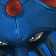
    Alright, I've got most of what I want finished as far as graphics go but I still need to think up some more fake pokemon to make my dex complete.
    [PokeCommunity.com] Pokemon Star Version Dex (and stuff)


    Yes, I know some aren't facing properly but I intend to correct that in the actual game and I'll update this post as needed.

    Here are my gym leaders and badges:
    [PokeCommunity.com] Pokemon Star Version Dex (and stuff)


    Here's my title screen:
    [PokeCommunity.com] Pokemon Star Version Dex (and stuff)


    And here's my female trainer card:

    [PokeCommunity.com] Pokemon Star Version Dex (and stuff)


    What I'm mainly concerned with at this point are my pokemon and their designs.


    COMMENTS, COMPLEMENTS and CRITICISM ALL APPRECIATED.
     
    Last edited:
    Oh good lordy, no.
    First of all, as you said some sprites don't face the wrong way.
    Second of a- Can I see a few default MSPaint colours?
    MY EYES.
    And half of those have no outline shading at all, the other half are just... so much no black.
    And your sprites are too straight.
    You need to read The Cave of Dragonflies' spriting guide right now.

    Yes, there are a few colors in there that are "defualt" colors but I could easily adjust that and I'm slowly going back through them and adding in the black parts.

    I'll take a look at the spriting guide.

    I do think I'm getting better at doing them though. Compare number 82 to number 63. (they aren't in the order I made them) Husgelid looks pretty good to me at least where as Perfuchsia definitely needs a little work.

    Thanks for the comments.
     
    Ignore Spycicle; it's a brand new account, no customization applied to it, and in any case we don't see him putting HIS work up for peer review. :)

    I like the ideas behind and designs of a lot of them, but there are so many that I won't even touch on that; this is a pixel art forum, after all. There are three problems that I notice right away. First, the outlines on some of your sprites really stand out... Bearium is a good example of this. If you look closely at Pokemon sprites, you'll find that their outlines are shaded, which breaks it up and prevents people from seeing solid black lines.

    Next, your outlines aren't quite round enough in places. Look at Taziger; on its tail, it goes between straight and diagonal lines very quickly, while they should have pixels to transition between them... Like on Hoppity, that's how rounding should be handled. Taziger also has some distractingly straight lines, that run on for longer than they should (see the legs).

    Finally, your shading really has no depth to it. Taziger is useful for this again. See how it has lots of shading clumped together? You want to avoid that, and not use so many shades of gray for it. You also don't want the shading to just follow the outline either, you want to use it to show curves, muscles, etc. Froglure, on the other hand, has minimal shading, which isn't quite right either; you have to find a balance.

    [PokeCommunity.com] Pokemon Star Version Dex (and stuff)


    Here's an example of a sprite using the things I mentioned above... Ignore how ugly it is. As you can see, mine is a little rounder, has more depth to it, and your eyes aren't really drawn to the outline. Of course, this isn't the direction you should go with your art, it's hideous, I'm just showing the techniques.

    Now, I'm not telling you to modify all of these lovely sprites you've drawn. I'm just saying, you have room for improvement, and it would be a shame if you didn't take advantage of it. Click the image in my signature to go to my tutorial thread, which will teach you the techniques step-by-step.
     
    Last edited:
    Ignore Spycicle; it's a brand new account, no customization applied to it, and in any case we don't see him putting HIS work up for peer review. :)

    I like the ideas behind and designs of a lot of them, but there are so many that I won't even touch on that; this is a pixel art forum, after all. There are three problems that I notice right away. First, the outlines on some of your sprites really stand out... Bearium is a good example of this. If you look closely at Pokemon sprites, you'll find that their outlines are shaded, which breaks it up and prevents people from seeing solid black lines.

    Next, your outlines aren't quite round enough in places. Look at Taziger; on its tail, it goes between straight and diagonal lines very quickly, while they should have pixels to transition between them... Like on Hoppity, that's how rounding should be handled. Taziger also has some distractingly straight lines, that run on for longer than they should (see the legs).

    Finally, your shading really has no depth to it. Taziger is useful for this again. See how it has lots of shading clumped together? You want to avoid that, and not use so many shades of gray for it. You also don't want the shading to just follow the outline either, you want to use it to show curves, muscles, etc. Froglure, on the other hand, has minimal shading, which isn't quite right either; you have to find a balance.

    [PokeCommunity.com] Pokemon Star Version Dex (and stuff)


    Here's an example of a sprite using the things I mentioned above... Ignore how ugly it is. As you can see, mine is a little rounder, has more depth to it, and your eyes aren't really drawn to the outline. Of course, this isn't the direction you should go with your art, it's hideous, I'm just showing the techniques.

    Now, I'm not telling you to modify all of these lovely sprites you've drawn. I'm just saying, you have room for improvement, and it would be a shame if you didn't take advantage of it. Click the image in my signature to go to my tutorial thread, which will teach you the techniques step-by-step.
    Lol thanks for the comments. I'll definitely take your advice and check out your sig link. I see what you're saying about your criticisms about the shading and rounding. I'll try to take care of that asap. :)
     
    Ignore Spycicle; it's a brand new account, no customization applied to it, and in any case we don't see him putting HIS work up for peer review. :)

    I like the ideas behind and designs of a lot of them, but there are so many that I won't even touch on that; this is a pixel art forum, after all. There are three problems that I notice right away. First, the outlines on some of your sprites really stand out... Bearium is a good example of this. If you look closely at Pokemon sprites, you'll find that their outlines are shaded, which breaks it up and prevents people from seeing solid black lines.

    Next, your outlines aren't quite round enough in places. Look at Taziger; on its tail, it goes between straight and diagonal lines very quickly, while they should have pixels to transition between them... Like on Hoppity, that's how rounding should be handled. Taziger also has some distractingly straight lines, that run on for longer than they should (see the legs).

    Finally, your shading really has no depth to it. Taziger is useful for this again. See how it has lots of shading clumped together? You want to avoid that, and not use so many shades of gray for it. You also don't want the shading to just follow the outline either, you want to use it to show curves, muscles, etc. Froglure, on the other hand, has minimal shading, which isn't quite right either; you have to find a balance.


    Here's an example of a sprite using the things I mentioned above... Ignore how ugly it is. As you can see, mine is a little rounder, has more depth to it, and your eyes aren't really drawn to the outline. Of course, this isn't the direction you should go with your art, it's hideous, I'm just showing the techniques.

    Now, I'm not telling you to modify all of these lovely sprites you've drawn. I'm just saying, you have room for improvement, and it would be a shame if you didn't take advantage of it. Click the image in my signature to go to my tutorial thread, which will teach you the techniques step-by-step.
    Ahem.
    One- Look at my signature.
    Two- I had an account previously.
    And three- Who are you to judgd? Show me your sprites then.
    If you can't handle criticism, then you're not fit to be an artist, chef or anything like that.

    But anyway, yes, there's room for inprovement. Just keep trying MissDigitalis, and you'll completely get the hang of it. :)

    Please don't try to start a flame war, nobody wants that.

    One: It's a nice signature, though you didn't have it at the time I posted.

    Two: I am familiar with your previous account, yes.

    Three: Who am I to judge? Where did I judge you? I said that you had a blank account, which at the time you did. You should know better than to post very rude things as the first thing you do with a new account on a forum; that's the fastest way to be labeled a troll.

    I don't know why you're talking about being unable to handling criticism... She handled it just fine (better than most would have, given how rude you were), and you have yet to criticize me. I haven't really done any Pokemon-style sprite work for a while, as I've been preoccupied with other things, but since you asked here are some sprites of mine from 2009.

    Spoiler:


    Now can the nice lady have her pixel art thread back?
    Yes, she can, as I was in a bad mood the past few days (personal stuff, like getting really annoyed by my family, almost the end of holidays, etc.)

    On another note- One of the bigger probs with the sprites are certain Fakémon have only slight variations of colours from default MS Paint, as I said earlier.
    Which does not make it automatically bad, but doesn't make it look good either.
    eg. Sparkoi, variation of MS Paint red.
    However, you have some great sprites in there like-
    Frostyke and Platytail, so you do have knowledge about outlines and colours, so remember- Just keep trying.

    Oh yeah- Sorry Chesu.
     
    I don't think that's such a big deal... Yamask uses R248, which is only four light values apart from R255, MS Paint's default red. Sparkoi uses R250-G25-B34.

    The bigger problem with Sparkoi than the base shade of red chosen (though I wouldn't have gone with it, myself) is the palette in general... The contrast between base and darker shade is fine, but the lighter shades are pink and a lighter pink, which don't really work.

    If you're going for a shiny look, MissDigitalis, I would recommend using white with just a bit of pink to soften the edges.
     
    Hey not bad! I especially like 3, 13, 8 and 18. (I didn't do that on purpose) I think if you used a little bit darker outlines and different shading it would help out a lot, well, basically what Chesu said. I hope you keep making original sprites :]
     
    Spycicle you're forgiven for the harsh words. Thank you Chesu so much. I appreciate the kindness. :)

    Also, Thank you for the comments TehSquidly.
     
    I like a lot of the ideas. However, as said before, a lot of the lines are too straight. Also, the names could use a bit of work. It annoys me how nearly every evolution line starts with the same thing, like 7, 8, and 9. But your sprites are still probably better than mine. xD
     
    I like a lot of the ideas. However, as said before, a lot of the lines are too straight. Also, the names could use a bit of work. It annoys me how nearly every evolution line starts with the same thing, like 7, 8, and 9. But your sprites are still probably better than mine. xD
    Oh, I didn't realize I'd done it so much. Sorry lol. I kind of thought that pokemon names were supposed to be sort of similar like that though. Like...

    CHARmander, CHARmeleon and CHARizard.
    PIDGEy, PIDGEotto, and PIDGEot.
    NIDOran, NIDOrina, NIDOqueen.

    And so on....

    But I'm open to changing some of the names.
     
    Granted there are many Pokemon with the same name parts, I don't think that's the sort of thing that should be encouraged. It's okay for a couple, but not for all of them.

    Anyways, I do like your Fakedex; it's interesting and a lot more complete than mine. Especially the Magpup line. Adn the Steellion, which bears a resemblance to a Fakemon I have in mind. THOSE ARE AMAZING. However, there a lot that you should definitely redesign and change the names of. These ones in particular stood out to me.

    #21 through #23 - I don't understand how a plant goes from being a flower to a tree. And losing its eyes in the middle stage doesn't make sense since both the first and last have eyes. Also, Psypress is based off of the word "cypress", no? Cypress trees have needles, not broad leaves, so your creature doesn't make sense to have that name.

    #27 through #29 - These are very plain and need some concept besides just being rocks with moss on them. Also, the names need HUGE work. You should research moss online and look at related words. I usually look at Wikipedia to look at scientific names and related species. If you look at the Geodude and Roggenrola lines, there is definite differences between the evolutions, which isn't prominantly displayed here.

    #51 through #56 - These seem too much of a repeat of Snover and Abomasnow. You could possibly remove them completely and make some other creative creatures.

    #71 and #72 - These could use some redesiging; there isn't much change between the two. Maybe you could change the pose of Zomber? And then the color and add some more zombie looking features on to Zombyow? The first one could be named Zombyow, but you should probably change the second one's name. Looking at most cat Pokemon, there is usually a huge name difference between the evolutions. Like with: Meowth, Persian; Skitty, Delcatty; Glameow, Purugly; Purrloin, Liepard.

    #127 through #129 - Repetitive. There are quite a few bug lines in your dex already. It seems like you're just filling space with them when you have that many... o . o;

    #143 and #144 - There isn't much change between these (a reocurring flaw...) and need I remind you of Spinarak and Ariados?

    In general, I think you should look back on some of the generations and compare them to yours. Take a look at what Pokemon has done and see if it matches too closely or doesn't match enough. Don't fit it to a T, but do try to follow along how Pokemon does. Feel free to be original, but don't jump completely off the tracks.

    Also, making some descriptions to go along with these would help you choose names easier. A little thinking and writing goes a long way. :)
     
    Granted there are many Pokemon with the same name parts, I don't think that's the sort of thing that should be encouraged. It's okay for a couple, but not for all of them.

    Anyways, I do like your Fakedex; it's interesting and a lot more complete than mine. Especially the Magpup line. Adn the Steellion, which bears a resemblance to a Fakemon I have in mind. THOSE ARE AMAZING. However, there a lot that you should definitely redesign and change the names of. These ones in particular stood out to me.

    #21 through #23 - I don't understand how a plant goes from being a flower to a tree. And losing its eyes in the middle stage doesn't make sense since both the first and last have eyes. Also, Psypress is based off of the word "cypress", no? Cypress trees have needles, not broad leaves, so your creature doesn't make sense to have that name.
    I redesigned Dazy to fix that. And yes, Psypress is from the word cypress because it's a tree. I figured it was close enough like how Charmeleon really doesn't have that much in common with chameleons.


    #27 through #29 - These are very plain and need some concept besides just being rocks with moss on them. Also, the names need HUGE work. You should research moss online and look at related words. I usually look at Wikipedia to look at scientific names and related species. If you look at the Geodude and Roggenrola lines, there is definite differences between the evolutions, which isn't prominantly displayed here.
    Ok, I'll take that suggestion into consideration.

    #51 through #56 - These seem too much of a repeat of Snover and Abomasnow. You could possibly remove them completely and make some other creative creatures.
    I kind of like them but if I think of something I like better I'll replace them possibly.

    #71 and #72 - These could use some redesiging; there isn't much change between the two. Maybe you could change the pose of Zomber? And then the color and add some more zombie looking features on to Zombyow? The first one could be named Zombyow, but you should probably change the second one's name. Looking at most cat Pokemon, there is usually a huge name difference between the evolutions. Like with: Meowth, Persian; Skitty, Delcatty; Glameow, Purugly; Purrloin, Liepard.
    Sure, I guess I could repose them and you do make a good point about the names of the cats.

    #127 through #129 - Repetitive. There are quite a few bug lines in your dex already. It seems like you're just filling space with them when you have that many... o . o;
    I just find bugs interesting I guess. Plus, about 10 percent of all real pokemon are bug types anyway.

    #143 and #144 - There isn't much change between these (a reocurring flaw...) and need I remind you of Spinarak and Ariados?
    Well Aracmite goes from being an albino spider to being a black widow with a skull for a head and a purple body so I think that's a significant enough change. I guess I'll change the name of Aridow since it's a bit too similar to Ariados though.

    In general, I think you should look back on some of the generations and compare them to yours. Take a look at what Pokemon has done and see if it matches too closely or doesn't match enough. Don't fit it to a T, but do try to follow along how Pokemon does. Feel free to be original, but don't jump completely off the tracks.

    Also, making some descriptions to go along with these would help you choose names easier. A little thinking and writing goes a long way. :)
    Alright.

    Thank you for the comments.
     
    Last edited:
    You have some really cool designs here. Leafelva especially is very cute, and I love Topat and Cheshady! The concepts behind them are very interesting and I'd totally train one if they were in a game. :D I'm a huge fan of Alice in Wonderland so it's nice to see you borrowed some ideas from them - many of your fakemon go beyond being based off of regular animals, which is great.

    Anyways, it's critique time!

    While your sprites are pretty good, a lot of them look similar when it comes to poses (such as Zomber and Zombyow and Ariem/Drimi and Spectreal). Additionally, many look a little flat, so I'd recommend working on angles a bit. There's also the general issue of anatomy but your sprites being so similar and a bit flat stands out much more than that in my eyes.

    Work on your jagged outlines, too; the final stage of your grass starter for example has outlines that are a bit rough on the eyes. Practice using the line tool a bit more - it's your savior for a lot of these things if you know how to use it right. ^_^

    Staying consistent with your coloring and general spriting style is also very important! Your fire starter starts out great but when it evolves there's suddenly a lot of stray pixels all over its body that really aren't necessary. Try not to go overboard with it. Here's what I mean, if you're curious:

    [PokeCommunity.com] Pokemon Star Version Dex (and stuff)


    Notice how many unneeded pixels are on the second and third stages in comparison to first? Not sure if that's what you intended but I thought I should point it out. Too much detail can hurt!

    Last pointer: work on the way you do eyes a bit. Filling a circle with a single color and adding a white or black dot should usually be avoided unless you really know what you're doing and have a better eye for whether certain colors would clash or not (especially using a color that's very light, making the white dot hard to even see, such as the yellow eyes of your grass starter). Simple filling isn't always bad and usually works better depending on what you're spriting, though. This doesn't apply to all of your fakemon (I love Frostyke's eyes) but try to put a little more detail (but not too much since sprites aren't very big to begin with, of course) into your more simpler eyes and be careful when choosing colors!

    Anyways, that is all! You're talented and have good sprites regardless so please keep posting! =D
     
    Last edited:
    You have some really cool designs here. Leafelva especially is very cute, and I love Topat and Cheshady! The concepts behind them are very interesting and I'd totally train one if they were in a game. :D I'm a huge fan of Alice in Wonderland so it's nice to see you borrowed some ideas from them - many of your fakemon go beyond being based off of regular animals, which is great.
    Thank you very much! ^_^ I'm glad you like them.

    Anyways, it's critique time!

    While your sprites are pretty good, a lot of them look similar when it comes to poses (such as Zomber and Zombyow and Ariem/Drimi and Spectreal).
    Additionally, many look a little flat, so I'd recommend working on angles a bit. There's also the general issue of anatomy but your sprites being so similar and a bit flat stands out much more than that in my eyes.

    Yeah I'm going to repose Zomber probably and rename it. Drimi and Spectreal were originally flying and ghost evolutions of Eevee but I decided not to include any original pokemon in my game but I still wanted to keep them in there somehow. I may change the ears of Spectreal or something but I'm not sure.


    Work on your jagged outlines, too; the final stage of your grass starter for example has outlines that are a bit rough on the eyes. Practice using the line tool a bit more - it's your savior for a lot of these things if you know how to use it right. ^_^
    Hmm.. alright. That was one of the first ones that I made while gomphant was one of the last so you can see that I've made some progress in my spriting. Remaking Ligerose shouldn't be too dificult since I've learned a few techniques since then and I wanted to make that one a bit larger anyway.


    Staying consistent with your coloring and general spriting style is also very important! Your fire starter starts out great but when it evolves there's suddenly a lot of stray pixels all over its body that really aren't necessary. Try not to go overboard with it. Here's what I mean, if you're curious:

    [PokeCommunity.com] Pokemon Star Version Dex (and stuff)


    Notice how many unneeded pixels are on the second and third stages in comparison to first? Not sure if that's what you intended but I thought I should point it out. Too much detail can hurt!
    I'll take a few of the extra dithering pixels out.


    Last pointer: work on the way you do eyes a bit. Filling a circle with a single color and adding a white or black dot should usually be avoided unless you really know what you're doing and have a better eye for whether certain colors would clash or not (especially using a color that's very light, making the white dot hard to even see, such as the yellow eyes of your grass starter). This doesn't apply to all of your fakemon though (I love Frostyke's eyes) but try to put a little more detail (but not too much since sprites aren't very big to begin with, of course) into your more simpler eyes and be careful when choosing colors!
    I'll have to think a bit about how to change those. No ideas come directly to mind in how to fix them.

    Anyways, that is all! You're talented and have good sprites regardless so please keep posting! =D

    Thank you! I really appreciate the C&C on the specifics! Very helpful. :)
     
    Back
    Top