
-
Ever thought it'd be cool to have your art, writing, or challenge runs featured on PokéCommunity? Click here for info - we'd love to spotlight your work!
-
Which Pokémon Masters protagonist do you like most? Let us know by casting a vote in our Masters favorite protagonist poll here!
-
Red, Hilda, Paxton, or Kellyn - which Pokémon protagonist is your favorite? Let us know by voting in our poll!
You are using an out of date browser. It may not display this or other websites correctly.
You should upgrade or use an alternative browser.
You should upgrade or use an alternative browser.
Rate the Avatar of the Person Above
- Thread starter G-LANCE
- Start date
- Status
- Not open for further replies.
More options
Who Replied?

- 1,701
- Posts
- 16
- Years
- UK
- Seen Jan 10, 2015
Awww, so cuuute!
Love it!
9/10
Love it!
9/10
SmashHero24
What?
- 11
- Posts
- 15
- Years
- Age 30
- New freakin' Jersey
- Seen Nov 26, 2009
Digging the Wolf :D
8.5/10
8.5/10
- 1,795
- Posts
- 16
- Years
- Age 31
- Ireland
- Seen Apr 27, 2025
8/10. Who doesn't like green dinosaurs?
(Tyranitar ftw)
(Tyranitar ftw)
AtomicoExploda
I don't know.
- 689
- Posts
- 16
- Years
- Seen Feb 6, 2013
Giratina is awesome, the background doesn't really suit it though... 7/10
ShadowLeader
because shadows follow...
- 653
- Posts
- 16
- Years
- Above The Shadows
- Seen Feb 9, 2010
9/10....i like yours very much!!
templekeeper
Remember: you're a member!
- 404
- Posts
- 15
- Years
- Seen Apr 3, 2010
8/10
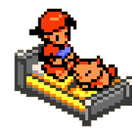
What/Who are they fighting?
What/Who are they fighting?
BHwolfgang
kamikorosu
- 3,906
- Posts
- 16
- Years
- Age 30
- Virginia
- Seen Feb 24, 2014
I'm not a fan of sprites being avatars. 6*10
Corvus of the Black Night
Wild Duck Pokémon
- 3,416
- Posts
- 16
- Years
- Age 32
- With the Birds
- Seen Jan 9, 2015
Bah. Too many friends have KH avatars.
Ha, but I won't mark you down for it! 9/10.
Ha, but I won't mark you down for it! 9/10.
Crystal-Heart
~Black & White~
- 1,193
- Posts
- 16
- Years
- The World In-Between
- Seen Apr 4, 2011
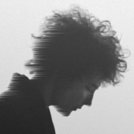
As I said before, I love the art style and his expression.
8/10
8/10

Banjora Marxvile
hOI!!!!!! i'm tEMMIE!!
- 3,497
- Posts
- 17
- Years
- Age 31
- Seen May 4, 2025
Interesting... Looks kinda cute (yes, Marxvile does actually have some emotions)
8/10
8/10
- 1,701
- Posts
- 16
- Years
- UK
- Seen Jan 10, 2015
It's pretty, even if just a sort of a/nearly a crop, like mine, so I guess I can't talk.
Love the different background.. it goes with the character, but doesn't steal the limelight..
9.1/10
Love the different background.. it goes with the character, but doesn't steal the limelight..
9.1/10
ShadowLeader
because shadows follow...
- 653
- Posts
- 16
- Years
- Above The Shadows
- Seen Feb 9, 2010
i like yours...it is very pretty and calming...9/10
.inLOVE
el su bosillo <3
- 1,712
- Posts
- 16
- Years
- Age 34
- Will's bed
- Seen Sep 12, 2012
9/10
I love the red and how the girl looks like Kagome.
I love the red and how the girl looks like Kagome.
- Status
- Not open for further replies.