Ever thought it'd be cool to have your art, writing, or challenge runs featured on PokéCommunity? Click here for info - we'd love to spotlight your work!
Welcome to PokéCommunity! Register now and join one of the best fan communities on the 'net to talk Pokémon and more! We are not affiliated with The Pokémon Company or Nintendo.
Graphically, the banner looks over sharpened and too bright. I'm not sure why you put the banner in the middle and the rest aligned to the left. Seems a bit disorganized.
Your sig is very well organized, the image is just the right size, and I love the gradientation of the text. However, the word "Heartbeat" is almost invisible on some themes (e.g. PC Pro, etc.).
I like your style, but, erm...
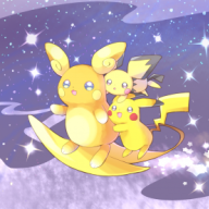
Isn't there a 500 pixel width limit on images?
9/10 regardless
I think you should label which game the friend code is for a bit more clearly. That's all.
Clustered and confusing.. me like alot.
Good combination of CSS and picture work.
I find it interesting how the music player jumps around when it scrolls :P
I really like the icons, and the suitesm but not so sure on the colour of the red dots, little vibrant. Other than that it's pretty cool, bit too simplistic for my liking, it's just not interactive enough for me XD 7/10
CSS is nice. It's not cluttered, and it's easy to navigate. The banner doesn't match with the color of the CSS, but that's because of the type of CSS that is used there. I'm on Poke Link 3, so the lines are shades of green, and thus doesn't match with the banner to the side. XD;