• Our software update is now concluded. You will need to reset your password to log in. In order to do this, you will have to click "Log in" in the top right corner and then "Forgot your password?".
  • Welcome to PokéCommunity! Register now and join one of the best fan communities on the 'net to talk Pokémon and more! We are not affiliated with The Pokémon Company or Nintendo.

Zar's Gallery

Zaroas

Dragon's Might
329
Posts
13
Years
  • Hey everyone, I'm Zar. I'm sure none of you know me because I hang out in the S&M part of the forum, but I make signatures (Or tags as a lot of you call them) on GIMP. I've been doing this for a couple of months. So please, enjoy.

    The Signatures (Or tags, whichever you want to call them)
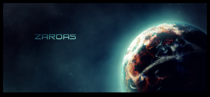
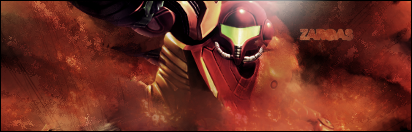
    Spoiler:

    So, that's my gallery. Any opinions? I can take constructive critisism well, so shoot away my friends. Don't hesitate to request or anything.
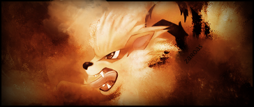
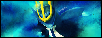
     

    Kelp

    <3
    379
    Posts
    13
    Years
  • You've got a lot of nice stuff here. ^_^

    Don't be afraid to stray from that grunge style though. A lot of your tags seems to use this style, and are a bit simple/empty. Be sure to try new effects such as c4ds, and fractals, to fill some of the space.

    Nice work though, keep it up.
     

    Zaroas

    Dragon's Might
    329
    Posts
    13
    Years
  • Thanks Kelp!

    Yeah, I'm starting to stray a bit from that style. I've recently been experimenting with C4Ds and fractals, as shown in the car signature (tag). I'm also going to try out some vector work, which seems pretty common around these parts.

    Once again, thanks!
     
    18
    Posts
    13
    Years
    • Seen Apr 5, 2011
    You need to work on your text, both placement and font. It's usually best to go for something simple, ie. Times New Roman or Impact. As for placement, try not to add the text too far from the focal. It's distracting otherwise. Good work though, keep it up.
     

    Zaroas

    Dragon's Might
    329
    Posts
    13
    Years
  • Thanks. Yeah, text has really been my problem when making these things, I find it kind of hard to do for some reason. Thanks for the tips, I'll be sure to try that next time. :)
     
    130
    Posts
    13
    Years
    • Seen Jan 8, 2023
    Just made this a couple hours ago.

    timeshiftsig3.png


    C+CC please?

    It is quite monotone.
    Not all sig's need text *hint*.
    Render seems distorted, hold shift while resizing.
    Smudging is okay, it isn't quite fitting though.
    The c4d's behind him help distort the flow. (Not a good thing)


    DON'T OVERUSE THE GRADIENT MAPS!
     

    Zaroas

    Dragon's Might
    329
    Posts
    13
    Years
  • It is quite monotone.
    Not all sig's need text *hint*.
    Render seems distorted, hold shift while resizing.
    Smudging is okay, it isn't quite fitting though.
    The c4d's behind him help distort the flow. (Not a good thing)


    DON'T OVERUSE THE GRADIENT MAPS!
    Thanks for your critisism.

    I know it's montone, but it's a lot better than what I had originally. Originally it was black and white, and I think the orangey feel made it better. Hint: Signatures can be montone.

    I understand about the text thing, but I've seen people ripping signatures a lot and claim them as their own. I'm a bit worried about that happening, so the text is like a watermark.

    I actually did hold shift while I was resizing, so it's either the smudging or the render quality. Yeah, looking at it now on the site I got it on, it's the render quality. I'll try to pick better renders in the future.

    I don't really see how the C4Ds or disrupting the flow. They're going in the direction of the smudging and the render, although in some places I agree. But for the most part, I don't.

    I didn't reuse any gradient maps, so I don't know what you're talking about.
     

    Uecil

    [img]https://i.ibb.co/4jfYrCT/tHdpHUB.png[/img]
    2,568
    Posts
    14
    Years
  • I was browsing at this thread yesterday. :P
    planet_signature_by_zaroas1-d2ylneg.png


    I love the use of light in this tag, also the text works well on it; in my opinion.
    Also, the background in the tag looks so smooth, so good job ;D

    carsig.png


    I loved how you've blended the car and smudged it, the colours are nice too.

    2mg6xz8.jpg


    and this one! I liked this one the most, I really liked the colours you've used in this tag plus the use of smudging.


    So, far great work. Keep it up!
     
    130
    Posts
    13
    Years
    • Seen Jan 8, 2023
    Thanks for your critisism.

    I know it's montone, but it's a lot better than what I had originally. Originally it was black and white, and I think the orangey feel made it better. Hint: Signatures can be montone.

    I understand about the text thing, but I've seen people ripping signatures a lot and claim them as their own. I'm a bit worried about that happening, so the text is like a watermark.

    I actually did hold shift while I was resizing, so it's either the smudging or the render quality. Yeah, looking at it now on the site I got it on, it's the render quality. I'll try to pick better renders in the future.

    I don't really see how the C4Ds or disrupting the flow. They're going in the direction of the smudging and the render, although in some places I agree. But for the most part, I don't.

    I didn't reuse any gradient maps, so I don't know what you're talking about.
    ha, yea about the ripping, i know someone who will put their name across the piece in a low oppacity white.
    but i think the c4d's kinda disrupt the flow because the render is just a bit more tilted a different direction..maybe it's just me though. anyways, i like the smudge style, just because it is basic doesn't mean it isnt a good start. i love the car one... kiu

    oh and about the gradient maps, i said that because that is normally what makes the signature monotone, i had a simliar problem. try playing with settings. im really liking your work though.. i'd like to see more in the future..
     

    Zaroas

    Dragon's Might
    329
    Posts
    13
    Years
  • Thank you, Galukxy! Also, thanks for clearing all that up keoni. I'm actually going to try the thing with the low opacity text soon.
    Before I saw all this though, I made something inspired by something I saw on a different forum.
    littlebigplanet.png

    I know, I have a problem with monotone these days, lol.
     
    130
    Posts
    13
    Years
    • Seen Jan 8, 2023
    Thank you, Galukxy! Also, thanks for clearing all that up keoni. I'm actually going to try the thing with the low opacity text soon.
    Before I saw all this though, I made something inspired by something I saw on a different forum.
    littlebigplanet.png

    I know, I have a problem with monotone these days, lol.

    the world looks a little too blurred, don't worry about being monotone, just try and see what made it like that. i had a problem with it being monotone a while ago too. just keep working on it and it will get better.
     
    6,302
    Posts
    15
    Years
  • Some of your tags seem to be blurred due to using too much smudging, and like others said be careful with text placement. Not all tags need text, so don't feel like you need to put text in.


    I like this one, though the text could be a bit bigger or more noticeable.

    Keep it up, your improving!
     

    Zaroas

    Dragon's Might
    329
    Posts
    13
    Years
  • sonic.png

    Just updating this with my latest piece of work.

    Critique, please? BTW, I got complaints on the outline on the spikes on Sonic's left side, but they're part of the render, so please don't complain about them.
     
    130
    Posts
    13
    Years
    • Seen Jan 8, 2023
    sonic.png

    Just updating this with my latest piece of work.

    Critique, please? BTW, I got complaints on the outline on the spikes on Sonic's left side, but they're part of the render, so please don't complain about them.

    for the lines, if your using photoshop...go to layers>matting>defringe>1 px.
     

    Geranyl

    Resident Pikachu
    17
    Posts
    13
    Years
    • Seen Nov 25, 2011
    somebody likes too many franchises...

    Eh, I do like your work; you have some weird nice method of making the render looks as if it was shrouded by a bunch of clouds... But that's where you need some variation. Get some brushes, or something; it'll give you a more... variegated gallery.
     

    Zaroas

    Dragon's Might
    329
    Posts
    13
    Years
  • somebody likes too many franchises...

    Eh, I do like your work; you have some weird nice method of making the render looks as if it was shrouded by a bunch of clouds... But that's where you need some variation. Get some brushes, or something; it'll give you a more... variegated gallery.
    Thanks. I know, I'm trying to work on that, but the computer I'm currently working on can't download brushes because DeviantArt is blocked. I know there are other places to find them, but I'm having trouble finding them. When I get my new computer this week I think, I'll download some brushes and work on that.
     
    Back
    Top