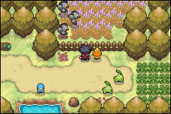
Even though it's in the official games, I think it's a bad design choice (I mean @Gamefreak for even putting it in). It looks silly for the type of effect they want. I'm assuming their goal was to make it like light coming from the trees, but it's overlaid on the trees. It would be different if the effect only applied to areas that were walk-able and not ON the trees themselves which should be making the effect in the first place. The light is hitting the the tree itself is creating the canopy meaning it shouldn't be layered like that.
I think you should improve on their design and not mimic it. You have a nice OW style, and a custom one, so why copy gamefreak with that design?
Edit: I might as well give you my suggestion on what to do lol.
I'd create a layered effect and make at least 2 images for the effect. I'd then give the images 2 different "z" values (depth/layers). Make one image possibly over the map and the other layered into the map itself minus 1 layer that the tree tops are on.