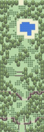
Game base FR
Game unamed test map
Credits, kyledove & speed dialga
map
Review: This map seems quite empty to me - There are no flowers and only one small tree. Try putting a greater variety of tiles (like small trees, flowers, sandy/dirt paths, boulders etc)
throughout the map to fill it up more. Your decision to place two lampposts right next each other seems a bit odd, I mean, you haven't used them anywhere else on the map and lamps (in the real world) are meant to be spaced apart to ensure that they do their job over a wide area. Putting some more around the map will also help to fill up the empty space.
What are those three blue-bar things (they kind of look like bicycle racks) exactly? I've always pictured them as fences, so if that is what you also see them as then try to use them like they are fences rather than placing them one at a time in random parts of the map.
If you don't see them as fences, then disregard this and my last two sentences :D. The small ledge at the bottom of the map is kind of unnecessary seeing as how the player can easily bypass it. It also forces the player to go through a one-tile path if they are travelling from left to right (there are also two other one tile paths at the top of the map) so getting rid of that would be a good thing :)
Overall, the ideas behind this map are good, but it's construction could have been done better.
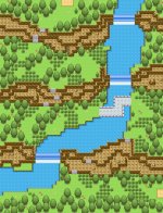
2.
Name: Nameless City
Game: FireRed Nameless Hack
Credits: Gamefreak
First off: well done on your tree placement, you've done an excellent job in mapping in a 'natural' style. Unfortunately, while your trees are placed like this, the large grey road that goes through your town conflicts greatly with it. I mean, everything surround the road is random, while the path itself is a constant width which never changes despite it's surroundings. While I'm not saying you should make the road jagged and totally random like some of your sandy paths, consider breaking it up into two or three parts and experiment with it's width to help give it a greater 'freestyle feel' like the rest of the map. Some of the distance involved when travelling in between your buildings (particularly the Pokemon Centre with the rest of the town) is larger than it needs to be. Considering shortening the distance between the buildings since they seem quite far apart as well as the long empty road down the left side of them map.
The pier seems to have some depth-perception problems. Looks at it's tiny stilt legs on it's bottom and compare it to the height of the cliff above it - The difference in height is quite large. I suggest forcing the player to go down a flight of stairs before being able to walk on the pier. Speaking of stairs, the set of stairs leading to the beach on the far right should be at least two tiles wide, along with the small strip of sand the player has to walk on once they have reached the bottom. This will give them a greater freedom of movement, like you have
generally given them throughout the rest of the map.
I strongly advise you to have a look at Pokemon's original maps and look at the tree shadowing. I can see a lot of shadowing errors across your map so learning when and where to apply shadows will be very beneficial for both this map and those you make in the future. Finally, you have used only one regular ground tile in this map, when there are five different available tiles in the default FR/LG tileset. Use these tiles randomly to break up any chance of having boring and repetitive ground.
Overall, I think this map's tree placement has done a great job of emulating a 'natural style' while other aspects of the town haven't succeeded as much. Don't get me wrong, this is a very good map, but the devils are in the details :P
Anyway, here's my first map I made in years:
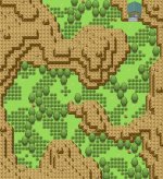
Fire Red ROM
Hoenn Rombase
Credit to NzFury and Alucus (:
Name of Town: Salika Town
The centre of this map seems very empty - Try adding a sandy/ dirt path to remove the monotony of the regular ground tile. The very top level of two of your house roofs don't seem to sync up with the other parts of the house. The lower left house appears to have a perfect roof, so the other two should copy it's arrangement of roof tiles. The small body of water in front of the lab isn't really necessary and restricts the player's movement - Consider making its dimensions smaller or moving it to an area which doesn't impede the play as much.
Similar to what I said to RedFan, this map's regular ground needs to be broken up between the five ground tiles rather than using the same one throughout the map's entirety. Along with that, consider learning how to add shadows to the default FR/LG trees correctly from closely analysing the original maps.