• Our software update is now concluded. You will need to reset your password to log in. In order to do this, you will have to click "Log in" in the top right corner and then "Forgot your password?".
  • Welcome to PokéCommunity! Register now and join one of the best fan communities on the 'net to talk Pokémon and more! We are not affiliated with The Pokémon Company or Nintendo.

4th Gen Lugia and Ho-oh

What do you think of Lugia and Ho-oh's new art?

  • Love it

    Votes: 107 72.3%
  • Hate it

    Votes: 2 1.4%
  • It's alright

    Votes: 39 26.4%
  • Not sure

    Votes: 0 0.0%

  • Total voters
    148

"Shadow Lugia"

Haven't used this in a while
  • 538
    Posts
    15
    Years
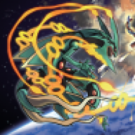
    In the CoroCoro scan we got new art of Lugia and Ho-oh. Following Red, Blue, Ruby, Sapphire, Diamond, and Pearl, there's a good chance that this art will be on the covers of the games. What do you think of them?

    I think Lugia looks really angry (and really awesome, as always).

    As much as I dislike Ho-oh, I have to admit that art makes it look really cool.
     

    Argent Crusader

    Isn't Falstad dead?
  • 300
    Posts
    17
    Years
    Lugia looks good. Ho-Oh is like a parrot this time, but not really much, just a little difference from the original.
     
  • 8,280
    Posts
    15
    Years
    • he/him
    • Seen today
    I love the the new art for both of them, definitely better than the older drawings.
     

    Bay

  • 6,390
    Posts
    18
    Years
    They're okay. I wonder how someone would say that Ho-Oh would look like a parrot…
    I guess it's because of its stance and the way the claws are positioned as if Ho-Oh is on a perch or something.

    Anyways, I like both of the art, but I prefer Ho-Oh better. Lugia does look angry, but the wings look too much like hands. Also, Lugia looks like as if he's going to grab something. XD
     

    fenyx4

    HOENN CONFIRMED!
  • 1,761
    Posts
    15
    Years
    Ho-Oh's new artwork looks AWESOME and majestic, I'd actually be glad if that was the box art! It's one of the few Ho-Oh artworks that looks fierce, while graceful and natural. Other Ho-Oh artwork looks...unnatural, I guess.

    Lugia looks OK, though it looks a bit too angry for a box cover. Though unlikely, I'd like the Lugia artwork shown here: https://www.pokecommunity.com/showthread.php?t=177544&page=3 (scroll downward a bit)

    Anyway, overall, the updated Johto artwork looks good! Liking how Larvitar looked cute yet fierce simultaneously! :) Keep up the cool artwork, Ken Sugimori!
     
    Last edited:

    AJ™

    ANGRY FAIC!!!
  • 1,495
    Posts
    16
    Years
    Doesn't mean they're not birds?!
    Ostriches can't fly, but they're still birds.
    DOUBLEPWN!

    I think Lugia is a Dragon-water hybrid creature.
     

    Artemis

    i'm no goddess
  • 5,585
    Posts
    15
    Years
    • Seen Dec 10, 2013
    The new art is very nicely done and I can definitely say that it is better than the original art. I can't say for sure that they'll be the new box art pictures, but there is a slight possibility.
     

    JP

    wut?
  • 2,163
    Posts
    15
    Years
    • Age 34
    • USA
    • Seen Dec 13, 2019
    Lugia's looks awesome, Ho-Oh's pose is a bit generic though, but still looks good.
     

    AJ™

    ANGRY FAIC!!!
  • 1,495
    Posts
    16
    Years
    Humans can fly and swim, be it by magical forces or aircraft!

    I would've preferred if it was Flying/Water, or Flying/Dragon. It'd make more sense.
     

    Gulpin

    poisonous
  • 3,271
    Posts
    17
    Years
    • Seen Jan 16, 2017
    It looks like there is awesome new artwork for other Johto-specific pokemon!
     
    Back
    Top