My stuff.
Maps
Oldest to newest:

An old cave map for an old hack that I'm now remaking. That means that at some time in the future, this map will be remade. It will be bigger, less linear and overall just a lot better.

I've already re-done this. I'm not sure why I'm posting this actually.

Ditto.
A random route to test some tiles. I only now realize how horrible this map is...meh.

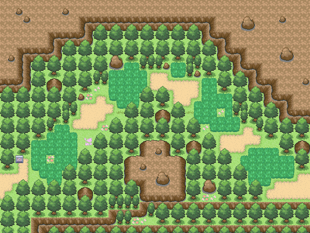
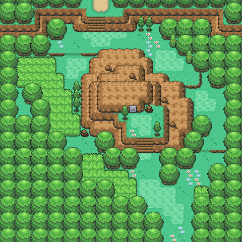
Other than the mountains, I actually like this. My first decent map tbh.
Made it to test Game Maker. Meh. Looks decent I guess.
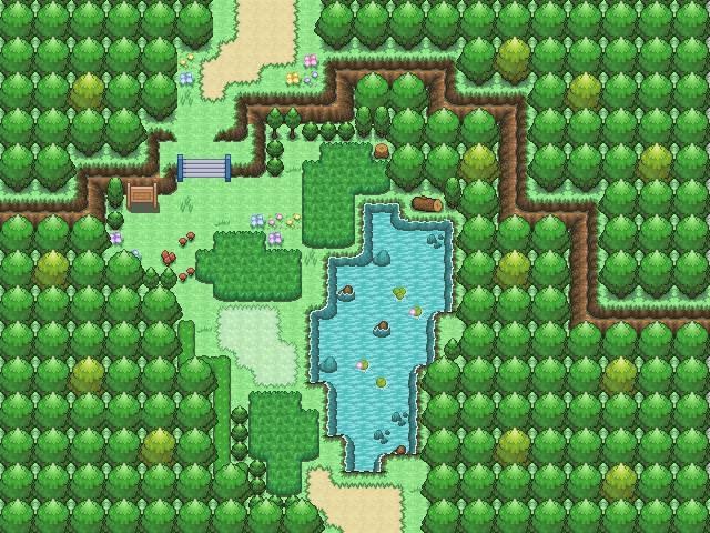
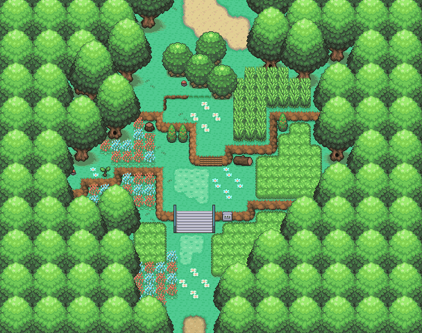
My best map ever. 'Nuff said.
Made for the GT8 Map-off. Obviously crap because I got 7th place.
Meh. I know about the error.

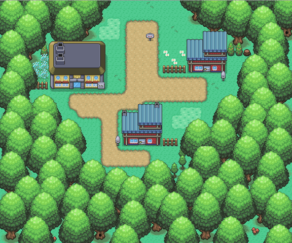
I guess this is all right...
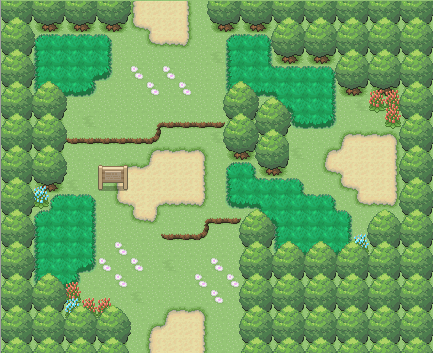
Too much flowers, take it back.
Sprites
Sprites from old to new:
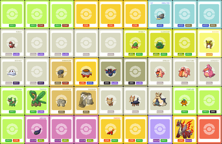
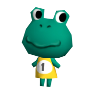
My fakedex. This will be updated when I feel like it. Please keep in mind that Hamahorn, Monana, Soupato, Fire Dragon and Rocrush were NOT sprited by me. And credit to Jesgrad07 for the dex base.

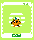
A PMD mugshot. Obviously crap because it got no comments or favs and only 12 views.
Tiles
Tiles from old to new:

Only thing worth showing here.
That's all. Click images for credits.
Maps
Oldest to newest:
Spoiler:
An old cave map for an old hack that I'm now remaking. That means that at some time in the future, this map will be remade. It will be bigger, less linear and overall just a lot better.
I've already re-done this. I'm not sure why I'm posting this actually.
Ditto.
A random route to test some tiles. I only now realize how horrible this map is...meh.
Other than the mountains, I actually like this. My first decent map tbh.
Made it to test Game Maker. Meh. Looks decent I guess.
My best map ever. 'Nuff said.
Made for the GT8 Map-off. Obviously crap because I got 7th place.
Meh. I know about the error.
I guess this is all right...
Too much flowers, take it back.
Sprites
Sprites from old to new:
Spoiler:
My fakedex. This will be updated when I feel like it. Please keep in mind that Hamahorn, Monana, Soupato, Fire Dragon and Rocrush were NOT sprited by me. And credit to Jesgrad07 for the dex base.
A PMD mugshot. Obviously crap because it got no comments or favs and only 12 views.
Tiles
Tiles from old to new:
Spoiler:
Only thing worth showing here.
That's all. Click images for credits.
Last edited: