
-
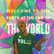
Our friends from the Johto Times are hosting a favorite Pokémon poll - and we'd love for you to participate! Click here for information on how to vote for your favorites!
-
Cyndy, May, Hero (Conquest), or Wes - which Pokémon protagonist is your favorite? Let us know by voting in our poll!
You are using an out of date browser. It may not display this or other websites correctly.
You should upgrade or use an alternative browser.
You should upgrade or use an alternative browser.
[Showcase] Fatal artwork
- Thread starter xFataLx
- Start date
More options
Who Replied?![[PokeCommunity.com] Fatal artwork](https://i112.photobucket.com/albums/n198/xTsukasax/Behemoth.png "[PokeCommunity.com] Fatal artwork")
![[PokeCommunity.com] Fatal artwork](https://i112.photobucket.com/albums/n198/xTsukasax/venom3.png "[PokeCommunity.com] Fatal artwork")
![[PokeCommunity.com] Fatal artwork](https://i112.photobucket.com/albums/n198/xTsukasax/blackandred.png "[PokeCommunity.com] Fatal artwork")
![[PokeCommunity.com] Fatal artwork](https://i112.photobucket.com/albums/n198/xTsukasax/abstractexplosionsotw.png "[PokeCommunity.com] Fatal artwork")

- 728
- Posts
- 9
- Years
- She/Her
- United States
- Seen May 23, 2025
Very nice! :DD
![[PokeCommunity.com] Fatal artwork](https://i521.photobucket.com/albums/w340/xfatalx/forza%206_zpscpvyj2yh.png "[PokeCommunity.com] Fatal artwork")
![[PokeCommunity.com] Fatal artwork](https://i521.photobucket.com/albums/w340/xfatalx/dragon%20head_zps903gk71k.png "[PokeCommunity.com] Fatal artwork")
myystogan
[cimg=width:30px;"]https://i.imgur.com/gbudGz1.png
- 176
- Posts
- 9
- Years
- GMT-6/CST
- Seen Aug 19, 2023
Hey Fatal, you've got a nice gallery here :-]
I like the way you use C4Ds, and while a lot of your pieces have a monocolor scheme, they don't feel flat. It's really important to make the image dynamic when making monotone graphics, and you pull this off. Here's an example of what I'm talking about:
![[PokeCommunity.com] Fatal artwork](https://i112.photobucket.com/albums/n198/xTsukasax/avpnotext.png "[PokeCommunity.com] Fatal artwork")
This tag is entirely green, but instead of looking boring due to the lack of color variety, it's interesting because of the very nice contrast and lighting. It's quite balanced imo, and the final outcome is cohesive. It's always important to "blend" the top image in with the background in whatever way possible, and I see that in your works.
Moving on, it seems to me that you're experimenting a bit more with effects. This is great, and you should keep on doing that. Personally, I believe the best way to get better is to try a lot of techniques, so in the end you become more flexible. I would totally encourage anyone to expand their borders, and I'm getting some of that from your latest tag (the one featuring a car).
Good points aside, I have some nitpicks. First off, borders don't always add something to a piece. I can tell that you're pretty fond of them, but in some tags they're not necessary.
![[PokeCommunity.com] Fatal artwork](https://i521.photobucket.com/albums/w340/xfatalx/mewtwo_zpsfw3sownp.png "[PokeCommunity.com] Fatal artwork")
![[PokeCommunity.com] Fatal artwork](https://i112.photobucket.com/albums/n198/xTsukasax/dothack3textless.png "[PokeCommunity.com] Fatal artwork")
In the first graphic, the uneven border honestly throws me off. It doesn't feel right, for a lack of a better explanation. I'd say it even makes everything look unequal. I bet the signature would've looked totally fine without it.
As for the second graphic, the border is a solid green color that is too eye-catching compared to everything else. My eye was first drawn to it instead of what my eyes should have been drawn to (the person). For that tag, top and bottom borders probably would've worked better, along with a slimmer but longer canvas size.
Also, I've noticed that your signatures are all center-cropped. There are no exceptions to this, unfortunately. So you should really experiment with other crops. If you stick to the same placement all the time, the overall look or first impression of your works all together will not be as impactful as it could be.
I know center crops are best for adding multiple effects, but left and right crops work out fine as well, and there's more space than you might think.
So yeah, that's all I have for you in terms of graphics. I can't provide c+c for drawings, because I don't draw too well myself, but the latest drawing you posted is stunning. Will be keeping an eye out for more stuff from you :-]
I like the way you use C4Ds, and while a lot of your pieces have a monocolor scheme, they don't feel flat. It's really important to make the image dynamic when making monotone graphics, and you pull this off. Here's an example of what I'm talking about:
This tag is entirely green, but instead of looking boring due to the lack of color variety, it's interesting because of the very nice contrast and lighting. It's quite balanced imo, and the final outcome is cohesive. It's always important to "blend" the top image in with the background in whatever way possible, and I see that in your works.
Moving on, it seems to me that you're experimenting a bit more with effects. This is great, and you should keep on doing that. Personally, I believe the best way to get better is to try a lot of techniques, so in the end you become more flexible. I would totally encourage anyone to expand their borders, and I'm getting some of that from your latest tag (the one featuring a car).
Good points aside, I have some nitpicks. First off, borders don't always add something to a piece. I can tell that you're pretty fond of them, but in some tags they're not necessary.
In the first graphic, the uneven border honestly throws me off. It doesn't feel right, for a lack of a better explanation. I'd say it even makes everything look unequal. I bet the signature would've looked totally fine without it.
As for the second graphic, the border is a solid green color that is too eye-catching compared to everything else. My eye was first drawn to it instead of what my eyes should have been drawn to (the person). For that tag, top and bottom borders probably would've worked better, along with a slimmer but longer canvas size.
Also, I've noticed that your signatures are all center-cropped. There are no exceptions to this, unfortunately. So you should really experiment with other crops. If you stick to the same placement all the time, the overall look or first impression of your works all together will not be as impactful as it could be.
I know center crops are best for adding multiple effects, but left and right crops work out fine as well, and there's more space than you might think.
So yeah, that's all I have for you in terms of graphics. I can't provide c+c for drawings, because I don't draw too well myself, but the latest drawing you posted is stunning. Will be keeping an eye out for more stuff from you :-]
xFataLx
Dreaming oV a Dead Sun
- 114
- Posts
- 9
- Years
- Seen Jul 7, 2018
really appreciate the cnc. I feel like borders add more depth to signatures and that's why ive always used them. the right borders? maybe not but something i need to take my time on as i tend to rush through them and probably why i end up with a bad border. I've tried to put the focal point on the left and right side of sigs and never was able to get them to look good. something i'll experiment with later on though.
![[PokeCommunity.com] Fatal artwork](https://i521.photobucket.com/albums/w340/xfatalx/alien%20drawing_zpsef9eacsr.png "[PokeCommunity.com] Fatal artwork")
![[PokeCommunity.com] Fatal artwork](https://i521.photobucket.com/albums/w340/xfatalx/dt_zps4hpymo8b.png "[PokeCommunity.com] Fatal artwork")
![[PokeCommunity.com] Fatal artwork](https://i521.photobucket.com/albums/w340/xfatalx/watain_zpskzr8zihg.png "[PokeCommunity.com] Fatal artwork")
![[PokeCommunity.com] Fatal artwork](https://i521.photobucket.com/albums/w340/xfatalx/darkspace_zpsspvcwpu0.png "[PokeCommunity.com] Fatal artwork")
- 347
- Posts
- 15
- Years
- Seen Dec 17, 2018
These look amazing!
![[PokeCommunity.com] Fatal artwork](https://i521.photobucket.com/albums/w340/xfatalx/melancholy_zpsqjri5eqj.png "[PokeCommunity.com] Fatal artwork")
![[PokeCommunity.com] Fatal artwork](https://i521.photobucket.com/albums/w340/xfatalx/darker%20days_zpsala3qhh5.png "[PokeCommunity.com] Fatal artwork")
![[PokeCommunity.com] Fatal artwork](https://i521.photobucket.com/albums/w340/xfatalx/drift%20away_zpsyd47qwjh.png "[PokeCommunity.com] Fatal artwork")
myystogan
[cimg=width:30px;"]https://i.imgur.com/gbudGz1.png
- 176
- Posts
- 9
- Years
- GMT-6/CST
- Seen Aug 19, 2023
The latest tags are impressive, Fatal! Those two pack good depth, and the effects you added are very tasteful. I love the typography in the first one, by the way. It looks great, thanks to your wonderful placement ;-]
![[PokeCommunity.com] Fatal artwork](https://i521.photobucket.com/albums/w340/xfatalx/xasthur_zpsju8kb7o8.png "[PokeCommunity.com] Fatal artwork")
^ I'm having trouble figuring out what's going on in that sig, though. The image looks a bit weird and awkward, with all the yellow. It's distracting, and the focal is just difficult to make out. Definitely not one of your best, though that one came before your other updates, so I'm glad you fixed that/improved.
^ I'm having trouble figuring out what's going on in that sig, though. The image looks a bit weird and awkward, with all the yellow. It's distracting, and the focal is just difficult to make out. Definitely not one of your best, though that one came before your other updates, so I'm glad you fixed that/improved.
xFataLx
Dreaming oV a Dead Sun
- 114
- Posts
- 9
- Years
- Seen Jul 7, 2018
The latest tags are impressive, Fatal! Those two pack good depth, and the effects you added are very tasteful. I love the typography in the first one, by the way. It looks great, thanks to your wonderful placement ;-]
^ I'm having trouble figuring out what's going on in that sig, though. The image looks a bit weird and awkward, with all the yellow. It's distracting, and the focal is just difficult to make out. Definitely not one of your best, though that one came before your other updates, so I'm glad you fixed that/improved.
thank you. yah that one the image i used had poor quality but it was the best image i could find of the subject so i tried my best to make something out of it but didn't turn out as good as the others obviously haha
![[PokeCommunity.com] Fatal artwork](https://i521.photobucket.com/albums/w340/xfatalx/mmmm_zpsrrfzfztm.png "[PokeCommunity.com] Fatal artwork")
![[PokeCommunity.com] Fatal artwork](https://i521.photobucket.com/albums/w340/xfatalx/Unbroken_zpsyv7ebbcm.png "[PokeCommunity.com] Fatal artwork")
![[PokeCommunity.com] Fatal artwork](https://i521.photobucket.com/albums/w340/xfatalx/rayquaza_zpsskki7upr.png "[PokeCommunity.com] Fatal artwork")
![[PokeCommunity.com] Fatal artwork](https://i521.photobucket.com/albums/w340/xfatalx/lugia%201_zpsjc8qbxm0.png "[PokeCommunity.com] Fatal artwork")
![[PokeCommunity.com] Fatal artwork](https://i521.photobucket.com/albums/w340/xfatalx/groudon_zpsprdl6rf8.png "[PokeCommunity.com] Fatal artwork")
![[PokeCommunity.com] Fatal artwork](https://i521.photobucket.com/albums/w340/xfatalx/mewtwo%20icon_zpsot6vb0um.png "[PokeCommunity.com] Fatal artwork")
![[PokeCommunity.com] Fatal artwork](https://i521.photobucket.com/albums/w340/xfatalx/melan%20icon_zpsmcsljy9a.png "[PokeCommunity.com] Fatal artwork")