Very nice, how much? (Just got done watching Borat). It's good to see someone who draws her pixel art. Its all very good.
Now, on to the crit. The Luxray one, overall, I think is your best. It has good shading and colors, good outlining, and good shape. The hand, though, is at an awkward angle and should probably be changed to a more natural one. The hair could be a little more detailed. The almost solid one-shade of dark blue would look better if there was a darker shade added in their to show more detail. Her left arm almost seems to be MIA. It would be wise to make it appear, or at least make her shoulder a bit more prevalent. The background is obviously not done, so I won't comment on that (though I will ask about the war picture. Seriously, whats up with that?).
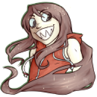
Now, onto the Tangrowth thing. It is really good so far. The colors are a good scheme for it. The shape is fairly good, too, and the shading is pretty good. Now, the hair doesn't really seem to be coming from her head, but rather a wig with absolutely no definition as to where the hair is supposed to come from. I know it is a WIP, but try making the hair look like it is coming from her head. the upper-most part of the left side of her hair also seems a little chopped off. I would recommend rounding it just a little more.
The blue demon-thing is probably your best shaded work. It is absolutely phenomenal. The shape is okay, but could probably be better if the ears were a little smaller and the head was a little wider. The hair is much better than the Tangrowth one. It actually looks like it is coming out of her head and follows a normal hairline. The only thing wrong is the left side is missing a bit of detail compared to the rest. the horns are good, but the look just a little flat, and they seem to disappear into her hair. Now, the thing that I really don't like about this piece is the mouth. It is really awkward, and generally doesn't fit the pose. It is at an extremely odd angle, too. I would recommend redoing it to fit the angle more, mainly by widening it, or scrapping the mouth altogether and making a somewhat evil grin type thing. The tendon on the neck is perhaps a little too prevalent and should be toned down. As such, the necklace thing should also be adjusted to the tendons, since it appears to actually stretch around the neck.
Now, onto the next piece. It is fairly decent so far. The folds in the arm bands are great so far, and the shirt is coming along well. The hand, though, is at an odd angle. Try straightening it out to match the angle of the forearm. I would also recommend making the hoodie appear not as skin-tight as it is now. Also, the left thigh looks really flat at this moment.
As an overall suggestion, there are some anatomy problems, too. For one, forearms are longer than biceps/triceps. Second, necks usually aren't that long and thin at the same time. Third, and finally, if you do all tendons like the ones in the precursor to Tangrowth, they should not be so extreme.
Overall, really good. I would love to see these works finished.

")
")
")
")
")
")
")
")


")