Just N Time

  • 17,597
    Posts
    20
    Years
    • Seen May 9, 2024
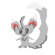
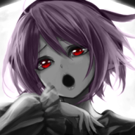
    Working on another style, due to be released next week. Features N.
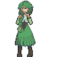
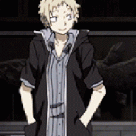
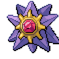
    Here's the sorta-semi-final banner:

    [PokeCommunity.com] Just N Time


    Inspired by N's Coronation and The Chamption.
    https://www.youtube.com/watch?v=PBblQDOTMek
    https://www.youtube.com/watch?v=b3B8q4bUgBo

    More to be shown soon!
    Suggestions welcome.
     
    That looks awesome Nick! I can't wait to see when it's finished because I want to use it right now. Are there going to be any color changing things like New Directions has? And now I don't mean banner, I mean bars.
     
    I've always pictured N with Reshiram rather than with Zekrom, yes :3

    Is it going to be a dark style or just having this dark banner? Really love the font for Pokécommunity, although it looks a bit weird that you dropped the ´ and put a large lightning thing there instead. The lightning thing looks good actually, but I think i'd like a normal ´ on the Pokécommunity as well, unless it looks too cluttered like that to you.

    Also, I think the header text could be moved a little to the right, since the left side of the banner is rather bright and vivid with details already.

    Now, I'm definitely not an expert on graphics matters so feel free to tell me that my opinions are wrong lol. Nah.
     
    That looks awesome Nick! I can't wait to see when it's finished because I want to use it right now. Are there going to be any color changing things like New Directions has? And now I don't mean banner, I mean bars.
    No.

    I've always pictured N with Reshiram rather than with Zekrom, yes :3

    Is it going to be a dark style or just having this dark banner? Really love the font for Pokécommunity, although it looks a bit weird that you dropped the ´ and put a large lightning thing there instead. The lightning thing looks good actually, but I think i'd like a normal ´ on the Pokécommunity as well, unless it looks too cluttered like that to you.

    Also, I think the header text could be moved a little to the right, since the left side of the banner is rather bright and vivid with details already.

    Now, I'm definitely not an expert on graphics matters so feel free to tell me that my opinions are wrong lol. Nah.
    Right now it's light, but I'm tossing an idea in my head of having a dark version selectable through the user CP with a reflected banner.

    [PokeCommunity.com] Just N Time


    Better?

    There's a reason that lightning thing is there, though. Most of what's on the banner is there for a very specific reason that ties into another part of the style.
     
    Mm, I do think it's much better. The N on the right feels tied in to the text somehow now, and I suddenly spot the ferris wheel~

    And I take your word for there being a reason to it ;) Looking forward to seeing more.
     
    Oh. I should also note that this style is fixed width at 1,008px.
     
    How about if you add little transparency to the right side of slogan so it can look better with background image? And meaby to the "PokéCommunity" text.

    I dunno, just throwing some ideas.
     
    That looks good. Although maybe just a tiiiiiiny bit smaller, so that the text doesn't touch Woobat's wing or N's hair :p /picky
     
    Ohmygod, I love you for this theme. XD N is so cool. The banner looks awesome, buuut the font for the usernames is a bit of a throw off. Probably because in all the other layouts the username text is the one thing that stays the same. o_o Though, once you get used to it, it's at least a nice font.
     
    Hope you do a dark theme with it.. those colors, the blues and greens, are epic.
     
    Back
    Top