• Our software update is now concluded. You will need to reset your password to log in. In order to do this, you will have to click "Log in" in the top right corner and then "Forgot your password?".
  • Welcome to PokéCommunity! Register now and join one of the best fan communities on the 'net to talk Pokémon and more! We are not affiliated with The Pokémon Company or Nintendo.

Kitsukitty's Fakemon/Other Sprites

How do you think my sprites are right now?


  • Total voters
    33

Nyu~♥!

Pokémon Opal Producer
478
Posts
14
Years
  • e730ae41d5f98bdbc089797c9a7a438b.gif

    Kitsukitty's Sprites!
    Or, I guess you could say "Nyu~♥!'s sprites" now...
    But, feel free to call me kitty! XD


    Hey peoples! As few of you know, I'm making a fakemon game, Pokemon Opal.
    Here I will be posting some sprites that will be used in the game! I know I'm not a proffesional, duh, but I want some advice so that I may get better. Please use criticism but try not to be rude. Someone's said "It looks terrible..." once, and I didn't really appreciate that, so
    please use a nice criticism.

    STEAL AND YOU'LL EXPLODE IN YOUR SLEEP!

    :3

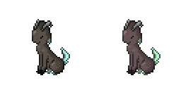
    Well, here are a couple of sprites to start with.
    picture.php
    picture.php
    picture.php
    picture.php
    picture.php

    Kerosprite.png
    Keroback.png
    picture.php


    I needed to replace these ones because it seems that some people still wanted to rate the old ones!
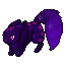
    A big one:

    picture.php


    I think that's all I have.
    Please rate some, all if you wish. Hehe!
    Thank you for looking. As I keep going I'll post more.

    Links

    My deviantart
    HiatuWiki, Fakemondex
    Official Pokemon Opal Thread

    G'day!
     
    Last edited:

    Domin-8

    aka Unoringinally Funny
    1,730
    Posts
    18
    Years
  • Your fakemon need better shading, you can barely tell the difference between shades. But otherwise I like your stuff.
     

    FireTears

    Animator and Artist
    82
    Posts
    14
    Years
  • They are cute ^^

    The shading is almost unnoticeable, it is best to use darker shades and lighter highlights. The second sprite is lacking in black, use black whenever the area is darkest or has shading. If black shows too much, your shading is too light. Otherwise, use a darker shade of your current outline color instead of the black.
     

    Nyu~♥!

    Pokémon Opal Producer
    478
    Posts
    14
    Years
  • They are cute ^^

    The shading is almost unnoticeable, it is best to use darker shades and lighter highlights. The second sprite is lacking in black, use black whenever the area is darkest or has shading. If black shows too much, your shading is too light. Otherwise, use a darker shade of your current outline color instead of the black.

    Oh, thank you! I'll certainly keep this in mind.

    You have great outlines, but its just the shading.

    Check out this tutorial by skeddles it helped me make the newest sprite (check it out) in my thread(shading wise)
    http://www.pokecommunity.com/showthread.php?t=144629

    Alright, your sprites are great.
    I'll use that tutorial, now I understand that my shading is the real problem.
     
    Last edited:

    Nyu~♥!

    Pokémon Opal Producer
    478
    Posts
    14
    Years


  • Here's another!
    This is Gattomier, designed by Kitsunez, for my game!
    Please critique nicely. ^^

    And I know it's really dark, I should've made it lighter?
     

    Nyu~♥!

    Pokémon Opal Producer
    478
    Posts
    14
    Years
  • hehe, well I guess I can't get any feedback from you since you're really sucky at it... at least that's what you think.
     

    Kitsunez

    Poke'mon Artist
    13
    Posts
    14
    Years
  • I do suck at spriting! It would be difficult for me to draw up something and then make it looked pixalized. And I can't just work on a clean canfas, I'm not good at completely digital art~
     

    Nyu~♥!

    Pokémon Opal Producer
    478
    Posts
    14
    Years
  • hehe, here's Gattomier's back sprite.

    I don't know why HiatuWiki's being a jerk.. o_0 makin the image smaller...
     
    159
    Posts
    16
    Years
  • Hello!

    My suggestion for the now is use more contrast between the colors on your sprites: Lighter highlights, darker shadows.

    Also, you may want to tone down the dithering a bit, you don't need it that much.

    You may want expiriment with more detailed shading, like more shading on the yellows head , showing fur and stuff.

    On the yellow one: I'd make the highlight on the head slightly bigger.


    Hope some of that helps ^^
     
    Back
    Top