• Our software update is now concluded. You will need to reset your password to log in. In order to do this, you will have to click "Log in" in the top right corner and then "Forgot your password?".
  • Welcome to PokéCommunity! Register now and join one of the best fan communities on the 'net to talk Pokémon and more! We are not affiliated with The Pokémon Company or Nintendo.

[Free Shop] Lapis Philosophorum

MurkMire

[font=special elite][color=#FF3399]Toxic Terror[/c
910
Posts
12
Years
  • Hello, hello. I'd like to request a 150x150 icon, if you please. I'd love to see what comes of it. ;)

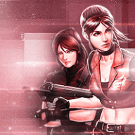
    Anyway, here's choice number one, but I do realize it has a watermark on it. So, here's choice number two.

    If it's too difficult to recolor the backgrounds/cut out the image into a different background and such, please let me know. I can definitely use choice number three if one and two aren't doable.

    I hope this wasn't too much, but just trying to make it easier. ;P Hope to hear from you soon!
     

    TwilightBlade

    All dreams are but another reality.
    7,244
    Posts
    16
    Years
  • [supporter]Zorogami[/supporter]
    You're welcome! :3

    Murkmire
    Hi hi, the first two are lower quality, so I tried to do something with the third one.
    Lapis Philosophorum
     

    derozio

    [b][color=red][font=helvetica][i]door-kun best boi
    5,521
    Posts
    14
    Years
  • https://www.pokecommunity.com/showpost.php?p=8141901&postcount=77
    Cool stuff as always. Though the blaziken icons in here kinda irk me. They're good color wise but darkening the edges doesn't seem to work in its favour. The lighting just doesn't seem proper, imo. Would've been better had you darkened three corners using burn tool and brightened one using dodge or something, I think. :p or tried something else. Butt yeahhh rest looks good!
     

    Nah

    15,952
    Posts
    10
    Years
    • Age 31
    • she/her, they/them
    • Seen today
    Not sure if this is the right place to ask (and if its not please direct to the right place), but I was wondering if perhaps you could come up with a Mega Zekrom avatar for me. Yeah, Mega Zekrom doesn't exist, but based on your past work, I'm sure you can come up with something great. If you do go for it, take your time.
     

    Zorogami

    WUB WUB
    2,164
    Posts
    11
    Years
  • I wanted to ask you if i could have 3 icons, each 100x100 please?? There are the links:
    Pic1 - Pic2 - Pic3

    Since i want to use them all as my sig, it would be cool if you made them in the same style, but different from how my avatar looks.
    Let me know if im asking for too much!! Thank you in advance <3
     

    TwilightBlade

    All dreams are but another reality.
    7,244
    Posts
    16
    Years
  • [supporter]Dante[/supporter]
    Heyo brother, thanks for the feedback. I don't think dodge&burn will achieve the same effect, as burn for me tends to make the edges turn crispy brown, or whatever color is dominant in the piece probably purple, knowing me. Maybe a soft black brush would be better. I'm using Lens Correction for the effect.
    1st one is plain, 2nd one is my sad attempt at dodge&burn and it's picking up purple colors, 3rd one is vignette effect that remains a soft black yet covers all four corners so the lighting is indeed off hm hm hm.
    Lapis Philosophorum
    Lapis Philosophorum
    Lapis Philosophorum


    [supporter]Noibat[/supporter]
    Yus, the colors~ How's this?
    Lapis Philosophorum
    Lapis Philosophorum


    No Chance Without Zekrom
    If you have a link to fanart of Mega Zekrom, I can turn it into an icon for you. Unfortunately, I don't make the fanart myself.

    [supporter]Zorogami[/supporter]
    Sure thing, I'll do it as soon as possible.

    tsatoma
    You're welcome~

    [supporter]Murkmire[/supporter]
    No problem, I'll get to your request soon.
     

    derozio

    [b][color=red][font=helvetica][i]door-kun best boi
    5,521
    Posts
    14
    Years
  • Well, with burn and dodge, I didn't necessarily mean only those haha. If soft brush works better, then that's that. My main gripe was that the lighting was off. As for the purple-ish hue that comes with burning - I'm personally a fan haha. If you notice, it is present in most of my icons. :p although there's still a way for you to do away with the purple/brown-ish hue - do another selecive coloring enhancement over it. Might seem like a lot of woork but it works lol. Though soft brushes are fine too. I've been using B/W brushes for the recent icons in my icon shop.

    I'll provide proper feedback on the newer icons later I think. ;p
     

    Nah

    15,952
    Posts
    10
    Years
    • Age 31
    • she/her, they/them
    • Seen today
    Lilith;8158476 [I said:
    No Chance Without Zekrom[/I]
    If you have a link to fanart of Mega Zekrom, I can turn it into an icon for you. Unfortunately, I don't make the fanart myself.

    Ah, ok. Actually, I don't think there's even any fanart of a Mega Zekrom. But I did find a couple of things that I would like to have turned into icons instead, if you don't mind:

    Link 1

    Link 2

    If you could do some cools things with those (idk, add a cool background or something), that'd be great.
     

    TwilightBlade

    All dreams are but another reality.
    7,244
    Posts
    16
    Years
  • Lapis Philosophorum
    Lapis Philosophorum
    Lapis Philosophorum


    Lapis Philosophorum


    Lapis Philosophorum

    Lapis Philosophorum

    P.S. Sprites don't translate well in icons.

    Okies, brother. I'm watching Gintama while making icons. Don't hurt me~
     
    Last edited:

    Shadow Sneak Sableye

    Bright Beauty ♥
    259
    Posts
    14
    Years
  • Stock: One Two
    Size: 130 x 130 for both
    Thank you!

    Looking through the gallery on your first post, I have to say, all your Sonic stuff has to be my favorite. I know you get this a lot, but your icons are beautiful and vivid. You make the stock you're given stand out exceptionally!
     

    WAS

    30
    Posts
    10
    Years
  • Awesome tags! I really love the placement of the effects and focals. However the only issue I have is almost every single one of them is oversharpened to the point there is color burn and hard pixels. Are you also throwing a High Pass layer over it? If so, don't sharpen then.

    Other then that, I am really absolutely digging your style! :D Make meh something. xD
     
    Back
    Top