• Our software update is now concluded. You will need to reset your password to log in. In order to do this, you will have to click "Log in" in the top right corner and then "Forgot your password?".
  • Welcome to PokéCommunity! Register now and join one of the best fan communities on the 'net to talk Pokémon and more! We are not affiliated with The Pokémon Company or Nintendo.

Le Beginners Supremo Graphicals Class

moments.

quixotic
  • 3,407
    Posts
    15
    Years
    Welcome to the Signature Making Class for Beginners! [noxious. homeroom]

    I,
    noxious. will be your teacher and mentor for the time you decide to stay in this class. I am a Graphic Designing Wannabe, so not quite at the level of some other members around here, but I am aspiring high and heading in that direction for later in my schooling so I guess that is my decision for wanting to be a teacher! :)
    In my signatures I often use
    smudging techniques and loads of gradients and filters.


    Teachers Pets

    ピチュー
    .Twenty Six
    Pikachu Trainer ~

    BrightFer
    .Pichu-kun

    ..PandA.CharadE..
    Decypher
    Ascaris


    Assignments

    Assignment #1.
    [8/8]
    I am going to PM each of you a test. This test is to allow me to evaluate where each and every one of you are at with your graphics knowledge. The last Graphics School had an assignment similar but they weren't PMed and resulted in people copying others. I want a the clearest answers I can get so I can help you guys more! Please be honest, if you don't know, leave it blank. Don't search the internet, if you do, I will assume you know and you might struggle later on. When you open it, fill in the test and PM it straight back.


    Assignment #2.
    [7/8]
    Ok so the first one revealed to me some information about where you are at with your graphics skills. The next assignment is to create a banner to the best of your ability using at least one of the effects/techniques found in the test that you answered incorrectly. That is right, incorrect. Simply post here to tell me which effect/technique you will be using and I can find you a link to a tutorial or you can search one yourself. Also if you want, I can supply images for you.
    NB: If you need help deciding which one you would like to do, simply PM and I can make a suggestion. You have 10 days to complete this assignment but if you need extra time for some reason just tell me. I am pretty understanding.
    Due Date : January 14.


    Assignment #3.
    [5/8]
    Ok so this assignment is basically a catchup on your graphics so I can see. Basically I am going to post a request and you are to follow it to create a tag which looks good, but that you have little input in. If you ever open a graphics shop, it will be like that. Every couple of Assignments I might post one of these to see where you are at.

    Image : Here we go, a nice image from PlanetRenders. I used this render in a tag I made ages ago so nostalgia might kick in for rates.
    Size : 370 x 150. Try and stick to this, but if you are really having trouble change it.
    Colours : Pinks, Yellows, Orange, Brown.
    Text : None unless you can think of anything.

    Assignment #4. [0/8]
    This assignment is quite a different sort of assignment to test your creativity and skills. It will probably be one of the more difficult assignments in this class, but nonetheless, I feel most of you should be capable of doing it...
    The assignment is to make a graphic without a person or character as the focal. The focal can be a C4D, it can be typography or it could be an object if you are really having trouble.
    Here is an example made by yours truly featuring a C4D. It isn't the best example as I made it a while ago, but it shows he general gist of the assignment. If you need a tutorial, I will post one, but I want to see some efforts without a tutorial first.

     
    Last edited:

    Spinor

    <i><font color="b1373f">The Lonely Physicist</font
  • 5,176
    Posts
    18
    Years
    • Seen Feb 13, 2019
    I guess I'll join if this has been allowed before. I'm a total novice at Graphics though, but it may be because I've never published anything besides sprites.
     

    moments.

    quixotic
  • 3,407
    Posts
    15
    Years
    You can join but you do need to go HERE and fill in an application.
    If you do decide to join, I will need to PM you the assignment.
     
  • 5,814
    Posts
    16
    Years
    • Age 30
    • Seen May 19, 2021
    I used the typography effect/technique.
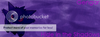
    I used a Gengar render from photobucket

    Here is what I made(my very first one EVER):
    Le Beginners Supremo Graphicals Class
     

    moments.

    quixotic
  • 3,407
    Posts
    15
    Years
    NOTE: I will rate each and every one of your banners in depth so that you learn from it. I will not flame it or insult any of you. All my ratings will be for the best intentions and to help you improve.

    .Pichu-kun: Ok, for a first banner it is good. You covered the basic principals of designing a tag. But there are several things that are lacking a bit. First off, as a general rule, don't ever cover the focal point or the render. Gengar looks very dark and blended into the background which draws focal attention away which it needs so it stands out.
    Placement of the render is ok, but remember, the rest of your banner needs to be filled with effects or something that looks appealing, but doesn't draw any attention from your focal. Your background is very simple and looks a tad messy. I for a fact know that it is because you are new and have yet to learn various techniques for designing a background.
    The text or typography was executed to some success. You chose a colour which is a different shade to the rest of your banner so it stands out, but doesn't draw heaps of attention (like putting bright yellow on a black banner). The font is meh but the choice of words is good.
    In my opinion, as extra work, I would get some tutorials (which I can supply if you want) and follow them so you can see how to add effects and incorporate different styles.
    Summary: The banner is good for a first time banner maker but lacks creative oomph. Never cover the render until later on when you have more experience. Tag is quite monotone and the background needs mroe flare to add to the tag.

    Thank you for completing Assignment 2, because there are still many people to finish, next assignment might not be up for a few more days. I will PM you some tutorials I'd like you to complete and you can PM your results back for another rate.
    What would a class be without homework? ;)
     

    ..PandA.CharadE..

    CUPCAKES :3
  • 66
    Posts
    15
    Years
    • Seen Mar 12, 2009
    Thanks noxious. I guess i'll make a sig with clipping masks then. I'm looking forward to the next assignment ^^
     

    moments.

    quixotic
  • 3,407
    Posts
    15
    Years
    Pikachu Trainer~
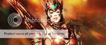
    First off very nice banner! Compared to your other graphics, this one is looking swish!
    Ok first off the bat, the background! It looks very good! Nice smudging and use of some C4D's ( I think ) in there too which is always nice to see. The colours of the background compliment and support the render very nicely and the flow is brilliant. My only concern is the square filter effect. It looks good, but you went overboard a bit. I think the only places you need it is towards the bottom of the tag around her arms and even covering her body on a light opacity could look nice. I would leave only the bottom stuff and around the wing and the rest can afford to leave.
    The render was nicely placed and the flow as mentioned before is great! Lovin' the little smudgizzling on the right shoulder! It looks great, but my worry is why you stopped there? It helped blend the render in so much and looks pretty awesome but it needs a bit more. I reckon her arms could go with some smudging and even a tad on her wing thing.
    I would comment on the typography but there is none, and everytime I look at this tag I search for the text as it seems to be the type of tag which comes by default with some text somewhere. I reckon you could chuck in some horizontal font to the right of her head just above her shoulder maybe even on top of the smudged shoulder a bit.

    Summary :
    Nice smudging and use of C4D's which form the background. Square filter went overboard, play around erasing some of it. Nearly qualified as a bit monotone, but those blue ish bits on the render saved it. Would look good with some text possibly over the right shoulder in a simple font, pretty small.
     

    Pikachu Trainer~

    PokéDex Project
  • 191
    Posts
    17
    Years
    I've put an updated version of my signature on the post above. I've done a couple of things that you commented on. Thankyou.

    >PT
     
  • 5,814
    Posts
    16
    Years
    • Age 30
    • Seen May 19, 2021
    NOTE: I will rate each and every one of your banners in depth so that you learn from it. I will not flame it or insult any of you. All my ratings will be for the best intentions and to help you improve.

    .Pichu-kun: Ok, for a first banner it is good. You covered the basic principals of designing a tag. But there are several things that are lacking a bit. First off, as a general rule, don't ever cover the focal point or the render. Gengar looks very dark and blended into the background which draws focal attention away which it needs so it stands out.
    Placement of the render is ok, but remember, the rest of your banner needs to be filled with effects or something that looks appealing, but doesn't draw any attention from your focal. Your background is very simple and looks a tad messy. I for a fact know that it is because you are new and have yet to learn various techniques for designing a background.
    The text or typography was executed to some success. You chose a colour which is a different shade to the rest of your banner so it stands out, but doesn't draw heaps of attention (like putting bright yellow on a black banner). The font is meh but the choice of words is good.
    In my opinion, as extra work, I would get some tutorials (which I can supply if you want) and follow them so you can see how to add effects and incorporate different styles.
    Summary: The banner is good for a first time banner maker but lacks creative oomph. Never cover the render until later on when you have more experience. Tag is quite monotone and the background needs mroe flare to add to the tag.

    Thank you for completing Assignment 2, because there are still many people to finish, next assignment might not be up for a few more days. I will PM you some tutorials I'd like you to complete and you can PM your results back for another rate.
    What would a class be without homework? ;)
    Thank you! :)

    I couldn't figure out how to not 'cover' the render behind the colors, without having the white background show.

    I would very much appreciate it if you could get me a good tutorial.
    Thanks again~
     

    moments.

    quixotic
  • 3,407
    Posts
    15
    Years
    Thank you! :)

    I couldn't figure out how to not 'cover' the render behind the colors, without having the white background show.

    I would very much appreciate it if you could get me a good tutorial.
    Thanks again~

    Do you know how to use Layers?
    General Rule : Place each new thing on a new layer. It works like this.
    Background on Layer 1, Render on Layer 2 for example. The render being on a higher layer would go over the background. Thus not being covered. I will find a tutorial for you.

    Pikachu Trainer~
    Ok the test is very nice and the colours match well. The one and only concern is the yellow dots. They don't look too flash, you could tone down the opacity, or simply delete them.
    Great work with the erasing and such of the squares! Looks much better!

    ..PandA.Charade..
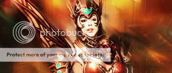
    Ok, cool use of splatters and effects coming from behind the render. The background is simple, yet quite effective so you get props for that. The Clipping Masks look good and don' distract the audience too much from Avril, the focal. One quite big concern with the background though, the left side. That large 'cut-off' point where everything stops and it is just orange. It does draw big attention away from the focal and just looks pretty poor. From where you are standing with the straight line of stopped effects, it might be easier for you to just crop that part off the banner. Otherwise, you can do some erasing and re splatter over that area.
    The render was placed pretty nicely, but there are some concerns again. Her colours have gone a bit monotone yellow/orange. I assume you used some Photofilters/Gradients over the top? Well it looks good on the background, but Avril is looking rather yellow and making her stand out less and the tag seems more monotone. You can fix this by erasing some of the gradients by brushing over the gradient layer with a black brush. The other thing the focal is missing is some nice lighting. Grab yourself a 100/200px soft brush and put the brush mode on 'Color Dodge' and its layer on 'Overlay'. Get the brush and make a single dot off the canvas, but just stretching on to the canvas. I see you already used a light source, but it was too yellow.. With the method I just told you, that should bring out the colours nicely, but you may need to turn down the opacity.

    Summary:
    Large blank cut off needs fixing. Typography is great, although could be moved a little closer to the focal, just a tad! Splatters look nice and match the tag very nicely. Lighting needs more light. And finally, Avril is looking very yellow, erase some of the gradients and photofilters.
     
    Last edited:
  • 5,814
    Posts
    16
    Years
    • Age 30
    • Seen May 19, 2021
    I like it too. :3
    Something I'll never be able to do for a while. ;;
     

    moments.

    quixotic
  • 3,407
    Posts
    15
    Years
    BrightFer
    Very very nice for a first use of a C4D in a banner. Because I am still not very experienced with C4D's myself this may not be as in depth as my other rates.

    Background is cool, liking the flow created by the C4D and love how the circular ring comes over in front of the render. Nice simple depth created there! The flower brush is ok, but it does seem a little out of place or not strong enough. I am not sure if it actually benefits the banner, but it doesn't make it look worse so it is ok. The little white balls/stars look nice, but some of those on top of the C4D and maybe even intertwining around some parts, maybe her arm could look good.
    The render is good and you fixed the problem of a lack of a clear flow by using the C4D so good job! I think you could have added even more depth to it by sharpening the gun barrel and then blurring her body and face just a tiny bit. You could have also added a better light source up the top just left of her head possibly using the method I mentioned in the last rate, or just with a Large White soft brush just put it on and play with settings.
    The text is the only real let down on the tag. The colour is a bit hard to read on the C4D and the placement is a bit boring. Also the font itself is a bit big for that simple style. I reckon scrap the text and either leave it without any, or get like a single word with a fancyish font and put it leaning on the forearm on our left ( just before the glove down towards the elbow ). Make it a white colour as well.

    Summary: Nice use of C4D as flow! Text is quite boring, make a white, fancyer font on her left forearm. Try adding some depth by blurring and sharpening, ligtening and darkening using the Burn and Dodge tool. Finally chuck a nice light source in there, possibly on Color Dodge to bring out the colours. It is a little monotone, but it still looks great!
     

    Kalseng

    Sig maker/Dimension User/RPer
  • 57
    Posts
    15
    Years
    • Age 29
    • USA
    • Seen Apr 5, 2009
    *paws at noxious.*

    Am I allowed here, Ms. Noxious? The other kids here really need food, and I'm going to be the only one bringing home any money... Timmy needs insulin...
     

    moments.

    quixotic
  • 3,407
    Posts
    15
    Years
    *paws at noxious.*

    Am I allowed here, Ms. Noxious? The other kids here really need food, and I'm going to be the only one bringing home any money... Timmy needs insulin...

    ms noxious? I am not sure how I am going to teach you successfully if you use another program, but I suppose I can add you and we can see how you go. If you can't understand the Photoshop jumbo, you will have to leave...
     

    ..PandA.CharadE..

    CUPCAKES :3
  • 66
    Posts
    15
    Years
    • Seen Mar 12, 2009
    Thanks noxious :3 I've never knew about that trick before about lighting. And yeah..is it okay if i don't remake it? Well, i didn't really save a psd file..
     

    moments.

    quixotic
  • 3,407
    Posts
    15
    Years
    You don't need to redo it but I would've recommended it as I could have rerated it and told you how you went.
    Next time, keep your PSD's so you can edit or whatever.
     
    Back
    Top