Arylett Charnoa
No one in particular.
- 1,129
- Posts
- 11
- Years
- Age 33
- Seen Jan 5, 2023
I'm gonna make a second attempt of this. Let's see if it dies or not.
Also, I do have a note on criticism.
I ask that, if possible, you try to articulate as much as you can how to FIX the issue you have rather than pointing it out. A lot of the time, I'm already aware of it, but I might not necessary know what the proper solution is. For example, let's say you think the legs are awkward on a picture I did. Try to think about why that might be. Maybe one of them is too small, and needs to be bigger. Perhaps the angles are too sharp. Etc. That sort of thing.
Also, I don't generally go back and fix errors in an already finished piece. (Unless it's a very simple piece, like my symbols) But that doesn't mean I don't listen to criticism! I will definitely take what has been said about a previous piece into account when working on the next. Really, I will. So don't feel like it has no effect. Your comments do.
Thank you! Try not to be too hard on me though. :P
Regular Old Art
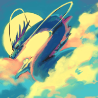
Lunaris vs. Sans
I watched my fiance beat this guy in Undertale, and I was so awed that I had to draw it to commemorate it. (I'm not very good at conveying motion; in the second panel, he's throwing Sans)
![[PokeCommunity.com] Made By the Hands of That Lady](https://orig13.deviantart.net/88f0/f/2016/064/2/9/lunaris_vs_sans_by_arylett_charnoa-d9u1iot.png "[PokeCommunity.com] Made By the Hands of That Lady")
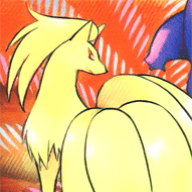
Lion Male (Aelita)
What a lion looks like in my original Aelita Crystal series. I'm basically working on all the different species there.
![[PokeCommunity.com] Made By the Hands of That Lady](https://orig05.deviantart.net/c880/f/2016/053/1/b/lion_male__aelita__by_arylett_charnoa-d9sovbj.png "[PokeCommunity.com] Made By the Hands of That Lady")
One As You
More stuff based on affection for that man known as Lunaris. Made as a surprise for Valentine's Day.
![[PokeCommunity.com] Made By the Hands of That Lady](https://orig12.deviantart.net/6fa0/f/2016/046/0/d/one_as_you_by_arylett_charnoa-d9rs9q0.png "[PokeCommunity.com] Made By the Hands of That Lady")
Evolve
Shiny Eevee considering her options for evolution.
![[PokeCommunity.com] Made By the Hands of That Lady](https://orig01.deviantart.net/be6d/f/2015/103/2/6/evolve_by_arylett_charnoa-d8pn29e.png "[PokeCommunity.com] Made By the Hands of That Lady")
Elements
Shiny Eevee's three sisters kind of showing off or something in a barren setting.
![[PokeCommunity.com] Made By the Hands of That Lady](https://orig03.deviantart.net/9a59/f/2015/131/3/1/elements_by_arylett_charnoa-d8t2823.png "[PokeCommunity.com] Made By the Hands of That Lady")
Anthro Braixen Pokesona
Basically what it says. My Pokesona, but more humanoid. This particular character was created for a science fiction-based RP on Deviantart, hence the weirdo techno stick she's holding.
![[PokeCommunity.com] Made By the Hands of That Lady](https://orig10.deviantart.net/4195/f/2015/250/c/6/audrey_caines__braixen_pokesona__by_arylett_charnoa-d98st80.png "[PokeCommunity.com] Made By the Hands of That Lady")
Symbols
Aelita Crystal
The (as of now) logo of the Aelita series.
![[PokeCommunity.com] Made By the Hands of That Lady](https://orig01.deviantart.net/9c62/f/2015/363/9/8/aelita_crystal_logo_by_arylett_charnoa-d9lybog.png "[PokeCommunity.com] Made By the Hands of That Lady")
Elements of Aelita
Symbols for my elemental system used in the Aelita series. If you're really curious about their meaning, I explain it on this page here.
![[PokeCommunity.com] Made By the Hands of That Lady](https://orig08.deviantart.net/e8e9/f/2016/068/3/2/elements_of_aelita_by_arylett_charnoa-d9ui1v4.png "[PokeCommunity.com] Made By the Hands of That Lady")
Arkra
The symbol in my signature. It is used to represent me. NOT A VECTOR.
![[PokeCommunity.com] Made By the Hands of That Lady](https://orig06.deviantart.net/aae9/f/2016/008/0/6/arkra_by_arylett_charnoa-d9n1oav.png "[PokeCommunity.com] Made By the Hands of That Lady")
Also, I do have a note on criticism.
I ask that, if possible, you try to articulate as much as you can how to FIX the issue you have rather than pointing it out. A lot of the time, I'm already aware of it, but I might not necessary know what the proper solution is. For example, let's say you think the legs are awkward on a picture I did. Try to think about why that might be. Maybe one of them is too small, and needs to be bigger. Perhaps the angles are too sharp. Etc. That sort of thing.
Also, I don't generally go back and fix errors in an already finished piece. (Unless it's a very simple piece, like my symbols) But that doesn't mean I don't listen to criticism! I will definitely take what has been said about a previous piece into account when working on the next. Really, I will. So don't feel like it has no effect. Your comments do.
Thank you! Try not to be too hard on me though. :P
Regular Old Art
Lunaris vs. Sans
I watched my fiance beat this guy in Undertale, and I was so awed that I had to draw it to commemorate it. (I'm not very good at conveying motion; in the second panel, he's throwing Sans)
Spoiler:
Lion Male (Aelita)
What a lion looks like in my original Aelita Crystal series. I'm basically working on all the different species there.
Spoiler:
One As You
More stuff based on affection for that man known as Lunaris. Made as a surprise for Valentine's Day.
Spoiler:
Evolve
Shiny Eevee considering her options for evolution.
Spoiler:
Elements
Shiny Eevee's three sisters kind of showing off or something in a barren setting.
Spoiler:
Anthro Braixen Pokesona
Basically what it says. My Pokesona, but more humanoid. This particular character was created for a science fiction-based RP on Deviantart, hence the weirdo techno stick she's holding.
Spoiler:
Symbols
Aelita Crystal
The (as of now) logo of the Aelita series.
Spoiler:
Elements of Aelita
Symbols for my elemental system used in the Aelita series. If you're really curious about their meaning, I explain it on this page here.
Spoiler:
Arkra
The symbol in my signature. It is used to represent me. NOT A VECTOR.
Spoiler:
Last edited:

![[PokeCommunity.com] Made By the Hands of That Lady](https://orig10.deviantart.net/7991/f/2016/069/4/4/_commission_16__suit_braixen_by_arylett_charnoa-d9unu4n.png "[PokeCommunity.com] Made By the Hands of That Lady")
![[PokeCommunity.com] Made By the Hands of That Lady](https://orig02.deviantart.net/81e8/f/2015/151/9/7/_commission_9__firelink_and_phoenix_by_arylett_charnoa-d8vai7q.png "[PokeCommunity.com] Made By the Hands of That Lady")
![[PokeCommunity.com] Made By the Hands of That Lady](https://orig01.deviantart.net/4e6c/f/2016/006/9/d/energy_symbols_by_arylett_charnoa-d9n1n07.png "[PokeCommunity.com] Made By the Hands of That Lady")

![[PokeCommunity.com] Made By the Hands of That Lady](https://puu.sh/nLsBH/75f64ff797.png "[PokeCommunity.com] Made By the Hands of That Lady")
![[PokeCommunity.com] Made By the Hands of That Lady](https://orig09.deviantart.net/9e95/f/2016/082/4/7/magical_girl_luna_by_arylett_charnoa-d9w889p.png "[PokeCommunity.com] Made By the Hands of That Lady")