• Our software update is now concluded. You will need to reset your password to log in. In order to do this, you will have to click "Log in" in the top right corner and then "Forgot your password?".
  • Welcome to PokéCommunity! Register now and join one of the best fan communities on the 'net to talk Pokémon and more! We are not affiliated with The Pokémon Company or Nintendo.

[Showcase] Odds & Ends

  • 10,674
    Posts
    15
    Years
    • Seen Sep 29, 2024

    abnegation's "art" dump
    the freedom to see, is the freedom to be.

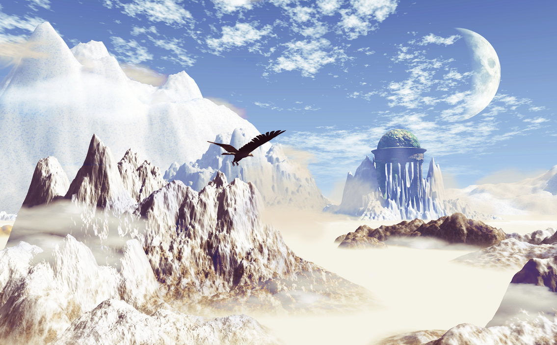
    digital art & design.
    icons.
    Feel free to use any of these, just add credit!
    [PokeCommunity.com] Odds & Ends
    [PokeCommunity.com] Odds & Ends
    [PokeCommunity.com] Odds & Ends
    [PokeCommunity.com] Odds & Ends
    [PokeCommunity.com] Odds & Ends
    [PokeCommunity.com] Odds & Ends
    [PokeCommunity.com] Odds & Ends
    [PokeCommunity.com] Odds & Ends
    [PokeCommunity.com] Odds & Ends
    [PokeCommunity.com] Odds & Ends
    [PokeCommunity.com] Odds & Ends
    [PokeCommunity.com] Odds & Ends
    [PokeCommunity.com] Odds & Ends


    tags

    *image removed*

    *image removed*

    *image removed*

    *image removed*

    *image removed*

    *image removed*

    *image removed*

    *image removed*

    [PokeCommunity.com] Odds & Ends


    [PokeCommunity.com] Odds & Ends


    *image removed*
    Collab with nano.


    digital painting.

    Spoiler:


    Spoiler:


    Spoiler:


    large graphic art.

    Shut it Down
    Spoiler:


    fin
    Spoiler:


    1980's...?
    Spoiler:


    untitled
    Spoiler:


    Chaos
    Spoiler:


    graphic design.


    Movie Poster, college assignment.
    Spoiler:


    Graphic Art team website (artistic images are placeholders, not necessarily all by me)
    Spoiler:


    https://www.gavintage.com/fringefx/ - here's the below site, live.
    Spoiler:


    Panem Online Forum Style
    Spoiler:


    Flames of Simplicity Forum Style - Try it
    Spoiler:


    Snivy's Holiday Forum Style - Try it
    Spoiler:


    Nimbasa's Shining Beauty (Collaboration with Morkula) - Try it
    Spoiler:


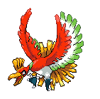
    pixel art.

    *image removed*
    10 colours. Scratch.

    [PokeCommunity.com] Odds & Ends

    8 colours (and trans). Scratch.

    Based on work by an artist named Crayon Chewer, her comment: "Oh wow, I have to say, this is pretty awesome! In some ways I'd say you've definitely improved upon my original picture too! I really love that the palette's been limited to only 8 colors; I've always had a fond love of all things pixelly.

    Keep doing what you're doing, it's incredible! "
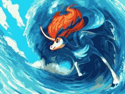
    [PokeCommunity.com] Odds & Ends

    Based on work by an artist named haisukka. Scratch.

    [PokeCommunity.com] Odds & Ends


    [PokeCommunity.com] Odds & Ends

    Collab with Cilerba, he did shading, I did lineart and base colours.

    [PokeCommunity.com] Odds & Ends
    [PokeCommunity.com] Odds & Ends
    [PokeCommunity.com] Odds & Ends
    [PokeCommunity.com] Odds & Ends
    [PokeCommunity.com] Odds & Ends


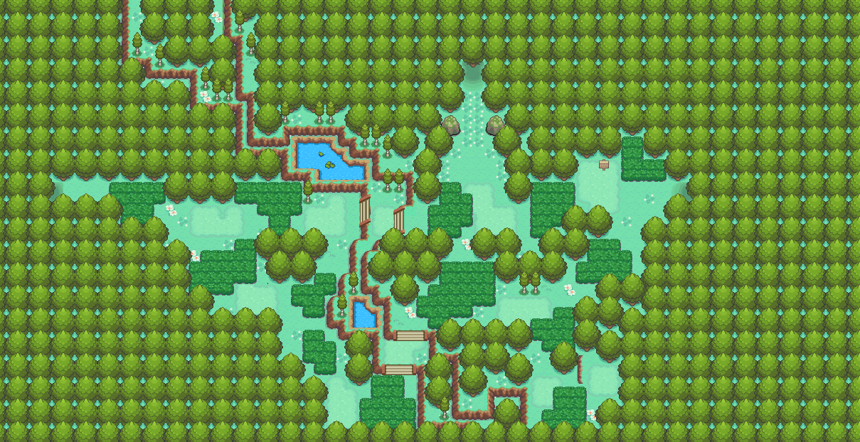
    maps.


    Route 1
    Spoiler:


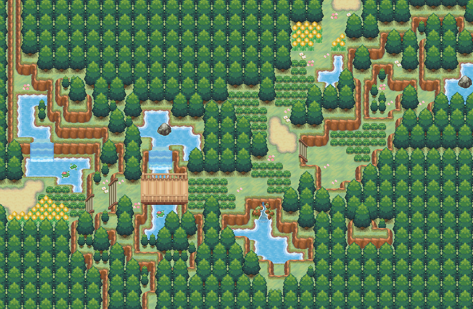
    Dencreep Forest
    Spoiler:


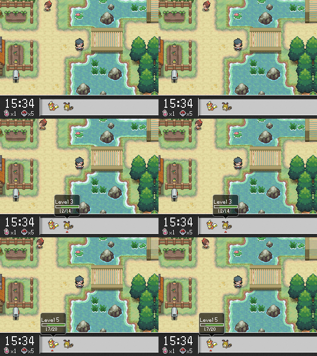
    Nocturne Town (water has been vastly improved from the version in the map, as seen in the in-game screenshot)
    Spoiler:


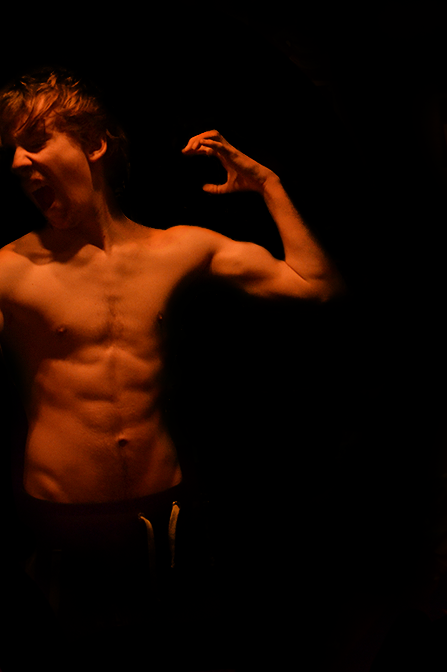
    photography.
    Spoiler:


    Spoiler:


    Spoiler:


    Spoiler:


    Spoiler:


    Spoiler:


    Spoiler:


    Spoiler:


    Hope you enjoy my work, I plan on adding my traditional artwork soon also.
     
    Those are some gorgeous pixel art pieces. And I'm talking about

    *image removed*

    in particular. The subtle color changes and composition is really just top notch in every way. Hope to see more of those. :)
     
    What is happening in the top image of Nocturne Town??? Whatever it is, I am into it. haha

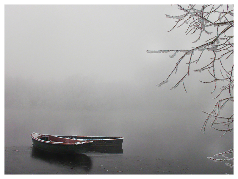
    Your Keldeo painting is really, really, awesome! And you are a really good photographer :D I love the first picture with the canoes.
     
    Bumping this because I'm not gonna bother with a new gallery. Anyway, here, have these.

    [PokeCommunity.com] Odds & Ends


    [PokeCommunity.com] Odds & Ends


    [PokeCommunity.com] Odds & Ends


    I'm rusty.
     
    This gallery has some priceless stuff, honestly. If I were to think of a reason as to why it hasn't gotten many comments, I can just come up with one - people were so awe-struck by the sheer amount of amazing stuff in here that they couldn't bring themselves to post anything more than "Wow, you are amazing". Your pixel and graphic art skills are top notch.

    If I had to pick favorites, I'd say the redemption icon and the one where there's a lone lady standing in the middle of nowhere are my favorites. Although I think the pixelated part in the latter serves as a distraction. As far as my opinion goes, the pixelated style works in the hayley icons but not in this one. Talking about the hayley icons, I think you went a little overboard with the saturation of reds. It is much more prominent in the first hayley icon (or the fifth icon from the first one) because of the fact that it hasn't got much going on - totally unlike the case with the two successive icons. Totally understand that empty space sometimes do wonders for tags but there's a little too much of it in here, imo. The placement just doesn't work for me. It works much better in the icon you made for moments (one beside redemption), for example. That has plenty of empty space as well but just doesn't look as awkward.

    As for your tags, I really love them. Most of them. Junkie's my fave because of the creative usage of the drinks and the text. I could never make a tag like it if my life depended on it, to be frank. Just that creative and good. The text in most of your other works is really well done as well - except, I feel, in the one which has 'definition: YyyY' or something. The style of text is alright but the box behind it just looks a little out of place. The color just doesn't fit the atmosphere of the tag, imo.

    But yeah, the para above made it sound as if I'm just a fan of junkie. Wash me away, Possess - Forget Clarity, the first and the seventh as well as the sinner tag look killer too. They're my favorite as well. Forget Clarity gets a special mention due to the amazing usage of colors. Just gorgeous. Quality of the stock is amazing too.

    Talking about updates, well, I like XY piece. Animation works for it. But there's a 'line' visible at the lower right corner. Might be due to it getting ignored while you probably took care of some layer masking and ended up in the final build. Or may just be intended. But yeah, whatever be the case, really liking it as well. Mostly due to how creative it is.
     
    Thank you so much for that comment! I read it on the train and it was a great read. Thank you :]

    Also literally dumping stuff I don't really consider to be showcasey.

    *image removed*

    *image removed*

    Sketch I did for the below collab with Elaynii
    Spoiler:


    Spoiler:


    Some old practice painting based on some photo lol.
    *image removed*

    Drawing I never bothered to finish.
    *image removed*

    Lame paint I did for a battle which never seen the light of day o/
    It was us (Heretic) against a really amazing team we had no chance against.
    Spoiler:


    Oh and these lol.
    Spoiler:


    Some drunken thing.
    Spoiler:


    So yep. Art dump of things I don't like, never wanted to use, didn't feel were good enough, and meh.
     
    Compilation image I did of a bunch of my stuff... I'm not sure how much of it isn't here, but anyway. I'm trying to unload all my trash into one place :]

    Spoiler:
     
    Trash he calls it, bah!

    I must have stared at that Butterfree for the better part of an hour. I love galleries that I feel compelled to come back to and every time I do, I find something I didn't see before. Hun, you've got one of those galleries. I'm just astounded by the wonderment. Every medium you've posted here you are a master of. The photography... the pixel art... the graphics... it's all just so stunning. This piece really speaks to me for some reason. The textures and the color pallet are just so beautiful. I especially love your winter photography (I believe there's only two of them). You've captured the mood and the appeal so well.

    I really, really hope you keep going with this thread! <3333; Also, if this is what you consider "a dump gallery" than you should really link to your good art stash cause I think we'd all love to see that. ;; (Then again, there's so much amazing stuff here already we'll probably be busy looking at it for a while).
     
    I'm surprised I haven't seen this before. Maybe I had you confused for someone else, or you have more than one thread? I could swear you had a thread for tags and avatars, but it was a shop or something.

    I think the pixel art, since it's not spoilered away, grabbed my attention first off all before going back through everything else. The guy in the forest is really great, and so is the Butterfree. I love how you limited yourself to only using a set amount of colors. I always want to work that way, but end up having too much going on (with admitingly a rainbow colored gaggle of goofballs). Maybe I oughta try something like that for my own game project, which I'm thinking may be in monochrome, but I haven't quite decided on yet.

    *image removed*

    The fact that a person can get something this intensive is nothing short of astounding. It's rare as all heck too, that or I've been to all the wrong places. Most people make pixel art to be intentionally blocky, and even the biggest, most time consuming wallpaper sized pixel arts I've seen look like I'm going to Lego Land. I guess it's because most people have preconceived notions of how a medium should appear or be utilized. For some reason, pixels are synonymous with 8 or 16 bit graphics, much like some people think cartoons are nothing but squash and stretch all day long (worse when that stuff shows up on TV. Oy (not saying the principles of animation aren't important, that's something else)).

    I love good graphic design, but I still can't find ways to talk about it. I'm just glad I can appreciate it at some level, though. I will say that the website examples are so good. The Fringe and Heretic ones, that is. Oh, and then there's this.

    *image removed*

    Dunno if that's painted (which you can totally do, as I've seen), but that's just... I just, I mean.. heh. I dunno what to say outside of I love it. Describing why will be hard because, again, I'm not great with the terminology, but it's the choice of colors, mixed with the overall warmness of the picture, and yet the mood doesn't make me feel warm fuzzies but puts me in more of a surreal, dreamy state of mind. That, and I like the colors on the girl, mostly the way the line art is just sort of painted.

    I dunno what else to say without talking in circles like a buffoon. You just really know how to apply graphic design to traditional art. I really appreciate seeing works like that, because it's like looking at art with a reason to exist*. It combines the freedom of fine art, with the necessity of graphic design, if you know what I mean.

    *Not saying fine art doesn't have a reason to exist. But because it's mostly based on self expression, I guess you can say it's not practical? I mean, I guess it's why a logo is more powerful to the average person than anything at an art gallery, but this is certainly not a generalization.
     
    Here's what I did tonight. Progress is in the spoiler.

    Spoiler:


    [PokeCommunity.com] Odds & Ends


    Programs used - 3DS Max, Photoshop CS6, ZBrush, all brought together with Vue XStream 10. I'd say more but I'm super tired lol.
     
    Awesome stuff! I really like that "f text - XY" thing, its hauntingly beautiful. Keep up the good work :)
     
    I'm redoing that piece above, the lighting was really wrong.

    Buy my games made for 10 year olds!!
    [PokeCommunity.com] Odds & Ends
     
    Two drawings.
    Spoiler:


    Spoiler:


    Some level design work from today. Actually part of what is going to be a functional game haha.

    Spoiler:

    Spoiler:

    Spoiler:

    Spoiler:

    Spoiler:
     
    Guess who's back back back.

    Study of Jamie Lannister (Nikolaj Coster) I spent most of the day doing. Just added a preliminary sketch, work in progress, and final digitally painted image (high res available if anyone wants it). Good to finally finish something. Keep half doing things lately. Done using pencil and paper for the sketch, and a Wacom drawing tablet and Photoshop for digitally painting & drawing.

    Preliminary Sketch
    WIP bust
    Primary Reference
    Spoiler:
     
    Last edited:
    Jaime. Okay, that is really amazing up close as well. I didn't know you were this skilled, actually. I'm glad you're spending full days drawing if this is what comes out of it ;) Here, have my appreciation, dear.
     
    Guess who's back back back.

    Study of Jamie Lannister (Nikolaj Coster) I spent most of the day doing. Just added a preliminary sketch, work in progress, and final digitally painted image (high res available if anyone wants it). Good to finally finish something. Keep half doing things lately. Done using pencil and paper for the sketch, and a Wacom drawing tablet and Photoshop for digitally painting & drawing.

    Preliminary Sketch
    WIP bust
    Primary Reference
    Spoiler:

    Ser Jaime Lannister of Casterly Rock.
    OMG herpaderp

    As a digital artist you probably did everything you could to make the colours seem frightening. Especially that constant red added in places, mostly on the left (right from here) side of his face. They seem a lot like lava than blood actually. Well the best part is the hair, you must've spent a lot of time colouring it up like that and making that beard. I want to see Ned Stark next!
     
    I'm alive! I have a few WIP's, namely this one.

    But anyway, a silly painting I did for a friend's birthday, which I hardly consider very much my artistic style, but anyway it's still worth a glance (because it's HILARIOUS (not)). The girl in question loves Asthon Kutchface so I drew this and put it in a frame for her birthday.

    Spoiler:


    Second, just did this tonight, quick sketch. Deviating from my usual stuff.
    Spoiler:


    I have a bunch of more crap laying about I wouldn't bother sharing, but enjoy these WIP's and lazy drawings!
     
    Wow this is amazing. The range of skills you possess is so great you seem to excel at any medium.

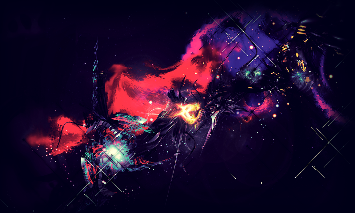
    The thing that caught my attention, albeit an older piece, was this one:

    *image removed*

    The color palette and arrangement of effects is divine. I can't really go into detail about the rest of the stuff, because I'd be here awhile, but this is a freaking good gallery.
     
    Back
    Top