• Our software update is now concluded. You will need to reset your password to log in. In order to do this, you will have to click "Log in" in the top right corner and then "Forgot your password?".
  • Welcome to PokéCommunity! Register now and join one of the best fan communities on the 'net to talk Pokémon and more! We are not affiliated with The Pokémon Company or Nintendo.

pøp! SEXYGO mαniαc☆

Sydian

fake your death.
33,379
Posts
16
Years
  • i know they're not great
    but I'm willing to improve

    ♥​

    Probably weird seeing me here, haha. But earlier this year, I got really into icon hunting/collecting. I love icons, and I have a folder dedicated to them. And recently (we're talking...really recently...maybe a couple of weeks?) I have been making my own. I know they're not great, but what little I do have, I'm very proud of them. What I'm going to post is kind of a mix of some earlier work and some more recent work (it'll be easy to tell which are which, lol). I experimented a lot, and I've found some things that click, and some things that didn't. But I'm ready to show you all what I've cooked up. :) Of course, all icon art and photography belongs to their respective artists. Only three of them were photographed by me.

    I should also mention I use Gimp and I'm not really savvy with all the terms, so if you're going to critique, you'll have to dumb it down. D; I'm really slow. But enjoy them! If you'd like to use any, please ask first. Credit is nice too~ :)

    100x100 icons

    pøp! SEXYGO mαniαc☆
    pøp! SEXYGO mαniαc☆
    pøp! SEXYGO mαniαc☆
    pøp! SEXYGO mαniαc☆
    pøp! SEXYGO mαniαc☆

    pøp! SEXYGO mαniαc☆
    pøp! SEXYGO mαniαc☆
    pøp! SEXYGO mαniαc☆
    pøp! SEXYGO mαniαc☆
    pøp! SEXYGO mαniαc☆

    pøp! SEXYGO mαniαc☆
    pøp! SEXYGO mαniαc☆
    pøp! SEXYGO mαniαc☆
    pøp! SEXYGO mαniαc☆

    pøp! SEXYGO mαniαc☆
    pøp! SEXYGO mαniαc☆
    pøp! SEXYGO mαniαc☆

    pøp! SEXYGO mαniαc☆


    150x150 icons

    pøp! SEXYGO mαniαc☆
    pøp! SEXYGO mαniαc☆
    pøp! SEXYGO mαniαc☆
    pøp! SEXYGO mαniαc☆

    pøp! SEXYGO mαniαc☆
    pøp! SEXYGO mαniαc☆
    pøp! SEXYGO mαniαc☆


    i am so shy about posting these omg ;-;
    ps: hi(gh) risa :D


    Last edited:

    Nameless.

    Guest
    0
    Posts
    Syddy! You posted a gallery just as I was looking through here! Awesomeeeeee.
    I shall go on to critique now for teh Syddy.


    pøp! SEXYGO mαniαc☆

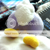
    I love this icon a lot. The colors are nice, cotton ball stands out good and the background doesn't overwhelm it. But you see that blank space in front of the sheepy?
    It looks like it needs something there, like text, especially one in Monmen's line of vision. Something like that would look really nice and would make this icon more eye-catching. :3


    pøp! SEXYGO mαniαc☆

    This is a really cute icon, and it makes a nice little creation.
    Though, it feels like the text should be smaller, a different font, and a different color -- or not there at all.


    pøp! SEXYGO mαniαc☆

    I wish to give a pointer on this one. Do you see how rough the edges are on the image, and how harsh it is to look at? This is what we call "over-sharpening".
    You have to be really careful when messing with sharpening and/or resizing. If an image's edges come out too rough, use the Blur tool with lowered pressure to bring down the harshness just a bit. :]


    pøp! SEXYGO mαniαc☆

    This would be really pretty, if only the quality of the image was better. Keep in mind that when you take a picture to make into a graphic, that it needs to have good clarity.
    Artifacts [pixels] make the image less appealing and not so fun to look at, no matter how amazingly you edit it.


    pøp! SEXYGO mαniαc☆

    I think this is one of your better icons. Though there isn't many effects or "pick-ups" in the image, the focal and the colors stand out rather well on their own.
    The quality and depth of the image is beautiful too. <3


    Sydian

    fake your death.
    33,379
    Posts
    16
    Years
  • Syddy! You posted a gallery just as I was looking through here! Awesomeeeeee.
    I shall go on to critique now for teh Syddy.


    pøp! SEXYGO mαniαc☆

    I love this icon a lot. The colors are nice, cotton ball stands out good and the background doesn't overwhelm it. But you see that blank space in front of the sheepy?
    It looks like it needs something there, like text, especially one in Monmen's line of vision. Something like that would look really nice and would make this icon more eye-catching. :3

    I thought so too, but couldn't think of what to say. XD; "hi i'm fluffy"?

    pøp! SEXYGO mαniαc☆

    This is a really cute icon, and it makes a nice little creation.
    Though, it feels like the text should be smaller, a different font, and a different color -- or not there at all.

    I have a bad time with fonts too. I need to download some more. And yeah, I should have added something more to that one. It's unlike me to leave things alone like I did with that one.

    pøp! SEXYGO mαniαc☆

    I wish to give a pointer on this one. Do you see how rough the edges are on the image, and how harsh it is to look at? This is what we call "over-sharpening".
    You have to be really careful when messing with sharpening and/or resizing. If an image's edges come out too rough, use the Blur tool with lowered pressure to bring down the harshness just a bit. :]

    I noticed that, but didn't know how to fix it! Thanks! I made that for Zet for his birthday btw. So if anyone wanted to use it, it's kinda off-limits.

    pøp! SEXYGO mαniαc☆

    This would be really pretty, if only the quality of the image was better. Keep in mind that when you take a picture to make into a graphic, that it needs to have good clarity.
    Artifacts [pixels] make the image less appealing and not so fun to look at, no matter how amazingly you edit it.

    Yeah, this one's a bit older. I didn't realize how ick it was til after I edited some more.

    pøp! SEXYGO mαniαc☆

    I think this is one of your better icons. Though there isn't many effects or "pick-ups" in the image, the focal and the colors stand out rather well on their own.
    The quality and depth of the image is beautiful too. <3

    Thank you! It's probably my favorite one I did. :) But I'm sure that's obvious, haha.

    AND THANK YOU RISA XOXO
     

    moments.

    quixotic
    3,407
    Posts
    15
    Years
  • Yay for new people in the section! :D

    pøp! SEXYGO mαniαc☆

    Ok, this one has potential to be very good. All it needs, is a bit more saturation, particularly the mouth of the wolf. Basically you want to make the colours pop more. The quality and tones of the icon are great, it's just feeling a bit washed out.

    pøp! SEXYGO mαniαc☆

    By far your best. The colours, placement and everything is just lovely! No real criticisms, I can't even make an icon this good. :P

    But yeah, as said above, watch the quality of images you are using for icons. Nearly all the 150x150 are of a lower standard purely because the image quality is poor.
     

    Sydian

    fake your death.
    33,379
    Posts
    16
    Years
  • Thank you, moments.! :) I'll definitely keep that in mind. And btw, you make muuuch better icons than me. XD;

    But with that Gaga icon in mind, apparently someone on LJ did the same effects I did. So if anyone's seen that icon, just know that I didn't steal it or anything. I really did do the coloring on mine, cause I remember Gimp freezing up on me a lot and it was the first icon I used brightness-contrast with. :( So yeah. Just clarifying that, in case some of you know.
     

    derozio

    [b][color=red][font=helvetica][i]door-kun best boi
    5,521
    Posts
    15
    Years
  • YO THE SMEXINESS FINALLY MADE A GALLERY~

    https://i274.photobucket.com/albums/jj273/SilverSmeargleSplatter/gagapinksmall.png

    I'm diggin this one, Sydbby. Lovely colors. I don't really have much to say here, because pretty much whatever can be said about your icons has been covered by the posts before mine. Remember to use high quality stocks in your future works, though. Stay away from LQ stocks. My only piece of advise to you.
     

    Sydian

    fake your death.
    33,379
    Posts
    16
    Years
  • Thank you Derozio! :) Yeah, I'm really starting to pay more attention to what I choose to make my icons from now.

    Here's some more 100x100's to tickle your fancies though...

    pøp! SEXYGO mαniαc☆
    pøp! SEXYGO mαniαc☆
    pøp! SEXYGO mαniαc☆

    pøp! SEXYGO mαniαc☆
    pøp! SEXYGO mαniαc☆

    pøp! SEXYGO mαniαc☆
     

    ~Ryukaa

    total nerd
    1,328
    Posts
    16
    Years
  • pøp! SEXYGO mαniαc☆


    I especially love this icon. Even though the original image's quality might not have been that good, I still love it. xD;

    I don't know if it counts as part of your gallery, but I'm digging your Darkrai icons. -in your Signature-
    xDD;;
     

    Sydian

    fake your death.
    33,379
    Posts
    16
    Years
  • Thanks! I still like my Espeon too, and there's a 100x100 version of it as well, if you ever wanted to use it. And no, Roswell made the Darkrai icons in my sig. :) Hover over "credit" and you'll see.
     

    Alternative

    f i r e f l y .
    4,262
    Posts
    15
    Years
  • The two which look like Britney (gret/seipa)
    I'm not sure if I'm really liking these. Not because they're the same or anything like that... I'ma follow in Gav's direction and just say that black and white icons need more depth to them, and the same rule generally applies to sepia as well. Don't be afraid to experiment with other tools, such as dodging and burning (I assume you use photoshop) and other tools. Maybe try sharpening the focal and blurring the background a bit to help bring out the focal and make the icon shine to it's best potential.
     

    Miss Doronjo

    Gaiden
    4,473
    Posts
    13
    Years
  • Hey, those avatars aren't too bad!

    I especially love this one [and the gaga one, but we've already talked about that]:

    pøp! SEXYGO mαniαc☆


    Its pretty cute! For some reason...I love the white plain background and the use of space. Permission to use it sometime? :3
     

    Sydian

    fake your death.
    33,379
    Posts
    16
    Years
  • Thanks Alternative. And no, I use Gimp (as mentioned in the first post). But I never saw where Gavin said that, lol. Shows I should lurk more. But I'll definitely take that advice and run with it. :)

    Thanks Doronjo! :) And sure, you can use it. Makes me happy someone other than me liked it. XD
     
    2,214
    Posts
    15
    Years
    • Age 29
    • Seen Mar 4, 2018
    Hey, nice icons bb! The one areas you need to work on are coloring and control your sharpening levels as they can make the icon look overdone at times. I'd say try and experiment with selective colorings and tone done on brightness levels. Also, it's best if you find high quality stocks rather than the low quality. Keep up the good work. <3
     

    ~Ryukaa

    total nerd
    1,328
    Posts
    16
    Years
  • Thanks! I still like my Espeon too, and there's a 100x100 version of it as well, if you ever wanted to use it. And no, Roswell made the Darkrai icons in my sig. :) Hover over "credit" and you'll see.

    Sure, I'd love to use it sometime. :D
    And, my bad. xDD;;
    They look nice anyway. :D
     

    Speed

    Skyward
    376
    Posts
    15
    Years
  • pøp! SEXYGO mαniαc☆


    I really like what you did with her lips, how you brought out the red in them, probably my favorite.

    Also, instead of going to filter>sharpen to sharpen your icons, use the sharpening and blurring tools. It helps much more, and you don't over sharpen.
     
    Last edited:

    Sydian

    fake your death.
    33,379
    Posts
    16
    Years
  • Here's a small update, mostly stuff from that big Pokemon stock I have. They make cute icons! :)

    pøp! SEXYGO mαniαc☆
    pøp! SEXYGO mαniαc☆
    pøp! SEXYGO mαniαc☆
    pøp! SEXYGO mαniαc☆

    And some older stuff...

    pøp! SEXYGO mαniαc☆
    pøp! SEXYGO mαniαc☆
    pøp! SEXYGO mαniαc☆

    And then this...

    pøp! SEXYGO mαniαc☆
     

    moments.

    quixotic
    3,407
    Posts
    15
    Years
  • pøp! SEXYGO mαniαc☆

    This one is lovely! The lighting and colours are quite the high standard right here... Anyways, all I would've changed was this my icon, would be to move the text down a little bit. It looks good in that area, but it is just stretching the eye to pull away from looking at both the text and the focal.

    pøp! SEXYGO mαniαc☆

    I think this one is too washed out and dark. Bringing out the reds a bit more would help this icon a lot methinks! Also just the size of the Pokemon, I would've made that a tiny bit smaller just so you get more of the Pokemon in the frame, positioning is ok though!

    pøp! SEXYGO mαniαc☆

    The only thing I don't like about this one is how sharp it is. If you undo the sharpen layer you did, I think it will look a lot better, because it is so close to becoming that pixelated sharp which isn't good... You could also possibly make the red on her shirt pop more.

    Nice icons! Do more of the Pokemon ones, they are definitely your strong point!
     

    Sydian

    fake your death.
    33,379
    Posts
    16
    Years
  • Funny thing about that Sewaddle icon is that it had other Pokemon in the part I cropped out (they all do, actually) and I smudged away the other Pokemon. I can't remember what was in there with Sewaddle, but it was obviously pink. I didn't plan for that pinkish color in the corner to come out, but I actually like it a lot better than what I originally planned for it, haha. Thanks though! I kinda realized the text should have come down too.

    Koromori and that Ke$ha icon aren't really my favorites, haha. I was actually thinking about redoing a few of these icons with the advice I've gotten here so that I can make them look better. :)
     

    Sydian

    fake your death.
    33,379
    Posts
    16
    Years
  • Just made a big boatload of icons. I was very inspired by Pokemon anime screenshots, though Lillipup kinda dominated for this batch. I thought the picture I used represented me so much! ^-^

    Here is the Lillipup batch. :3

    pøp! SEXYGO mαniαc☆
    pøp! SEXYGO mαniαc☆
    pøp! SEXYGO mαniαc☆
    pøp! SEXYGO mαniαc☆

    And here are some other 100x100's.

    pøp! SEXYGO mαniαc☆
    pøp! SEXYGO mαniαc☆
    pøp! SEXYGO mαniαc☆
    pøp! SEXYGO mαniαc☆

    pøp! SEXYGO mαniαc☆
    pøp! SEXYGO mαniαc☆
    pøp! SEXYGO mαniαc☆

    pøp! SEXYGO mαniαc☆
    pøp! SEXYGO mαniαc☆


    And here's Ke$ha because I love her<3

    pøp! SEXYGO mαniαc☆
     
    Back
    Top