• Our software update is now concluded. You will need to reset your password to log in. In order to do this, you will have to click "Log in" in the top right corner and then "Forgot your password?".
  • Welcome to PokéCommunity! Register now and join one of the best fan communities on the 'net to talk Pokémon and more! We are not affiliated with The Pokémon Company or Nintendo.

Rate The Signature Of the Person Above You

Status
Not open for further replies.

Perriechu

i make this look easy tik-tik boom like gasoline-y
4,079
Posts
15
Years
The text is alright, and you could lay of the images, like about 4 or something.

But otherwise it's quite good ~ 9/10
 
3,499
Posts
17
Years
  • Seen Jul 16, 2013
10/10

I really like this signature - it's simple, but really nice. I really like how the text is organized~
 

Thomas

HAIL HYDRA!
5,986
Posts
20
Years
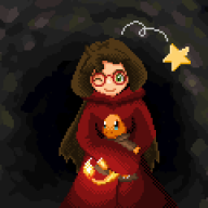
7/10 I would give you a 10 out of 10, but not text :( you gotta have some text in there...also I hate when the avatar is the same as the signature banner. Buuuut....Britney <3
 
3,499
Posts
17
Years
  • Seen Jul 16, 2013
10/10

There's nothing I can say wrong about it, it looks really nice and organized. I really like the signature image and the colours in it.
 

mew_nani

Pokécommunity's Licensed Tree Exorcist
1,839
Posts
14
Years
10/10 I like the lady in the picture. She's quite beautiful. (Plus it's organised and simple. You have to love simplicity.)

.......( I bet mine sucks. :D)
 
3,499
Posts
17
Years
  • Seen Jul 16, 2013
4/10

It's a little plain, tbh. :S You could probably do without the text at the top, and perhaps a better way of formatting the text and links at the bottom. Play around with other colours and fonts~
 
Status
Not open for further replies.
Back
Top