• Ever thought it'd be cool to have your art, writing, or challenge runs featured on PokéCommunity? Click here for info - we'd love to spotlight your work!
  • Our weekly protagonist poll is now up! Vote for your favorite Trading Card Game 2 protagonist in the poll by clicking here.
  • Welcome to PokéCommunity! Register now and join one of the best fan communities on the 'net to talk Pokémon and more! We are not affiliated with The Pokémon Company or Nintendo.

Rate The Signature Of the Person Above You

Status
Not open for further replies.
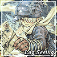
I'm not sure about the organization of the signature, but it's alright. I am not too fond of the two lines going across from the clickables and the font is meh. However, the banner is pretty interesting and it isn't low quality.

6.2/10
 
I love the organization and the colors, but I'm sad to say the banner is a bit over done for my tastes..
7.6 out of 10
 
It's pretty simple, which I like, but the large box size of the signature is what turns me away. Also, the image is a bit low quality and the text just doesn't work well for the signature either, but overall it isn't terrible.

6/10.
 
9.5/10. Banner looks awesome and so is the text alignment. Only VERY TINY AND INSIGNIFICANT complaint I have about the signature is that I have to click to find out who made the theme. I don't want to look like a profile stalker! :[
 
6/10 it's ok you should've put more detail in the background on photoshop to give it a little bit of excitement to the picture
 
6/10 put some color into it to bring out the flavor it's too darkish for my liking
 
8/10

A little too brightly coloured for my taste, but it's tolerable, and the signature itself really isn't too bad.
 
Banner is painfully mediocre, and with nothing else..

3/10
 
Meh, Pokemon (As in Pokemon Banners. I Love Pokemon. >.>) and advertising. Not my area of faves.

6/10
 
Status
Not open for further replies.
Back
Top