• Ever thought it'd be cool to have your art, writing, or challenge runs featured on PokéCommunity? Click here for info - we'd love to spotlight your work!
  • Welcome to PokéCommunity! Register now and join one of the best fan communities on the 'net to talk Pokémon and more! We are not affiliated with The Pokémon Company or Nintendo.

Rate the signature of the person above you

Status
Not open for further replies.
@Twilight Blade - I like how it pyramids downward, mine used to do that. That banner is crowded-ish, but I like it. I think it has too many colors though. btw, nice user title, but thats off topic...

6/10

@Azonic - It acutally looks well done. I think its much better than the one you had before. 8/10
 
Azonic: Yeah but it was getting uber old... And there's not much now because I don't know what kind of banner to make. No inspiration. Help meh think. XD
The Solitary Angel: Thanks and it's only 3 colors and black and whatever the images make up? o.O The the userbar/banner is only there for fill in until I have more time to think of a banner subject.. My usertitle is in your username which is my name. 8D

Ahh... The banner and colors are nice. The ?!'s I don't like but the Japanese is cool.. 8/10

Nuu dun rate the eyebleeding horror. D8
 
The quote is correct, but there isn't much else other than a code, links, and some sprites. The banner isn't good.

6/10 for the good text arrangement.
 
the age and gender thing gave me quite a laugh. Pretty catchy too, one of the better sigs on PC, 9/10.
 
It's messy. You can try and center is or something, and make the text smaller. Also, please try to place some text in spoiler tags to scale down the six a little. The banner is fine. Basically, this sig could use modifying.

3/10
 
9.1/10 Well I think it's well done.
 
Okay, the image isn't good and neither is the text. Also, the text at the bottom is confusing. However, the rendering is excellent.

3/10
 
You have images that are just X's. I don't know what that banner is but it's not that great. I mean it's not that bad I guess...The KFC thing is starting to get old and it seems leik theirs TMI. AT least everything is organized....6.2/10
 
Thanks.
~9.7/10
Make the text green to go with the theme, but it's otherwise pretty good.
 
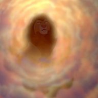
8D There IS a freaking picture in there, and I can SEE it now~
Seriously, your themes have interested me for like... the longest time. I never understood the pretty little swirls of colors. I hope there wasn't pictures in all of them, because dangit, I couldn't find them before D=.

I like the banner. And I like the text. The saying is cute~
But, the box... is bland. It's organized nicely at least.

>< 8/10!
 
Very cute banner! Nice colorful sig 9/10
 
The girl kinda scares me...O.o
But otherwise it's a really nice sig.
~9.8/10
@MK:Lol. Those swirls were when I couldn't paste straight images into GIMP.
 
Is this another new sig? It's probably not...9/10
 
Status
Not open for further replies.
Back
Top