
-
Ever thought it'd be cool to have your art, writing, or challenge runs featured on PokéCommunity? Click here for info - we'd love to spotlight your work!
-
It's time to vote for your favorite Pokémon Battle Revolution protagonist in our new weekly protagonist poll! Click here to cast your vote and let us know which PBR protagonist you like most.
You are using an out of date browser. It may not display this or other websites correctly.
You should upgrade or use an alternative browser.
You should upgrade or use an alternative browser.
Rate the signature of the person above you
- Thread starter Fire Master
- Start date
- Status
- Not open for further replies.
More options
Who Replied?Z o M B ii 3
Upgrade your Grey Matter.
- 179
- Posts
- 16
- Years
- Age 31
- Hastings, NY.
- Seen Jan 24, 2009
Pretty good, except for something
is telling me it doesn't match, no
idea what though.
7/10
is telling me it doesn't match, no
idea what though.
7/10
Buoysel
Trust me, I'm a Professional*
- 2,006
- Posts
- 16
- Years
- Kansas City
- Seen Aug 4, 2015
7/10 too much text
My sig translated: Pair/Brother Blue/ Brother Ice
9/10
I can't read japanese!
My sig translated: Pair/Brother Blue/ Brother Ice

Conman
Knowledgeable Ignorance
- 523
- Posts
- 18
- Years
- Bisnis, Nunya
- Seen Jul 3, 2021
I really like your signature, the colors of the banner are pretty nice. Not to mention all the links and text are organized nicely. 9/10.
----------------
Listening to: Evanescence - Cloud Nine
via FoxyTunes
----------------
Listening to: Evanescence - Cloud Nine
via FoxyTunes
Buoysel
Trust me, I'm a Professional*
- 2,006
- Posts
- 16
- Years
- Kansas City
- Seen Aug 4, 2015
8/10
Eevee is still out of place.
I was wondering who it belonged too, I took it down until I get permission.
Eevee is still out of place.
thats a nice sig but that belongs to chimchar59 did he give you permission? Anyway 10/10 coz its an awsome animated gif sig!
I was wondering who it belonged too, I took it down until I get permission.
Z o M B ii 3
Upgrade your Grey Matter.
- 179
- Posts
- 16
- Years
- Age 31
- Hastings, NY.
- Seen Jan 24, 2009
10/10
Its amazing, pure epic.
Its amazing, pure epic.
Buoysel
Trust me, I'm a Professional*
- 2,006
- Posts
- 16
- Years
- Kansas City
- Seen Aug 4, 2015
Is that you?
too much text, but still good. 7~/10
too much text, but still good. 7~/10
Z o M B ii 3
Upgrade your Grey Matter.
- 179
- Posts
- 16
- Years
- Age 31
- Hastings, NY.
- Seen Jan 24, 2009
Is that you?
too much text, but still good. 7~/10
Yah, I couldn't figure out what
else I could have put
on it.
You get a 10/10, it doesn't matter
what your signiture is.
It will be
10/10
else I could have put
on it.
You get a 10/10, it doesn't matter
what your signiture is.
It will be
10/10
Buoysel
Trust me, I'm a Professional*
- 2,006
- Posts
- 16
- Years
- Kansas City
- Seen Aug 4, 2015
7/10
Could be better, use the rule of thirds in photograph. Place the center of you face on one of the the grids.
What is the rule of thirds you ask? Helpful link.
.
Could be better, use the rule of thirds in photograph. Place the center of you face on one of the the grids.
What is the rule of thirds you ask? Helpful link.
.

Aizuke
[b]long sword style[/b]
- 3,025
- Posts
- 17
- Years
- Canberra, Australia
- Seen Nov 6, 2015
I liked the banner before, too bad it wasn't yours. D:
Hoorah for Japanese writing?
7/10
Hoorah for Japanese writing?
7/10
Buoysel
Trust me, I'm a Professional*
- 2,006
- Posts
- 16
- Years
- Kansas City
- Seen Aug 4, 2015
I liked the banner before, too bad it wasn't yours. D:
Hoorah for Japanese writing?
7/10
9/10 colors go good together.
I've got permission to use it, but I like the Japanese writing for now. Besides the black lettering says: "This signature is lost in translation"
THIRTY-SIX
Banned
- 8,172
- Posts
- 20
- Years
- Seen Nov 18, 2015
Tis ok… kinda… bit odd though.
7.10
7.10
Z o M B ii 3
Upgrade your Grey Matter.
- 179
- Posts
- 16
- Years
- Age 31
- Hastings, NY.
- Seen Jan 24, 2009
Yours is a bit odd.
7/10.
7/10.
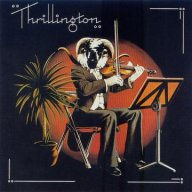
Percy Thrillington
The Mad Hatter
- 4,424
- Posts
- 17
- Years
- Seen Jan 1, 2023
Hm, yours is pretty good, especially seeing as the writing fits from end to end with the banner, but the person in the banner reminds me of John Lennon, so...
7/10
7/10
Unforgettable
Melodies of Life
- 1,620
- Posts
- 17
- Years
- Kentucky
- Seen Jan 3, 2013
And I don't like the pokemons.. takes away from it I guess.
7//10~
Just text... and a bit boring. 2//10~
THIRTY-SIX
Banned
- 8,172
- Posts
- 20
- Years
- Seen Nov 18, 2015
6.10
Ehh… the text needs to be better organised.
7.10
Buoysel
Trust me, I'm a Professional*
- 2,006
- Posts
- 16
- Years
- Kansas City
- Seen Aug 4, 2015
a little scary. also WTF??
7/10
7/10

World King
Twilight Silver Beast
- 1,501
- Posts
- 17
- Years
- Age 33
- Twilight Dimension; waiting for my rebirth as the
- Seen Aug 26, 2023
What is there to Rate? ??/10
- Status
- Not open for further replies.