• Ever thought it'd be cool to have your art, writing, or challenge runs featured on PokéCommunity? Click here for info - we'd love to spotlight your work!
  • It's time to vote for your favorite Pokémon Battle Revolution protagonist in our new weekly protagonist poll! Click here to cast your vote and let us know which PBR protagonist you like most.
  • Welcome to PokéCommunity! Register now and join one of the best fan communities on the 'net to talk Pokémon and more! We are not affiliated with The Pokémon Company or Nintendo.

Rate the signature of the person above you

Status
Not open for further replies.
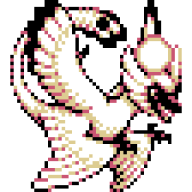
Ew smiley. :x The small text on top of the banner is barely noticable compared to your banner. It would look better if it was center aligned and the text was at the bottom. If not, stick it at the bottom of the banner.

5/10
 
Last edited:
Bg low quality compared to the over sharpened focal.

Text needs better colouring and probably would look better with some character spacing.

6.10
 
You don't know it? wth?

anyway...It's just a google searched pic of spyro x.x

2/10
 
nice banner, I like the effects for the images^^ 8/10
 
It's pretty decent. It could use better color-coordination between the text and the banner, but then I just like stuff that matches.

6.5/10
 
neat banner and it has my favorite color as well^^ 8/10
 
I'd say either the background colour of your CSS box or the font colour could be tweaked so that the text isn't too hard to read. Your banner, however, looks beautiful.

7/10
 
I like it, is that CSS around the pic? ^_^ verry nice 9/10
 
It's nicely CSS'd

But I'm not a fan of that banner..

Definately not your best.

6.5/10
 
I like it! Great job Color Me Evil. :33
8/10.
 
Status
Not open for further replies.
Back
Top