PokéCommunity supports the Stop Killing Games movement. If you're a resident of the UK or EU, consider signing one of the petitions to stop publishers from destroying games. Click here for more information!
Welcome to PokéCommunity! Register now and join one of the best fan communities on the 'net to talk Pokémon and more! We are not affiliated with The Pokémon Company or Nintendo.
After fixing up the brightness of my theme, I think it is better suited.
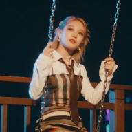
I really like your avatar and banner theme. The ice cream is just a very nice touch too. The CSS is different from most, but fits well with your theme. The Avii and Banner aren't exactly the same, but it still works out well.
The avi and siggy banner on their own tie together nicely, but with all the white space in the banner, it makes the other text seem out of place or that the siggy could do better without it (particularly since the font/colors of the other text don't fit with the banner, either). Also, I'm just not a fan of larger banners.
8/10.
I like how the avatar cuts off the girl on the side, I LOVE how it's angled differently from how the banner present her [Sorry if that doesn't make sense.]
The only thing that bothers me is the red links. It makes it looks Christmas-like.