You are using an out of date browser. It may not display this or other websites correctly.
You should upgrade or use an alternative browser.
You should upgrade or use an alternative browser.
Kage's Sprites with 100% less annoying(lets hope)
- Thread starter BurstX
- Start date
- Status
- Not open for further replies.
More options
Who Replied?Atomic Reactor
Guest
- 0
- Posts
Well, that sprite looks creepily familiar ;)
I really like how these turned out, the caps look good on both of them.
You matched the overworld with its battle sprite perfectly. There's nothing that I can see that needs improving. Although, the trainer in general could use a tad more detail. Idk other than that though..
I really like how these turned out, the caps look good on both of them.
You matched the overworld with its battle sprite perfectly. There's nothing that I can see that needs improving. Although, the trainer in general could use a tad more detail. Idk other than that though..
- 2,096
- Posts
- 15
- Years
- Him/Them
- «UK»
- Seen May 6, 2024
Cool.
the surfin pikachu looks ASWOME!
the surfin pikachu looks ASWOME!
... SPRTEZ!!! Yep. Looking god KageX. The breeders cap looks good on the battle sprite. However it looks really bad on the OW. I think you need to show it going down more.
BLAH! I LIEK IT SO IMMA KE3P IT!1
Well, that sprite looks creepily familiar ;)
I really like how these turned out, the caps look good on both of them.
You matched the overworld with its battle sprite perfectly. There's nothing that I can see that needs improving. Although, the trainer in general could use a tad more detail. Idk other than that though..
haha =P this was made first!!!
im still working on the designs, i plan on putting a cool design on leather jacket
(yea thats right its a sexy leather jacket!!!)
Cool.
the surfin pikachu looks ASWOME!
Cool.
the crit you gave me is ASWOME!
also heres somthing friggin sexy,

its a custom contest hall!!!!!!!
and it even has a sotry, yay!
So i was pissed off at life and pokemon games becuase they never really had a sontest hall that i really liked. the one from D/P/Pt came close but it wasnt good enough, so i give you this!!!! ome of these tiles are custom some are edits and some are just normal nintendo tiles.
Peple don't stand during Contests though... only at the end when they clap.
have you ever been to a Rise Against concert or a Linkin Park concert? NO ONE is sitting...
but i do agree, some chairs may help fill in the rather large empty spaces below the stage.
or else this is great! i LUV the archetecture. the angled ends are a nice touch, they make the hall less linear... give it more of an edge... the rail is nicely shaded... i had to do a double take looking at that! ^_^
my big concearn though, the display board in the background has a weird outline shape... it's kinda squiggly... like a cloud... maybe make it more rounded to match the modern edge that the hall holds?
Anyhow, i like it alot! It's pretty bad ass...
Keep Spriting!
not sure if i want to keep this thread alive, but heres an update i guess?
so i had this old tyranitar revamp i did back in the days of burst ninja

and it was really bothering me that the sprite was just plain terrible.
soooooo knowing me and my issues i went and reworked it to look like this!

aint it just 5 times sexier
so i had this old tyranitar revamp i did back in the days of burst ninja

and it was really bothering me that the sprite was just plain terrible.
soooooo knowing me and my issues i went and reworked it to look like this!

aint it just 5 times sexier
[NovaPirate]
And the rest went riding on.
- 802
- Posts
- 18
- Years
- In that cardboard box down the street.
- Seen Feb 13, 2011
-woof-
I'm going to pop in here, throw this crit. in like a smoke grenade, a disappear, 'kay?
Now, about your Tyranitar revamp: It's all good, I like it, but it looks like maybe you could shrink the body a bit, because poor Tyranitar looks like he's eaten around sixteen too many hamburgers. Just a smaller thing, but the nails on the right (Tyranitar's right) foot are quite different looking from the nails on the left foot, with the one on the right foot being a lot larger than the three on the left. Also, the right leg doesn't have the spots the left does, but that's just a design choice. Also, the tail looks a bit bulgy and just "off" towards where it tapers off into the spikes.
Edit;
Looked at the tail, and that bulgyness seems to be cause by the pixels on the top of the tail. It looks like they could be a bit more horizontal or something.
Finally, on the blue stomach, my first problem is that the pixels before it is blocked by the hand and the pixels after it's blocked by the hand aren't aligned, and that looks kind of funky. Furthermore, the stomach itself seems like it could be rotated more counter clockwise, but again, that might just be a design choice.
But overall, it's really nice and shows how far you've come.
Good luck!
im gonna post then edit later since ive tried 5 times to post this and my computer keeps freezing.
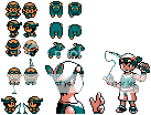
ok so now ill talk, if anyone remembers way back to my original thread back when i was a n00b i had a hack i was working on called Pokemon ocean dive in. now i know terrible name terrible hack, it never went anywhere, but i did post sprites for it like the hero heroine and what not. so then last year i took some ideas from ocean and turned into pokemon peridot. again the hack went nowhere. well now ive decided that i hated my design for peridot. i had nothing from the original design and the hero was not at all what i wanted, so heres what i did. i decided to make the hero in all his glory the way i had him originally.

i give you teal! this is what the original design consisted of. the shorts the bandanna and the fishing rod. the back sprite is a wip, i suck at them so itll need some work.
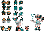
so now i added the saddle sprites. wait did i just sasy sadle? why yes, yes i did. the saddle would have replaced the bike as a newish feature allowing you to ride a pokemon
or atleast thats how it would appear.

now what game wouldnt be complete without some pokemon overworlds. these actually will be featured in pokemon prism by coolboyman, but if i was to make my hack i would have used them too.

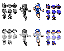
now this is slightly off topic of pokemon teal but its in g/s/c style so yea. if any of you people remember in my second thread i had posted some terrible sprites of blue (to me shes blue and the rival is green, you might think it the other way i dont) and when i saw some concept art for her i realized that the sprites were wayyyyyy off. thus i redid them with a much better pose and a better face/hair/everything. just a note the ows are still a wip, i can only seem to get the foward sprites to look good.
EDIT: i added some stuff to teal, if you didnt look at it yet, look now.
ok so now ill talk, if anyone remembers way back to my original thread back when i was a n00b i had a hack i was working on called Pokemon ocean dive in. now i know terrible name terrible hack, it never went anywhere, but i did post sprites for it like the hero heroine and what not. so then last year i took some ideas from ocean and turned into pokemon peridot. again the hack went nowhere. well now ive decided that i hated my design for peridot. i had nothing from the original design and the hero was not at all what i wanted, so heres what i did. i decided to make the hero in all his glory the way i had him originally.

i give you teal! this is what the original design consisted of. the shorts the bandanna and the fishing rod. the back sprite is a wip, i suck at them so itll need some work.
so now i added the saddle sprites. wait did i just sasy sadle? why yes, yes i did. the saddle would have replaced the bike as a newish feature allowing you to ride a pokemon
or atleast thats how it would appear.

now what game wouldnt be complete without some pokemon overworlds. these actually will be featured in pokemon prism by coolboyman, but if i was to make my hack i would have used them too.

now this is slightly off topic of pokemon teal but its in g/s/c style so yea. if any of you people remember in my second thread i had posted some terrible sprites of blue (to me shes blue and the rival is green, you might think it the other way i dont) and when i saw some concept art for her i realized that the sprites were wayyyyyy off. thus i redid them with a much better pose and a better face/hair/everything. just a note the ows are still a wip, i can only seem to get the foward sprites to look good.
EDIT: i added some stuff to teal, if you didnt look at it yet, look now.
Last edited:
GFA
Mega Blastoise is my homeboy
- 1,830
- Posts
- 15
- Years
- Seen Sep 7, 2018
Looking good. The bac sprite for Teal needs work, he's a litlle weirdly proportioned in the chest. Also, ypou should probably see some more of the other arm...
As for Blue, her battle sprite looks fine, but her OW... I really don't like the little 'cowlick' it makes it look non symetrical, and Blue's hair should be symetrical. In my opinion anyway.
As for Blue, her battle sprite looks fine, but her OW... I really don't like the little 'cowlick' it makes it look non symetrical, and Blue's hair should be symetrical. In my opinion anyway.
i agree with gfa... it looks like alien is popping out of his belly... in the form of an arm ^_^ either raise it up a bit or show more elbow up...
as for the pkmn ow's... god, you're a god! They are wonderful! I love how you took the old sprites and created movement with them. And the original ones are just as neat! Their style overall is great, and matches the old g/s/c style nicely! Great job on those!
btw, were you gonna post the revised contest hall score board?
- GP
Looking good. The bac sprite for Teal needs work, he's a litlle weirdly proportioned in the chest. Also, ypou should probably see some more of the other arm...
As for Blue, her battle sprite looks fine, but her OW... I really don't like the little 'cowlick' it makes it look non symetrical, and Blue's hair should be symetrical. In my opinion anyway.
like i said i suck at backsprites and ill be working on it, but i was using the "dude" as a base so i dont really want to stray to far from his original design.
for blue, i wasnt sure to include the cowlick. i know it its in the artwork ive seen, and i kinda liked how it ooked but i wasnt sure to put it on the ows, ill take it off and see how it looks.
i agree with gfa... it looks like alien is popping out of his belly... in the form of an arm ^_^ either raise it up a bit or show more elbow up...
as for the pkmn ow's... god, you're a god! They are wonderful! I love how you took the old sprites and created movement with them. And the original ones are just as neat! Their style overall is great, and matches the old g/s/c style nicely! Great job on those!
btw, were you gonna post the revised contest hall score board?
- GP
lol that alien comment make me laugh really hard, just letting you know. im really glad you think the pokemon ows came out thsat good, haha.
um i guess i will post a revised version since ill just be showing updated sprites in this post.
so revised teal

the new contest hall

and the revised blue

GFA
Mega Blastoise is my homeboy
- 1,830
- Posts
- 15
- Years
- Seen Sep 7, 2018
The OW is much better, but I think that the cowlick should actually stay on the in battle sprite. Sometimes, you can't actually show all of the detail oon the OW, it's just not worth your while.
I need a course in how to express my thought
I need a course in how to express my thought
so i just realized that i have never posted any of may fakemon in this thread, so heres every decent fakemon ive ever done :D


ok so heres some info.
first row,
shargodon, water/dark type, evolves from sharpedo by leveling up in dive spot while holding deep sea tooth. (most likey my most famous fakemon, it won me 2nd place in a contest on deviantart, getting thin as my prize. https://g-fauxpokemon.deviantart.com/art/Prize-1-Sugi-esque-Shargodon-112906415 )
aurancario, fighting/steel type, evolves from lucario by leveling up while holding metal coat.
hitmonchamp, fighting type, evolves from tyrogue when attack defence and speed are equal, evolves from hitmontop/hitmonlee/hitmonchan at level 60.
row two,
dosolo, normal type, evolves to doduo via happiness.
joegy, normal type, evolves into kangaskan at level 30 if female.
diglett unearthed form, ground/rock type, transforms from diglett while holding _________.
third row
riprok, ghost/rock type, evolves into tomblare at levlel 32.
sutorisu, electric type, evolves from pachirisu by leveling up while holding quick claw.
aveon, normal/flying type, evolves from eevee by leveling up while holding sharp beak.
row four
spectreon, ghost type, evolves from eevee by leveling up while holding reapers cloth.
toxeon, poison type, evolves from eeveel by leveling up while holding poison barb.
quakeon, rock type, evolves from eeveel by leveling up while holding hard stone.
finally here is a sprite i did for the same person i made the g/s/c fakemon fanart for. this is her character lou.

more info about lou here https://liliebiehlina3siste.deviantart.com/art/Lou-Diamond-Pearl-136921264


ok so heres some info.
first row,
shargodon, water/dark type, evolves from sharpedo by leveling up in dive spot while holding deep sea tooth. (most likey my most famous fakemon, it won me 2nd place in a contest on deviantart, getting thin as my prize. https://g-fauxpokemon.deviantart.com/art/Prize-1-Sugi-esque-Shargodon-112906415 )
aurancario, fighting/steel type, evolves from lucario by leveling up while holding metal coat.
hitmonchamp, fighting type, evolves from tyrogue when attack defence and speed are equal, evolves from hitmontop/hitmonlee/hitmonchan at level 60.
row two,
dosolo, normal type, evolves to doduo via happiness.
joegy, normal type, evolves into kangaskan at level 30 if female.
diglett unearthed form, ground/rock type, transforms from diglett while holding _________.
third row
riprok, ghost/rock type, evolves into tomblare at levlel 32.
sutorisu, electric type, evolves from pachirisu by leveling up while holding quick claw.
aveon, normal/flying type, evolves from eevee by leveling up while holding sharp beak.
row four
spectreon, ghost type, evolves from eevee by leveling up while holding reapers cloth.
toxeon, poison type, evolves from eeveel by leveling up while holding poison barb.
quakeon, rock type, evolves from eeveel by leveling up while holding hard stone.
finally here is a sprite i did for the same person i made the g/s/c fakemon fanart for. this is her character lou.

more info about lou here https://liliebiehlina3siste.deviantart.com/art/Lou-Diamond-Pearl-136921264
pokemongarnet
CAT-BUS!
- 724
- Posts
- 15
- Years
- Seen Dec 13, 2016
What is an OC? My first guess is original character.
- Status
- Not open for further replies.

