
You are using an out of date browser. It may not display this or other websites correctly.
You should upgrade or use an alternative browser.
You should upgrade or use an alternative browser.
Rate The Signature Of the Person Above You
- Thread starter abnegation
- Start date
- Status
- Not open for further replies.
More options
Who Replied?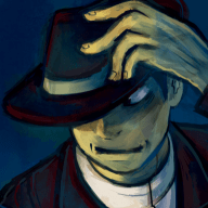
Overlord Drakow
Banned
- 3,655
- Posts
- 16
- Years
- Age 34
- Down Under
- Seen Nov 6, 2019
^Not a fan I'm afraid.
2/10
2/10
- 2,319
- Posts
- 16
- Years
- Age 30
- PA, USA :effort
- Seen Dec 8, 2013
4/10. Banner tries too hard to be DARK and EDGY. It's barely legible and it's mostly a mess of red and storm effects to the point where the original stock/renders can't be seen anymore.

Rensider
Do as the Snamor do.
- 71
- Posts
- 13
- Years
- Pandora...you know which one
- Seen Sep 18, 2011
I'm a fan of the elemental monkeys so i like this. Don't really care about the other stuff though. 6/10.

Full Metal
C(++) Developer.
- 810
- Posts
- 16
- Years
- Age 28
- In my mind.
- Seen Aug 19, 2018
Simplistic, and good picture.
However, your username is done in a terribly boring font, and almost kills the pic. :(
Again with a bad font below the pic.
7//10. (:
However, your username is done in a terribly boring font, and almost kills the pic. :(
Again with a bad font below the pic.
7//10. (:
~Ryukaa
total nerd
- 1,328
- Posts
- 16
- Years
- Age 27
- Melbourne, Australia
- Seen Apr 5, 2021
Like you said. An otter using a Shell as a blade's badass. xD;
It's nice. But just a picture and a tag. 7/10.
It's nice. But just a picture and a tag. 7/10.

derozio
[b][color=red][font=helvetica][i]door-kun best boi
- 5,521
- Posts
- 14
- Years
- Akihabara
- Seen Jun 27, 2020
Not bad. But the pic is kinda low quality and it would've looked much better centralized. All that text doesn't really fit the image, tbh. Go for a better background image. Oh, and your signature messes up those 'edit/quote/etc' buttons on the left. -ve points for that. :(
6//10
6//10
Full Metal
C(++) Developer.
- 810
- Posts
- 16
- Years
- Age 28
- In my mind.
- Seen Aug 19, 2018
^ well said.
8//10.
The image is amazing, may I say.
What keeps this from being a 10/10 is the colors on the left of your text. they bother me. :( The text is nicely colored (especially the orange parts). The only reccomendation I would make is to make the text mostly orange, and the important parts bolded white. Yea. so...actually...8.5//10 :)
[also, for those who look @ my sig. I'm using gravatar for the pic :) ]

A Pixy
Cruel?
- 3,171
- Posts
- 16
- Years
- The Great Northern Nation of Canada
- Seen Oct 15, 2023
CSS isn't excessive, it's minimal and used well. +1.5
That image of Ed isn't cut properly. I'm assuming this is intentional, but it doesn't look very nice. However, those icons with links seem very professional and look good. +1
Text is... Odd. This is all me, but I just don't like the way it is. However, it does pitch in to being theme. +1
8.5/10
That image of Ed isn't cut properly. I'm assuming this is intentional, but it doesn't look very nice. However, those icons with links seem very professional and look good. +1
Text is... Odd. This is all me, but I just don't like the way it is. However, it does pitch in to being theme. +1
8.5/10
Full Metal
C(++) Developer.
- 810
- Posts
- 16
- Years
- Age 28
- In my mind.
- Seen Aug 19, 2018
Hm....idk. The concept seems...idk. Not to crazy, but at the same time, pretty adnag cool. The padding isn't non-existent on the text, which is good :) and the pics are unique...hmm...I give a 9/10.
+2 for the (more/less) originality.
+2 For the text which is awesome. :)
+2 for the (more/less) originality.
+2 For the text which is awesome. :)
Rainy Day
Perfect Weather
- 135
- Posts
- 13
- Years
- Age 27
- Beneath the rain
- Seen Jun 4, 2011
7/10 CSS is well done, but it's not particularly creative. Not bad, but not a standout.
6/10.
The girl's pretty, the words...aren't First off, block isn't good unless you have a clear background, which this one doesn't have at all. Second of all, it's in the smack dab middle of the signature, making it hard to look at in general.
Remove the words, I'll give a better score.
The girl's pretty, the words...aren't First off, block isn't good unless you have a clear background, which this one doesn't have at all. Second of all, it's in the smack dab middle of the signature, making it hard to look at in general.
Remove the words, I'll give a better score.
champagnepapi
exile
- 1,796
- Posts
- 13
- Years
- Age 27
- new england
- Seen Sep 4, 2016
Looks OK, a bit too big for my tastes, but each to his own. 6/10
Now, rate my flow, betties.
Now, rate my flow, betties.

derozio
[b][color=red][font=helvetica][i]door-kun best boi
- 5,521
- Posts
- 14
- Years
- Akihabara
- Seen Jun 27, 2020
Just an image. And not a very good one, at that.
4//10
My suggestions:
Get a better image. This one..doesn't look too appealing.
Try adding some text.
Although not necessary, a lil' bit of CSS wouldn't hurt.
4//10
My suggestions:
Get a better image. This one..doesn't look too appealing.
Try adding some text.
Although not necessary, a lil' bit of CSS wouldn't hurt.
- Status
- Not open for further replies.