• Our software update is now concluded. You will need to reset your password to log in. In order to do this, you will have to click "Log in" in the top right corner and then "Forgot your password?".
  • Welcome to PokéCommunity! Register now and join one of the best fan communities on the 'net to talk Pokémon and more! We are not affiliated with The Pokémon Company or Nintendo.

Pokémon Sprite Discussion [from RBYG to XY]

Guy

just a guy
7,128
Posts
15
Years
  • 264.png


    Hey. For a moment I thought it was a different pokemon. This is one of the major sprite changes (and I gotta say it's pretty good, too).
    Whoa, Linoone looks really awesome with it's new sprite. I thought it looked great before, but seeing this, I think I want another one in Black and White. n_n

    I'm going to talk about Sceptile now.

    R/S/E:
    pkrs003.gif


    D/P/P and HG/SS:
    dpmfa254.png


    B/W:
    254.png


    From R/S/E to B/W, this is the worst sprite update in history. The R/S/E Sceptile is my favourite. D/P/Pt/HG/SS doesn't appeal to me because I don't like the pose. B/W, what happened here?
    I prefer DPPt's sprite of Sceptile the best. Like Syd, I think the RSE lacks the creativity and character that DPPt gave it. Going with the crowd, I also say B&W made Sceptile look too skinny. Except, I like its new vibrant color. It gives it a more fierce look.

    On a side note, I was browsing Arcanine last night, and I forgot how awesome it's Yellow sprite was. :]

    Spr_1y_059.png
     
    432
    Posts
    14
    Years
    • Age 29
    • Seen Mar 13, 2011


    Is it me, or does Poliwag's left eye look bug-eyed or something? Each time I see it in HeartGold, it just bugs me.
     

    PlatinumDude

    Nyeh?
    12,964
    Posts
    13
    Years
  • Bellossom%20Front.gif

    When I look at Bellossom's B/W sprite, I can't help but think that it's rickrolling me (because of the movements of its hands).
     

    Heart's Soul

    Hey, look, I was gone.
    2,535
    Posts
    16
    Years
    • Age 28
    • Seen Aug 20, 2020
    I wish I could replace HGSS's sprites with BW ones. On my retail game. *sigh*

    Where'd you find the sprites?
     

    Rainbow-Sasuke

    300 Posts be the 15th?
    245
    Posts
    13
    Years
  • 184.png
    < This. A chubby happy man. What more do you want?

    18.png
    < I like the stance on this one. I also like the the head thingy!
     
    Last edited:

    Heart's Soul

    Hey, look, I was gone.
    2,535
    Posts
    16
    Years
    • Age 28
    • Seen Aug 20, 2020
    Some were good, some were not. I prefer BW over GSC, but that's just me.
     

    NiKaNoRoU

    we are but particles
    658
    Posts
    14
    Years
  • Here's a list of sprites on B/W that dissapointed me:

    Spoiler:
     

    Mickeycricky

    Mickeycricky
    50
    Posts
    13
    Years
  • Here's a list of sprites on B/W that dissapointed me:

    Spoiler:

    OMG Crobat grew feet!?!

    Yea I agree, the black outline make them look flat -__-
     
    2,982
    Posts
    15
    Years
  • anyone else noticed that mostly all Hoenn's sprites have been changed? inb4pokemonR/S/E remake.

    I don't really understand why they switched to the Black and White sprites for Mudkip and it's evolutions.. ):

    HG/SS -
    Spr_4d_258.png
    Spr_4d_259.png
    Spr_4d_260.png


    BW -
    258.png
    259.png
    260.png


    They were pretty perfect in HG/SS. I probably don't like the Swampert one because of the palette choice.
     

    PlatinumDude

    Nyeh?
    12,964
    Posts
    13
    Years
  • anyone else noticed that mostly all Hoenn's sprites have been changed? inb4pokemonR/S/E remake.

    I don't really understand why they switched to the Black and White sprites for Mudkip and it's evolutions.. ):

    HG/SS -
    Spr_4d_258.png
    Spr_4d_259.png
    Spr_4d_260.png


    BW -
    258.png
    259.png
    260.png


    They were pretty perfect in HG/SS. I probably don't like the Swampert one because of the palette choice.
    Now that you said it, Swampert's colors are darker compared to the older sprites. Swampert's B/W sprite is also the first of Swampert's sprites to be on all fours.
     

    Amew

    Red Mage
    50
    Posts
    13
    Years
    • Seen Dec 10, 2011
    When you look at it, it's kinda funny....

    5th Gen Sprite for Nintales. Look familiar?

    I do believe they based it on this. The...er...face avatar thing in Pokemon Mystery Dungeon.

    Consistency, perhaps?
     

    560cool.

    An old timer?
    2,002
    Posts
    14
    Years
  • When you look at it, it's kinda funny....

    5th Gen Sprite for Nintales. Look familiar?

    I do believe they based it on this. The...er...face avatar thing in Pokemon Mystery Dungeon.

    Consistency, perhaps?
    This one kinda reminds me of the Exeggutor thing. It had the same sprites in both Yellow and Gold and the developers hardly even change his pose, and usually go back to old ones. Yeah, just lazy people at GF...

    Now that you said it, Swampert's colors are darker compared to the older sprites. Swampert's B/W sprite is also the first of Swampert's sprites to be on all fours.

    Actually, that's not on all four, he's just leaning in front. I think. I haven't seen him in game yet.

    anyone else noticed that mostly all Hoenn's sprites have been changed? inb4pokemonR/S/E remake.

    I don't really understand why they switched to the Black and White sprites for Mudkip and it's evolutions.. ):

    HG/SS -
    Spr_4d_258.png
    Spr_4d_259.png
    Spr_4d_260.png


    BW -
    258.png
    259.png
    260.png


    They were pretty perfect in HG/SS. I probably don't like the Swampert one because of the palette choice.

    Actually, they only pretty changed the lighting in the sprites to reflect the 3D and made Swampert lean. That's all.

    Here's a list of sprites on B/W that dissapointed me:

    Spoiler:

    I totally agree.
    And no, Muk looks 3D, mostly because of the lighting if the sprite. Take a look at his hand, see the color ?
    And OMG, Crobat grew feet ! =_=
     

    PlatinumDude

    Nyeh?
    12,964
    Posts
    13
    Years
  • Actually, that's not on all four, he's just leaning in front. I think. I haven't seen him in game yet.
    Really? It looks like it's on all fours to me.

    Anyway, I find B/W's Salamence a huge improvement over the R/S/E and D/P/Pt Salamences:

    373.png

    B/W

    Spr_3r_373.png

    R/S/E

    Spr_4d_373.png

    D/P/Pt
     

    Superjub

    Pokémon Aureolin
    2,288
    Posts
    16
    Years
  • Yeah, I agree. I much prefe the colour scheme of Salamence in B/W. :) Also, I prefer the red wings to the orange ones, and the pose is good too! :)

    Also, I guess they don't care/forgot about Gulpin, as I don't think it got a new sprite in B/W. :l

    D/P/Pl/HG/SS:
    Spr_4d_316_m.png

    B/W:
    316.png
     
    Last edited:

    Sydian

    fake your death.
    33,379
    Posts
    16
    Years
  • I disagree about Swampert's HGSS sprite being better than BW. Its facial expression looks worried in HGSS and that bugged me. -_-
     
    5,285
    Posts
    14
    Years
    • Seen May 1, 2024
    I really like Salamence's BW sprite. It looks more like the official artwork, which has a much better pose than the other sprites. I like the colouring too, it looks more like the Hg/Ss overworld Salamence, which is kickass...which is also more like sugimori's artwork.

    The same goes for Swampert, as far as the pose goes...I mean, looking at its' previous sprites....is it honestly going to fire a Hydro Cannon whilst appearing to be sitting up, on two legs? It's not a Snorlax, ffs....But I think the colouring is fine.

    I gotta admit, the ones where they stole the Gen IV sprites are pretty lazy....as is the fact that all of the previous 5 generation's pokemon have their Platinum pokedex entries too....but you gotta at least realise with Houndoom they chose the one with the best colouring.
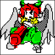
    Yes, Crobat and Sudowoodo do look really weird...

    Also, I gotta say, I only really came on this thread to say something about Dragonite....although I only include Gen III/IV sprites, as I haven't played a Gen I/II game, and they look out of context on Bulbapedia.


    Spr_3r_149.png

    RSE: Why the long, bent face? Looks like a horse viewed whilst drunk.....It also seems to look lazy...

    Spr_3f_149.png

    FrLg: Better face...my second favourite Dragonite sprite, but it still looks iffy....

    Spr_4d_149.png

    DPPt: What is with that pose? It doesn't look lazy like Gen III, but it's a weird pose, it looks like it's about to kidnap me with those arms...but it's Dragonite, and it looks too friendly to wish me harm.

    Spr_4h_149.png

    HgSs: Slight hint of RSE nose....but looking back, all the noses look slightly off. Colouring is slightly different, but good. I like the pose, too, it makes it look active, whilst showing off most of his features. I also like the slightly different feet. Good job really, when one of my longest battles in-game will involve fighting 3 of them..

    149.png

    BW: Haven't played the game yet....but it doesn't bode well.

    I don't know if people are normally so fussy about their sprites....but I love Dragonite, and I just wish he looked better in these games...

    Oh, and another Gen III pokemon to finish off my post:

    384.png

    I personally think this is really, really good, although none of Rayquaza's sprites are bad (luckily he's lost the Gen III blue tongue), this has a hint of his official artwork, but he's leaning forwards ready to hit you with a Hyper Voice or Dragon Pulse, and looks pretty amazingly bad-ass tbh
     

    Sydian

    fake your death.
    33,379
    Posts
    16
    Years
  • I like the DPPT Dragonite best. :) <3

    Now, I wanna take this time to discuss one of my favorite Pokemon ever. :3

    DP:
    Spr_4d_479.png


    Oooo!

    Plat/HGSS:
    Spr_4p_479.png


    Oooo!

    BW:
    Spr_5b_479.png


    OOOO!

    SO MUCH CHANGE. OH MY GOD. SO DIFFERENT. SO APPEALING. Even though it's a little Pokemon, there are plenty more poses they could have put the lil guy in. :|

    I'm not going to bother posting other forms, lol.
     
    546
    Posts
    13
    Years
  • Really? It looks like it's on all fours to me.

    Anyway, I find B/W's Salamence a huge improvement over the R/S/E and D/P/Pt Salamences:

    373.png

    B/W

    Spr_3r_373.png

    R/S/E

    Spr_4d_373.png

    D/P/Pt

    Ewww! Sorry, but Salamence's R/S/E sprite was HIDEOUS. Its legs were so bulky, and its color palette wasn't any better... D:
    Its B/W sprite is BEAUTIFUL, though. I love the dark red wings and other spots that were previously orange. :3

    But has anyone else noticed how most of the Hoenn Pokemon's B/W sprites have very dull colors? I'm not saying that in a bad way, though. It makes them look WAY better. <3
     
    Back
    Top