

Altairis
take me ☆ take you
- 5,178
- Posts
- 13
- Years
- database database
- Seen Nov 14, 2023
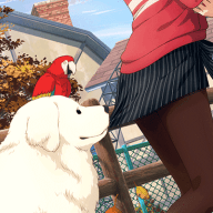
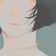
Your smudges are probably your best in my opinion. In a lot of the ones in the first section, the text is really bright and distracts from the render and rest of the sig as a whole, and I'm generally not really a fan of that. Your vertical one has nice colors, however, the lighting doesn't really make any sense. It looks like the background light is behind her, meaning that there shouldn't be any glowing lines on her in the front because it wouldn't be bright there. And maybe try blending her more, since it looks like she was just placed on top and the lines on top of her. kiu :)
take this with a grain of salt because I'm still learning myself and I struggle with blending and lighting the most lol
take this with a grain of salt because I'm still learning myself and I struggle with blending and lighting the most lol


![[PokeCommunity.com] Chibi's Gallery](https://data.pokecommunity.com/attachments/5/5292-5d76e0aedbebfee49903af79c934f3b3.jpg "[PokeCommunity.com] Chibi's Gallery")
![[PokeCommunity.com] Chibi's Gallery](https://data.pokecommunity.com/attachments/5/5293-dc3535c9d60d404b14c7c0f7696602d1.jpg "[PokeCommunity.com] Chibi's Gallery")
![[PokeCommunity.com] Chibi's Gallery](https://data.pokecommunity.com/attachments/5/5294-724b10f8694cca171e08132cefe0baa9.jpg "[PokeCommunity.com] Chibi's Gallery")