![[PokeCommunity.com] dionen's gallery of sadness and sorrow](https://i.imgur.com/ywkdN25.gif "[PokeCommunity.com] dionen's gallery of sadness and sorrow")
hellllllllllllllllooooooooooooooooooooooo world
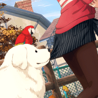
these are some really old tags from another forum. I lack some inspiration to create new ones :c
some of them are cool, some are shitty, some are complex and some are just cute.
tell me what you think ^_^
![[PokeCommunity.com] dionen's gallery of sadness and sorrow](https://i.imgur.com/otqOp9Q.png "[PokeCommunity.com] dionen's gallery of sadness and sorrow")
made with illustrator
Spoiler:
![[PokeCommunity.com] dionen's gallery of sadness and sorrow](https://i.imgur.com/fWmwPn7.png "[PokeCommunity.com] dionen's gallery of sadness and sorrow")
![[PokeCommunity.com] dionen's gallery of sadness and sorrow](https://i.imgur.com/jZtUifJ.png "[PokeCommunity.com] dionen's gallery of sadness and sorrow")
![[PokeCommunity.com] dionen's gallery of sadness and sorrow](https://i.imgur.com/PU64oB7.png "[PokeCommunity.com] dionen's gallery of sadness and sorrow")
reasons: japan's earthquake
![[PokeCommunity.com] dionen's gallery of sadness and sorrow](https://i.imgur.com/w4dnTZj.png "[PokeCommunity.com] dionen's gallery of sadness and sorrow")
![[PokeCommunity.com] dionen's gallery of sadness and sorrow](https://i.imgur.com/D5Hguff.png "[PokeCommunity.com] dionen's gallery of sadness and sorrow")
because why not? ^^
![[PokeCommunity.com] dionen's gallery of sadness and sorrow](https://i.imgur.com/RwST4NT.png "[PokeCommunity.com] dionen's gallery of sadness and sorrow")
![[PokeCommunity.com] dionen's gallery of sadness and sorrow](https://i.imgur.com/L7LAP2Q.png "[PokeCommunity.com] dionen's gallery of sadness and sorrow")
![[PokeCommunity.com] dionen's gallery of sadness and sorrow](https://i.imgur.com/svrTcSb.png "[PokeCommunity.com] dionen's gallery of sadness and sorrow")
![[PokeCommunity.com] dionen's gallery of sadness and sorrow](https://i.imgur.com/cJGpE2x.png "[PokeCommunity.com] dionen's gallery of sadness and sorrow")
![[PokeCommunity.com] dionen's gallery of sadness and sorrow](https://i.imgur.com/vMG8sJx.png "[PokeCommunity.com] dionen's gallery of sadness and sorrow")
some vexel tentatives
BONUS: LOITUMA FARFETCH'D
![[PokeCommunity.com] dionen's gallery of sadness and sorrow](https://i.imgur.com/omthNP4.gif "[PokeCommunity.com] dionen's gallery of sadness and sorrow")
ps: don't even try calling me a psycho