• Our software update is now concluded. You will need to reset your password to log in. In order to do this, you will have to click "Log in" in the top right corner and then "Forgot your password?".
  • Welcome to PokéCommunity! Register now and join one of the best fan communities on the 'net to talk Pokémon and more! We are not affiliated with The Pokémon Company or Nintendo.

Loki Art Dump

Loki

x
6,829
Posts
18
Years
    • Seen Apr 4, 2024

    galleryyyyyyy


    'Sup guys, Loki here with a new gallery that's a lot neater than the last one /ohohoho~


    Some notes:
    - I normally work exclusively on the computer, but sometimes I sketch on paper and go over it digitally-- depends.
    - I use Paint Tool SAI and touch up in Photoshop. Any backgrounds are all done in Photoshop CS2.
    - As always, please don't use these without my permission :>


    These are my latest works, not in any particular order but generally from oldest to newest. Click to see bigger versions.


    [/CENTER]
     

    Kura

    twitter.com/puccarts
    10,994
    Posts
    19
    Years
  • As always, I love seeing your work :3 Great stuff! I really like how you're trying to make stuff more dynamic! Try playing a little more with some perspective if you want to try and push your drawings a bit further. There are some nice Street-Fighter perspective reference stuff from some of the udon crew like Alvin Lee or Arnold Tsang, and it's pretty good reference to get you thinking with a camera and perspective in mind :3
    Spoiler:


    Can't wait to see more stuff <33 Keep drawing!!
     
    Last edited:
    41,360
    Posts
    17
    Years
  • Oh, your stuff is heaps awesome! But I can't help and feel like a lot of it looks pretty static as far as poses go, so I'd definitely love to see more "action" from you. ^_^ I love your coloring style, especially in this one. Find myself coming back to that one when browsing your gallery (I love how the characters go from colored to grayscaled to no colors/grays at all, very awesome)!

    Pose Emporium has some pretty awesome photo poses for reference for this type of stuff, so I'd recommend trying it out when you're able!

    Oh, I also want to say I'm in love with this picture, too. The pale colors just go so well with the pose and style and everything :'D
     

    Loki

    x
    6,829
    Posts
    18
    Years
    • Seen Apr 4, 2024
    @Kura: Asdfghjkl; thank youuu, I will definitely check out the street fighter art-- I was actually looking at Chun Li lately, don't know how it didn't occur to me to look at the rest of the characters! XD I'll definitely be giving perspective a shot from now on, thank you for the feedback! ^^//

    @Cirno: AHHHH I know my stuff is so boring /sob I'm working on practicing poses I haven't done before, particularly in the last three thumbnails but I think I need to figure out the working of the human body before going any further.... Amg though that link is beautiful I will be using that to no end *A*** thanks so much for the comment!!


    Spoiler:


    Omg can't even begin with how many things are wrong with this picture BUT LETS START WITH THE SHODDY FIRE, SHALL WE? I might fix it this weekend to make it look more like fire, but I'm going to Blizzard tomorrow, so I was like NOPE. XD And then of course his face is just asdfghjk;l but yeahhhh experimenting.
     

    Kura

    twitter.com/puccarts
    10,994
    Posts
    19
    Years
  • AARRGH I just wrote up a ton here and it deleted..

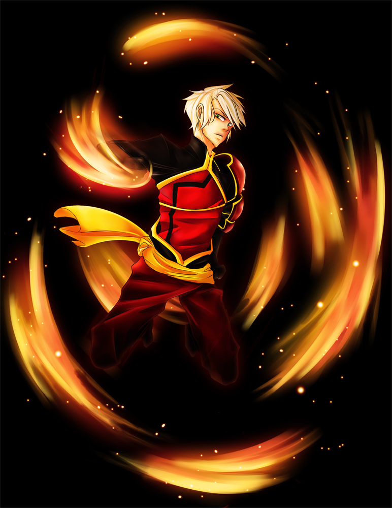
    Anyways, I wanted to say, it's really good! The structure is great; but watch your twinning (see how the legs are almost mirrored of each other) If you have them overlap then it would be dynamic.

    If you wanna bring this over to the drawover paintover thread, I can doodle up some pose options for you to consider. And help you with keeping that dynamism, because, for example, the back arm being straight like that breaks the rythm of the piece and makes it static.

    The fire may look shoddy to you because real fire, especially when it moves, has gaps on the inside, and a flame will dissapate at the top when the fire starts to go out. The fire, aside from the flames near his hand, aren't following the movement of the body, and that's why they may feel out of place for you.

    I'd like to see what you do with it once you fix it up, though, so I really hope you post so we can see your process and what you feel is the right approach.

    I think your style, colouring, and anatomy are great, but there are a few choices you can make to turn this into a stronger piece. Try and think about silhouette, for example, and just colour over his whole body in white and see what you "read" from that pose. If you show that whited out picture and ask someone "what does this look like he's doing?" and they say "I don't know" or they say something else that you weren't going for, then it's time to revisit the pose and try something new.


    Hope this helps! I'm excited to see new stuff from you!
     
    Back
    Top