Thank you everyone for your continual support, participation, and most of all, patience! This class we are going to be going over shading, lightsourcing, and dithering, and what it means in pixel art. But, before anything else, roll call!
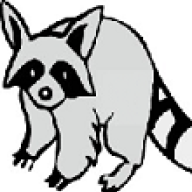
Shading and lighting exists in every aspect of art, and capturing those shadows is what helps make your art feel real and give it the illusion of depth. This applies for pixel art as well. Shading, in pixel art terms, refers to the process of altering the color of an object/surface/polygon in the 3D scene, based on its angle to lights and its distance from lights to create a photorealistic effect. With the creation of a color ramp, you are pre-deciding what your shadows are going to be colored.
The important thing to know about shading is that it is dependent on the lighting used. Your shading will have a different effect according to what lighting technique you use. For the sake of ease and simplicity, we'll only focus on two schools of shading.
Ambient lighting
An ambient light source represents a fixed-intensity and fixed-color light source that affects all objects in the scene equally. Upon rendering, all objects in the scene are brightened with the specified intensity and color. This type of light source is mainly used to provide the scene with a basic view of the different objects in it. This is the simplest type of lighting to implement and models how light can be scattered or reflected many times producing a uniform effect.
Directional lighting
A directional light source illuminates all objects equally from a given direction, like an area light of infinite size and infinite distance from the scene; there is shading, but cannot be any distance falloff.
Commonly, new or young pixel artists will make the mistake of linear shading and pillow shading.
Pillow shading is shading by surrounding a central area with increasingly darker bands. Pillow-shading is bad because it pays no attention to the light source, and conforms to the shape of the area rather than the form it represents of how light affects it, ignoring a subject's 3-Dimensional potential. Pillow shading is often, but not always, combined with banding, as the above example illustrates.
Linear shading on the other hand is when a range of colors is simply stacked on top of one another, paying attention to a light's direction, but with no regard for how that light may be impacting an object's surface. However, it is not to be confused with just "blocking out your colors", a pixel art technique in which you very liberally apply color to the area meant to be shaded and refine it.
The left is an example of blocked out shading, the right an example of refined shading.
Always start by assigning your base color to the subject and defining a light source. Use the (darker) colors you made with your color ramp to begin adding shadows to where it makes sense to. Focus on the shape of the object, and the way it contours. When your shadows have been laid out, begin highlighting
sparingly. Though it should be noted that different textures (visually representing different surfaces) have different levels of reflectivity.
Remember the rules about lines and apply it here. Your shading and coloring must be clean along with your outlines. Make sure you're using smooth transitions and not doubling up on lines that don't need it. Avoid banding and too much AA. Once you feel your shading is sufficient, you can begin refining your shadows and highlights accordingly.
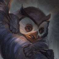
The word "dither" in pixel art is a branch of its vanilla definition, meaning to tremble. And that is a literal, visual representation of what you're making your pixels do, shake outside of their normal spheres. Dithering is used to create additional colors and shades from an existing palette by interspersing pixels of different colours. On a monochrome display, areas of grey are created by varying the proportion of black and white pixels. The different colours can either be distributed randomly or regularly. Basically, your mixing colors without adding to your color count and smoothing the transition between two contrasting colors.
The traditional and most basic form of dithering is the 50% dither, a checkerboard between two acting colors. As the above example illustrates, there are many ways to buffer between a solid color and a 50% dither, so be creative!
The 50% dither, much like banding, is something that is easily recognizable and allows your eye to pick up on the underlying grid, thus interrupting the audiences whole view on the piece . If you use dithering, do so selectively. It can be just as damaging to a piece as it is successful. Not all pieces need dithering!
Other categories of dithering include
stylized and
random dithering, however these are advanced techniques and should be reserved until one is comfortable with dithering. They have the added potential of including unnecessary, harmful pixel "noise" to your piece.
Easy. This time it's up to you to use the above tools to fix any problems with the existing shading on your shape. Most of you already have (whether intentional or not), but define a light source, shade/highlight appropriately, and dither out your pixels. All using the palette you made in the last lesson. If you need to, make adjustments to your palette but remember to post the new one. So to recap:
You guys are doing great.


![[PokeCommunity.com] Pixel Art](https://i.imgur.com/FmtOKFy.png "[PokeCommunity.com] Pixel Art")

![[PokeCommunity.com] Pixel Art](https://i.imgur.com/jshmbPV.png "[PokeCommunity.com] Pixel Art")
![[PokeCommunity.com] Pixel Art](https://i.imgur.com/rHi50Ur.png "[PokeCommunity.com] Pixel Art")
![[PokeCommunity.com] Pixel Art](https://i.imgur.com/MKD9gdX.png%22]https://i.imgur.com/MKD9gdX.png "[PokeCommunity.com] Pixel Art")
![[PokeCommunity.com] Pixel Art](https://i.imgur.com/HVMlZ5n.png?1 "[PokeCommunity.com] Pixel Art")
![[PokeCommunity.com] Pixel Art](https://i.imgur.com/luEHwja.png "[PokeCommunity.com] Pixel Art")
![[PokeCommunity.com] Pixel Art](https://i.imgur.com/mxrEEr8.png "[PokeCommunity.com] Pixel Art")

![[PokeCommunity.com] Pixel Art](https://i1336.photobucket.com/albums/o660/Soulryu17/Trapezium_zpsqqi36an4.png "[PokeCommunity.com] Pixel Art")
![[PokeCommunity.com] Pixel Art](https://i.imgur.com/ovnMTlN.png "[PokeCommunity.com] Pixel Art")
![[PokeCommunity.com] Pixel Art](https://upload.wikimedia.org/wikipedia/commons/d/df/Shading1.png "[PokeCommunity.com] Pixel Art")
![[PokeCommunity.com] Pixel Art](https://upload.wikimedia.org/wikipedia/commons/thumb/7/7c/Shading2.svg/227px-Shading2.svg.png "[PokeCommunity.com] Pixel Art")
![[PokeCommunity.com] Pixel Art](https://upload.wikimedia.org/wikipedia/commons/2/2c/Shading3.PNG "[PokeCommunity.com] Pixel Art")
![[PokeCommunity.com] Pixel Art](https://i.imgur.com/CHZp0h4.png "[PokeCommunity.com] Pixel Art")
![[PokeCommunity.com] Pixel Art](https://i.imgur.com/n75Mm9P.png "[PokeCommunity.com] Pixel Art")
![[PokeCommunity.com] Pixel Art](https://i.imgur.com/NN0MRGs.gif "[PokeCommunity.com] Pixel Art")
![[PokeCommunity.com] Pixel Art](https://i.imgur.com/Xsmjfop.png "[PokeCommunity.com] Pixel Art")
![[PokeCommunity.com] Pixel Art](https://i.imgur.com/TicRm6v.png "[PokeCommunity.com] Pixel Art")
![[PokeCommunity.com] Pixel Art](https://i.imgur.com/8lMX9X7.gif "[PokeCommunity.com] Pixel Art")
![[PokeCommunity.com] Pixel Art](https://i.imgur.com/jXvZmPg.png "[PokeCommunity.com] Pixel Art")
![[PokeCommunity.com] Pixel Art](https://i.imgur.com/Rsbnq.png "[PokeCommunity.com] Pixel Art")
![[PokeCommunity.com] Pixel Art](https://i.imgur.com/vH6uoL9.png "[PokeCommunity.com] Pixel Art")
![[PokeCommunity.com] Pixel Art](https://i.imgur.com/rFsdxvR.png "[PokeCommunity.com] Pixel Art")

![[PokeCommunity.com] Pixel Art](https://i.imgur.com/MKD9gdX.png"]https://i.imgur.com/MKD9gdX.png "[PokeCommunity.com] Pixel Art")
![[PokeCommunity.com] Pixel Art](https://i.imgur.com/ocLRFaf.png "[PokeCommunity.com] Pixel Art")
![[PokeCommunity.com] Pixel Art](https://i.imgur.com/kZZA6oj.png "[PokeCommunity.com] Pixel Art")