KingCharizard
C++ Developer Extraordinaire
- 1,229
- Posts
- 14
- Years
- Pennsylvania
- Seen May 15, 2016
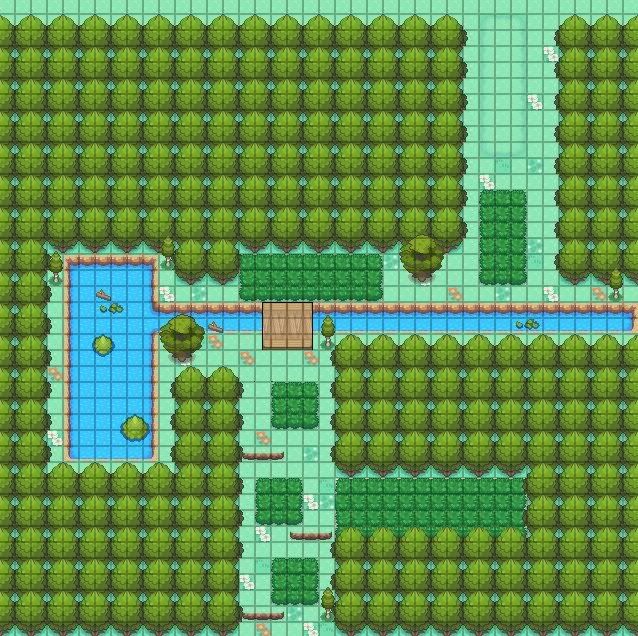
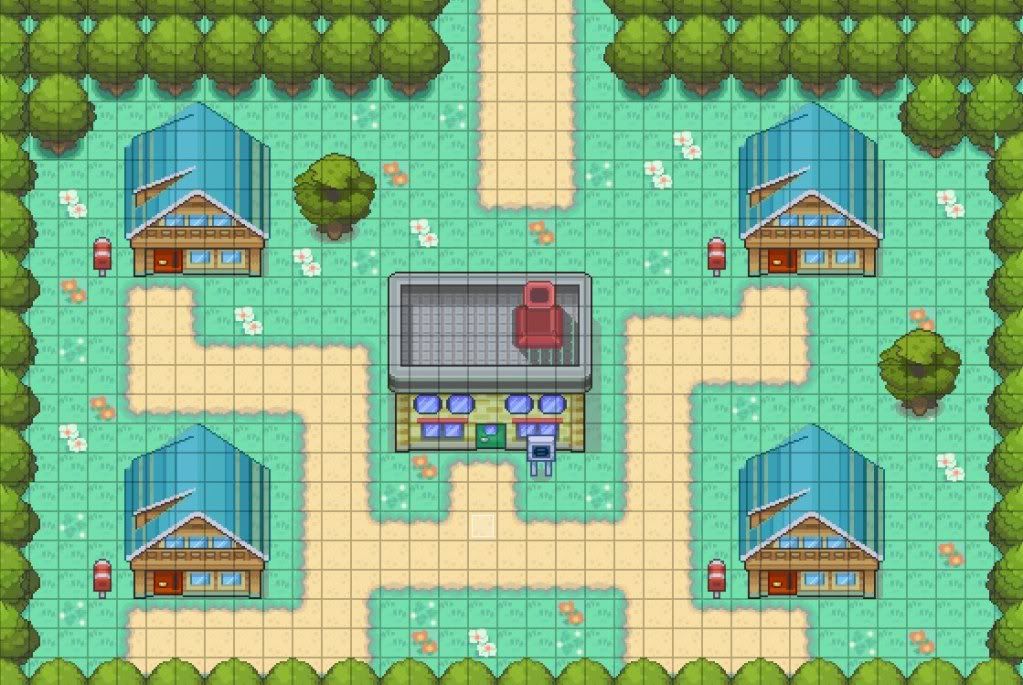
Too square for my liking but if square is what you were going for then good job other wise try to make the route look more nature madeThanks for the advice lx_theo!
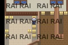
I edited the lab so it wouldn't look "bad".
The town actually has enough tiles so that the player can't see the black.
I used 1x not 2x while taking the screenshot that's why.
Here's a new map:
Spoiler:
It's my First Route!