The layout makes my gallery layout look so amateur-ish in comparison, haha. CSS is just amazing here, so yes, props on that! Looking real smooth. :)
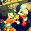
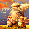
Anyway, moving on, your icons - they're lovely. Quite a lot of them, actually. And most work due to your typography. You're reeeeeeeaaaaaaalllly good when it comes to typography in icons. These ones for instance:
http://i1140.photobucket.com/albums/n576/littlelambie2/breakaway.png
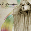
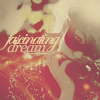
http://i1140.photobucket.com/albums/n576/littlelambie2/inspirationimagination.png
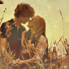
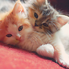
http://i1140.photobucket.com/albums/n576/littlelambie2/breeze.png
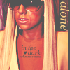
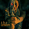
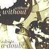
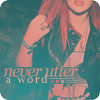
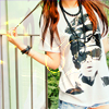
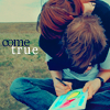
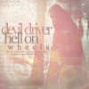
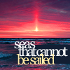
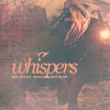
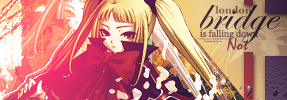
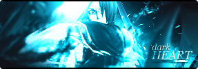
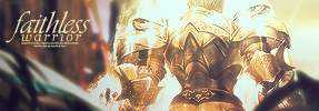
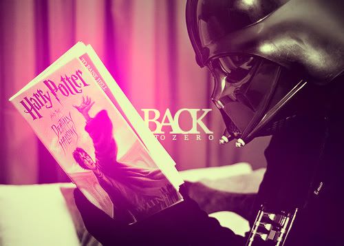
They just work. Really, really well. There are icons where this style doesn't seem to work that well, imo, but they're still good enough for the most part. Problems arise when you translate the same kind of typography into your banners. The style just doesn't work. In most, imo. The only ones where the text looks good (nevermind the placement for now, I'll talk about it in a bit..), imo, are these two:
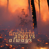
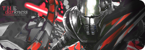
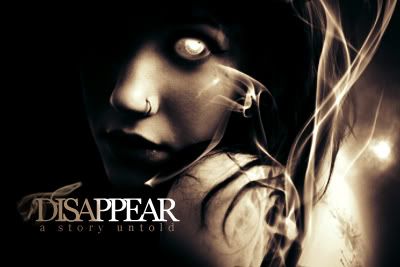
http://i1140.photobucket.com/albums/n576/littlelambie2/thedarkness.png
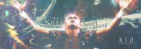
http://i1140.photobucket.com/albums/n576/littlelambie2/faithlesswarrior.png
They're compact - don't take up unnecessary space - and fit the atmosphere of the tag. But the fact that I could only find two examples of text done well out of so many probably points to the fact that you can work on typography in tags in general. Don't try to restrict yourself to the style you go for in icons and replicate them here - go for varied fonts, orientations, various sizes and letter spacing. Experiment more, in short.
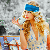
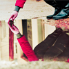
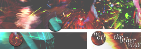
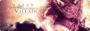
Now, with that out of the way - Placement. Text placement could be improved quite a bit, imo. Rule of the thumb is not to place text too far away from the focal of a tag. It'll end up as nothing but a distraction and serve as a secondary focal instead of serving as a means to compliment the focal itself. A wise man once told me - try not to have the text touch corners - I've been following this ideology for a while now with satisfactory results, haha. Maybe try it out yourself as well, hmm? ;3 Try not to have the text occupy a lot of space like in this tag:
http://i1140.photobucket.com/albums/n576/littlelambie2/watchyourselfbecomeavillain.png
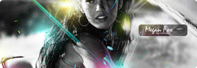
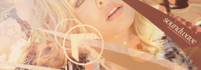
Even text that's small in size surrounded by a black box-type thingy in order for the text to stand out from background ends up looking ~sorta~ awkward like in
http://i1140.photobucket.com/albums/n576/littlelambie2/meganfox.png
In short, for your tags, I'd try mixing things up a bit. Experiment with fonts, sizes and try different text placements.
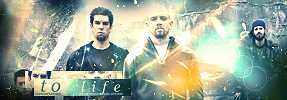
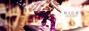
Try not to go overboard or ~underboard~ with effects, either. Former case can be seen here:
http://i1140.photobucket.com/albums/n576/littlelambie2/tolife.png
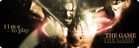
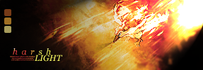
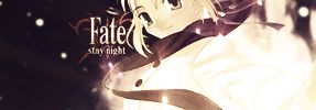
A lot of bookeh + light textures/grains there. Just makes the whole thing look messy. Try to limit the amount of effects to a degree where the stock/render doesn't get overwhelmed - the effects should be built around the stock in order to enhance/compliment the look of the stock and not overwhelm it - as is the case here. Also, try not to have the tag be too plain either - with the minimum amount of effects and whatnot. Makes the result look bland. As is the case here, imo:
http://i1140.photobucket.com/albums/n576/littlelambie2/fate.png
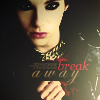
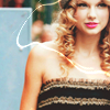
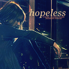
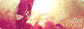
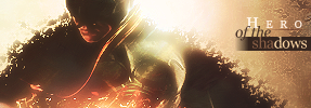
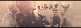
I still have quite a bit to say but I think I'll either make another post later on or maybe edit this one (got home from a 16 hour journey and haven't slept for a while now). For now, I'll just say that this tag of yours is impressive:
http://i1140.photobucket.com/albums/n576/littlelambie2/thedarkness.png
I just really, really like the c4d usage and the great usage of monotone. The font placement is awkward but that's probably the only immediate problem I see, tbh. Stands out quite a bit from your other tags imo.
Anyway, yeah, just my two cents and I'll be sure to edit this later on with my thoughts on your LPs + sprites and some more stuff about your icons and tags. Keep it up. Again, gallery layout is amazeballs.