

If you were going for sinister, then you've managed it. It just seems like a recolour for the sake of it, rather than trying to make it look good. The same goes even more so for your battle screen (and the Gen 5 battle bases for the sake of newer graphics rather than using the much superior ones that Essentials came with).I've changed my summary text, working on other things.

Criticsm appreciated, plese tell me if the Colors look good with each other or not.
You are using an out of date browser. It may not display this or other websites correctly.
You should upgrade or use an alternative browser.
You should upgrade or use an alternative browser.
Screenshot/Music Showcase
- Thread starter Avatar
- Start date
- Status
- Not open for further replies.
More options
Who Replied?
PiaCRT
[i]Orange Dev[/i]
- 936
- Posts
- 13
- Years
- Age 28
- Mikan Island
- Seen yesterday
Just showing off the Options menu I made. Screen resizing works perfectly:
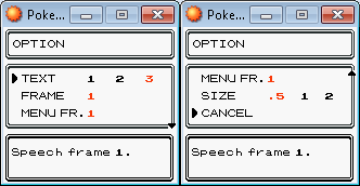
Feedback would be appreciated. I have limited space to work with but I'm happy to hear suggestions.
Feedback would be appreciated. I have limited space to work with but I'm happy to hear suggestions.
nuzamaki90
Knight of The Volt
- 97
- Posts
- 16
- Years
- Age 30
- North Carolina
- Seen Mar 20, 2014
Gonna quickly show off an event in the beginning of the game.

Feedback and constructive criticism would be great. Any suggestions are good at that moment.
Feedback and constructive criticism would be great. Any suggestions are good at that moment.
ppooookkkkkkk
Banned
- 229
- Posts
- 11
- Years
- Age 23
- Newbud town (Pokemon Morning/Night)
- Seen Apr 14, 2014
If you were going for sinister, then you've managed it. It just seems like a recolour for the sake of it, rather than trying to make it look good. The same goes even more so for your battle screen (and the Gen 5 battle bases for the sake of newer graphics rather than using the much superior ones that Essentials came with).
Here I have smoothened and edited some aspects of the summary screen:

I'm keeping the gen 5 battle bg's as I see nothing wrong with them, as I don't have a graphic designer to design me some custom ones so.
Nuzamaki:
The tiles look great they produce the pseudo 3d effect, also I like the GUI.

Rayquaza.
Lead Dev in Pokémon Order and Chaos
- 702
- Posts
- 12
- Years
- Age 27
- United Kingdom
- Seen Jan 24, 2021
I've changed my summary text, working on other things.
Criticsm appreciated, plese tell me if the Colors look good with each other or not.
Not to make it seem like I'm showing off or anything but you really have just recoloured it and put a new background in which doesn't suit the style.

I must apologize for using one of my own but here I have not simply recoloured the image but reinvented the style.
Gonna quickly show off an event in the beginning of the game.
Feedback and constructive criticism would be great. Any suggestions are good at that moment.
This looks really great now that it doesn't look resized like the last one. I love the iterface at the bottom of the screen but I don't think that the tiles mix well with the sprite style simply because it isn't isometric.
Now onto my screens:
Spoiler:
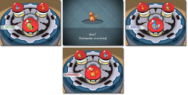
I have a new evolution interface as well as a new starter selection interface and sequence.
Last edited:
I'm not the best with graphics, but how is your "new" summary screen not simply a recolour of the Essentials one? Are you referring to the metallic streaks over it? In any case, it's also dark and sinister when it really doesn't need to be (not to mention any black text is hard to read).Not to make it seem like I'm showing off or anything but you really have just recoloured it and put a new background in which doesn't suit the style.

I must apologize for using one of my own but here I have not simply recoloured the image but reinvented the style.
Rayquaza.
Lead Dev in Pokémon Order and Chaos
- 702
- Posts
- 12
- Years
- Age 27
- United Kingdom
- Seen Jan 24, 2021
I'm not the best with graphics, but how is your "new" summary screen not simply a recolour of the Essentials one? Are you referring to the metallic streaks over it? In any case, it's also dark and sinister when it really doesn't need to be (not to mention any black text is hard to read).
The black text has been fixed as I updated the image 1 minute after your post. I mean that the whole style has been changed. The reason it still resembles that of the essentials one is because changing the position of the text is a difficult job resulting in many errors for the inexperienced scripter.
The black text has been fixed as I updated the image 1 minute after your post. I mean that the whole style has been changed. The reason it still resembles that of the essentials one is because changing the position of the text is a difficult job resulting in many errors for the inexperienced scripter.
It resembles the default essentials one, because it's a recolour... Nothing of the design other than the colours have changed.
Rayquaza.
Lead Dev in Pokémon Order and Chaos
- 702
- Posts
- 12
- Years
- Age 27
- United Kingdom
- Seen Jan 24, 2021
It resembles the default essentials one, because it's a recolour... Nothing of the design other than the colours have changed.
By redesign I mean restyle.

Radical Raptr
#BAMFPokemonNerd
- 1,121
- Posts
- 13
- Years
- Age 29
- everywhere
- Seen yesterday
The black text has been fixed as I updated the image 1 minute after your post. I mean that the whole style has been changed. The reason it still resembles that of the essentials one is because changing the position of the text is a difficult job resulting in many errors for the inexperienced scripter.
One thing I think should be changed is the little square in the corner (i sound stupid but i'll describe it) its the thing thats moved outward signifying you're on the "summary" screen of the pokemon's info, all the other squares are blue I think the one that you're currently on should be something like white or gray
Wow, I guess yours got lost in the slue of new screenies
Nothing special this time around, just a screenshot with an example of the style of the tiles in my next project. We're working on it with the Allegro lib, and the engine is still very rudimentary, as seen by the lack of features onscreen.
(the title is blurred because reasons)
I like the style, its like the actual design of RPG maker instead of the traditional pokemon game
It could go either way but I find it refreshing to use something like this, in any case, the screenshot is pretty good (although theres not much to go off of) the house (or shed really) looks a little tiny and cramped, but I can't wait to see the overworld
Last edited:
By redesign I mean restyle.
That's still not the correct terminology to use with your provided example. A recolour is the most accurate, as that's all it is. The style of an UI does not only consist of of it's background and colors, but also of the various elements within it. That consists of: button positions, fonts, text positions, text styles, and the multitude of the UI images themselves.
This is a recolour of the bag interface. This is a restyle/redesign of the bag interface. See...big difference. And still don't think I'd be arrogant enough to call the second one "completely re-inventing it", because it isn't.
You keep using that word. I do not think it means what you think it means.By redesign I mean restyle.
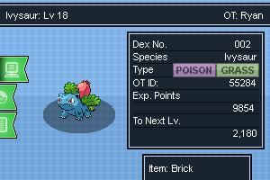
I can't help crawling back to developing a Pokémon game XD. So anyway, decided to work on making a new summary screen for my game Pokemon: Lost souls. Still needs a lot of work doing to it, but you get the basic idea.
ppooookkkkkkk
Banned
- 229
- Posts
- 11
- Years
- Age 23
- Newbud town (Pokemon Morning/Night)
- Seen Apr 14, 2014
I can't help crawling back to developing a Pokémon game XD. So anyway, decided to work on making a new summary screen for my game Pokemon: Lost souls. Still needs a lot of work doing to it, but you get the basic idea.
I looooovveeeee it! good one 100% better than mine!
anyway here is my redesign of my summary screen.

Looks like the original but little different still WIP.
Radical Raptr
#BAMFPokemonNerd
- 1,121
- Posts
- 13
- Years
- Age 29
- everywhere
- Seen yesterday
here is my redesign of my summary screen.
Looks like the original but little different still WIP.
I like the idea, it seems pretty cool, but the problem i have is how everything seems like its in empty space
firstly, theres no borders on the top or bottom, it just seems unnatural to me...theres at least one at the top or bottom, it seems kind of weird without it, like its a simulation or something...its hard to explain but i think it would look good with something, maybe a darker color if you're against a border
second, the text lies on the border in some areas (such as the "item" being too close to the edge, the exp numbers being close to the edge, and the pokeball being close to the corner) if theres was a little more room it would be perfect
finally, an aesthetic choice that you might want to consider, where it says dragonite next to species, and red next to the OT, etc, i think it should be a lighter color than the rest of the background so it gives it a place, rather than being floating in space
it's just something to consider, overall I like it! and I hope you make it even better, you've improved from the original post
Rayquaza.
Lead Dev in Pokémon Order and Chaos
- 702
- Posts
- 12
- Years
- Age 27
- United Kingdom
- Seen Jan 24, 2021
anyway here is my redesign of my summary screen.
Looks like the original but little different still WIP.
It's definitely an improvement from your last attempt. A lot better and there isn't such a clash of colours.
I would recommend putting tabs in to represent the different aspects of it - Trainer Memo, Moves, Ribbons, etc.
Rayquaza.
Lead Dev in Pokémon Order and Chaos
- 702
- Posts
- 12
- Years
- Age 27
- United Kingdom
- Seen Jan 24, 2021
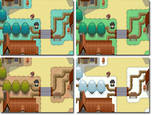
All four seasons taken in Oldoak Town. Something that my never come because of the diversity of different tilesets I use for different maps:
Spoiler:
Does grass normally turn blue in spring and brown in autumn? Also, that's very neatly laid out snow there.All four seasons taken in Oldoak Town. Something that my never come because of the diversity of different tilesets I use for different maps:
Spoiler:
Rayquaza.
Lead Dev in Pokémon Order and Chaos
- 702
- Posts
- 12
- Years
- Age 27
- United Kingdom
- Seen Jan 24, 2021
Does grass normally turn blue in spring and brown in autumn? Also, that's very neatly laid out snow there.
The biomes of the top two are taking inspiration from the seasonal colours used in BW. The bottom two were improvised and the snow I'm still working on, although I have no reason to because this feature may never come.
Minorthreat0987
Pokemon Tellurium
- 462
- Posts
- 18
- Years
- Seen Jan 28, 2021
Just gonna drop these here. This is what I have been working on lately regarding my project Pokemon Tellurium! Progress is going very well, so hopefully I will be creating a thread here very soon! :)
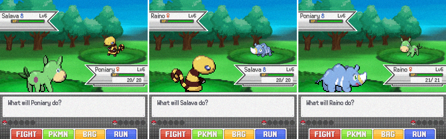
These screens are showcasing the look of the battle system for my game, as well as my new starter Pokemon, designed by the wonderful Riceeman! :)
Enjoy!
These screens are showcasing the look of the battle system for my game, as well as my new starter Pokemon, designed by the wonderful Riceeman! :)
Enjoy!
- Status
- Not open for further replies.