
You are using an out of date browser. It may not display this or other websites correctly.
You should upgrade or use an alternative browser.
You should upgrade or use an alternative browser.
Rate the THEME above you [v.4]
- Thread starter Mr. L
- Start date
More options
Who Replied?~Ryukaa
total nerd
- 1,328
- Posts
- 16
- Years
- Melbourne, Australia
- Seen Apr 5, 2021
The pictures are adorable. I love it!
However, I personally think the text on the banner in your signature could have been pretty'd up a bit more. o3o
But hey! It's not like it looks bad.
Everything's well organised, the art is freaking awesome, and I'm really glad you didn't use a white font for Froakie. xDDD;;
(But adding a stroke to the font would have fixed that, alternatively. o3o)
In terms of the avatar, there's not much to say. It's cute, haha.
They both work well together. It's a good theme!
7/10!
Last edited:

Captain Gizmo
Monkey King
- 4,843
- Posts
- 11
- Years
- Age 30
- Canada
- Seen Jan 30, 2024
5/10
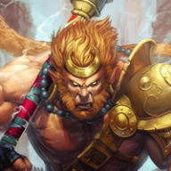
I like the colors and effect on the sig, but not really loving the avatar. And I don't know the person who you're trying to represent :C
Nice CSS tho.
I like the colors and effect on the sig, but not really loving the avatar. And I don't know the person who you're trying to represent :C
Nice CSS tho.

Seth Rollins
Holding on to You |-/
- 2,398
- Posts
- 11
- Years
- Nah
- Seen Feb 28, 2017
10/10.
I love Spider man, so 10.
I love Spider man, so 10.
Captain Gizmo
Monkey King
- 4,843
- Posts
- 11
- Years
- Age 30
- Canada
- Seen Jan 30, 2024
6/10
The sig is actually a good quality, but I don't even know that anime :C
The sig is actually a good quality, but I don't even know that anime :C
Cosmotone8
silhouette of the past
- 1,758
- Posts
- 12
- Years
- Boston, MA, USA, Earth, Sun Solar System, Milky Wa
- Seen Jul 22, 2016
NEEDS TEXT. Other than that 8/10
Dying Light
Pegasus Knight
- 344
- Posts
- 12
- Years
- Exiled
- Seen Oct 2, 2015
5/10.
I'm not a fan of tennis, so the fact that the signature .GIF is funny is its' saving grace.
I'm not a fan of tennis, so the fact that the signature .GIF is funny is its' saving grace.
CourageHound
Trust & Courage. Nothing More
- 823
- Posts
- 11
- Years
- Florida
- Seen Oct 5, 2016
9/10
Looks pretty cool although I'm not sure who he is
Looks pretty cool although I'm not sure who he is
Cosmotone8
silhouette of the past
- 1,758
- Posts
- 12
- Years
- Boston, MA, USA, Earth, Sun Solar System, Milky Wa
- Seen Jul 22, 2016
Avatar has low quality, the image in the middle of the sig is squashed, and the font for the text isn't the best.
4/10
4/10
The Grubby Pup
Where's mah shiny squeaky ball
- 373
- Posts
- 15
- Years
- Lettin' da madness & da music get 2 me!
- Seen May 8, 2016
6/10 Whoops indeed. Cool gif...but tennis doesn't appeal to me, unless I'm seeing giant hammers or turtle monsters blowing fire on tennis balls.
- 866
- Posts
- 11
- Years
- Seen Jul 16, 2014
Wow looks cool but the sig's background is a bit bland.
9/10
9/10