Ever thought it'd be cool to have your art, writing, or challenge runs featured on PokéCommunity? Click here for info - we'd love to spotlight your work!
Welcome to PokéCommunity! Register now and join one of the best fan communities on the 'net to talk Pokémon and more! We are not affiliated with The Pokémon Company or Nintendo.
8/10 Lovin the pic, the text's colors kinda kill it though. Also, not a lot in there either...
haha, i think i fixed the lines issues :P (i was up at 2:30am working on that -.-)
Lots of css is always good, but there only needs to be one scroll bar for the whole thing. The image is nice but could do with some sharpening. The best thing about this sig is the little app like icons, where did you get them from? 65/100
That image is a lot better than the other. 75/100 now. https://img697.imageshack.us/img697/3559/fullmetalu.png
Now I've done that for you, you have to tell me where you found those app icons I looked for for 2 hours yesterday ;)
And thanks.
The banner is blurry and of low quality, mainly because of the stock you used. Also, it's a bit hard to read the text in the banner as well, and the background doesn't blend with said stock.
Well, it's a good sig in my opinion.
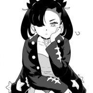
Did you rush ? If yes, you could maybe do something cooler than this one if you take your time.
The colors suit the character, and the text too. The effects are not bad neither.
But, justly, the effects for the text are too...How to say, too thin. You should maybe make them a little less big (the borders I mean), and it should be better.
And also, to make the picture more beautiful, you should play with the contrast between the dark and the light. :P