Welcome to PokéCommunity! Register now and join one of the best fan communities on the 'net to talk Pokémon and more! We are not affiliated with The Pokémon Company or Nintendo.
I've gotta say, at least it's organized. However, I think it would look even better if you used a signature bar/user bar or an icon for the Facebook link. Just my thought process though.
I've thrown together some user bars if you want to use them. I didn't make any of them, just assembled the BB code.
[url=https://facebook.com/trollhan][img]https://i.imgur.com/dZ78p.png[/img][/url]
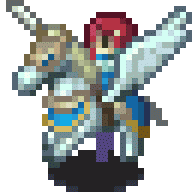
[url=https://facebook.com/trollhan][img]https://i.imgur.com/LWe3l.gif[/img][/url]
[url=https://facebook.com/trollhan][img]https://i.imgur.com/GZC7a.jpg[/img][/url]
[url=https://facebook.com/trollhan][img]https://i.imgur.com/kZaXc.png[/img][/url]
Just copy/paste them into your signature if you want to use them.
Banner is high quality. Not a fan of its contents, though. And CSS is alright. So much spacing wasn't really needed though, imo. Also, the sole "Pokemon Dark Mist" at the bottom looks a little odd. Put it at a CSS box on the top, maybe? :o
6.8//10