Rayquaza.
Lead Dev in Pokémon Order and Chaos
- 649
- Posts
- 13
- Years
- United Kingdom
- Seen Jan 24, 2021
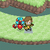
I really like your badges. Two things though.
1: It seems like you're really under-utilizing your space. You've got about 1/3 a screen there just blank, so it feels empty.
2: The "back" looks really weird with the letters being the same color as the background, and the outline doesn't distinguish it enough. Try a thicker outline, or a different font color.
Just my two cents
Thanks. The back button is just a placeholder as I haven't been bothered to make one yet. I'm also not sure what to fill the space with so I'm open to suggestions.
![[PokeCommunity.com] Screenshot/Music Showcase](https://40.media.tumblr.com/d45abc77ec389773dc5347e3d7c8d8c1/tumblr_nfz1r9zwQK1tw3pqeo1_500.png "[PokeCommunity.com] Screenshot/Music Showcase")
![[PokeCommunity.com] Screenshot/Music Showcase](https://40.media.tumblr.com/8bcbcf72393154eb282030f3e821a141/tumblr_nf3fttZiSu1tw3pqeo2_500.png "[PokeCommunity.com] Screenshot/Music Showcase")
![[PokeCommunity.com] Screenshot/Music Showcase](https://38.media.tumblr.com/2b84725d1054365bf8cc698ead98d683/tumblr_ncqeh0DOyQ1tw3pqeo2_500.gif "[PokeCommunity.com] Screenshot/Music Showcase")

![[PokeCommunity.com] Screenshot/Music Showcase](https://i.imgur.com/sKKUVYS.png "[PokeCommunity.com] Screenshot/Music Showcase")
![[PokeCommunity.com] Screenshot/Music Showcase](https://i.imgur.com/fM9mU1M.png "[PokeCommunity.com] Screenshot/Music Showcase")

![[PokeCommunity.com] Screenshot/Music Showcase](https://fc09.deviantart.net/fs70/f/2014/355/4/a/screenshots___gsc_style_pokemon_game_by_gexeys-d8ao6i1.gif "[PokeCommunity.com] Screenshot/Music Showcase")
![[PokeCommunity.com] Screenshot/Music Showcase](https://fc09.deviantart.net/fs70/f/2014/355/c/a/crystal_styled_animation__phantump___708_by_gexeys-d8aobu1.gif "[PokeCommunity.com] Screenshot/Music Showcase")
![[PokeCommunity.com] Screenshot/Music Showcase](https://dl.dropboxusercontent.com/u/10498962/lib/Screenshot%202014-12-26%2015.29.54.png "[PokeCommunity.com] Screenshot/Music Showcase")
![[PokeCommunity.com] Screenshot/Music Showcase](https://dl.dropboxusercontent.com/u/10498962/lib/Screenshot%202015-01-11%2016.05.43.png "[PokeCommunity.com] Screenshot/Music Showcase")