Some tips on my technique or approach on these would be great.
Free palette here, no restrictions. Went with a sort of radial shading.
This is 8 bit, not including transparency. Palette on top.
The Butterfree is flawless, simply put. I really, really really struggle to find anything wrong with it. It's just...perfect <3
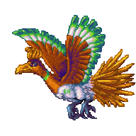
The Ho-oh, however, could be improved somewhat. From afar it looks great; you've got a great sense of colouring, general anatomy and composition. The shading and lineart, however, have room for improvement. Note that I'm not referring to the wings, tail or sky here; they all look pretty good. It's the actual "body" of Ho-oh that bugs me.
To begin with, the outline goes jaggy in
a lot of places. Here are the ones I could identify:
If I were not lazy, I'd explain why these are jaggies/how to do smooth outlining, but I have faith that you can google "pixel art jaggy outline tutorial" or something.
Lineart aside, in some places the shading is too flat (see: the green "strip" on Ho-oh's neck), but most of all I think you should anti-alias (again, google that shizz) the colours as the transition seems very rough and clashes with the almost glossy look the rest of the picture has (correct me if I'm way off).
It's still a way better piece then I could do, the background is stunning and the wings are really a marvel, so well done etc. dude :D


![[PokeCommunity.com] Spriters Showcase Thread](https://i56.tinypic.com/4r3gut.png "[PokeCommunity.com] Spriters Showcase Thread")
![[PokeCommunity.com] Spriters Showcase Thread](https://i54.tinypic.com/142bytk.png "[PokeCommunity.com] Spriters Showcase Thread")
![[PokeCommunity.com] Spriters Showcase Thread](https://i937.photobucket.com/albums/ad217/GreatMazinger_sup_m/Untitled-3-2.png "[PokeCommunity.com] Spriters Showcase Thread")
![[PokeCommunity.com] Spriters Showcase Thread](https://oi52.tinypic.com/2hhpzsw.jpg "[PokeCommunity.com] Spriters Showcase Thread")
![[PokeCommunity.com] Spriters Showcase Thread](https://i55.tinypic.com/2emomxc.png "[PokeCommunity.com] Spriters Showcase Thread")
![[PokeCommunity.com] Spriters Showcase Thread](https://img838.imageshack.us/img838/2580/fakemon003.png "[PokeCommunity.com] Spriters Showcase Thread")
![[PokeCommunity.com] Spriters Showcase Thread](https://i1178.photobucket.com/albums/x371/ares102/moorwen2.jpg "[PokeCommunity.com] Spriters Showcase Thread")
![[PokeCommunity.com] Spriters Showcase Thread](https://i41.tinypic.com/wmleh5.png "[PokeCommunity.com] Spriters Showcase Thread")
![[PokeCommunity.com] Spriters Showcase Thread](https://i44.tinypic.com/35hpgdf.jpg "[PokeCommunity.com] Spriters Showcase Thread")
![[PokeCommunity.com] Spriters Showcase Thread](https://i40.tinypic.com/20jo29u.png "[PokeCommunity.com] Spriters Showcase Thread")

![[PokeCommunity.com] Spriters Showcase Thread](https://desmond.imageshack.us/Himg401/scaled.php?server=401&filename=86525739.png&res=medium "[PokeCommunity.com] Spriters Showcase Thread")
![[PokeCommunity.com] Spriters Showcase Thread](https://fc00.deviantart.net/fs70/f/2011/348/7/b/the_phoenix_by_gavzxhayley-d4j3fgo.png "[PokeCommunity.com] Spriters Showcase Thread")
![[PokeCommunity.com] Spriters Showcase Thread](https://fc09.deviantart.net/fs70/f/2011/349/2/7/8bitfreeeee_by_gavzxhayley-d4j66mc.png "[PokeCommunity.com] Spriters Showcase Thread")
![[PokeCommunity.com] Spriters Showcase Thread](https://img51.imageshack.us/img51/3026/094gengarrg.png "[PokeCommunity.com] Spriters Showcase Thread")
![[PokeCommunity.com] Spriters Showcase Thread](https://img818.imageshack.us/img818/2962/gengary.png "[PokeCommunity.com] Spriters Showcase Thread")
![[PokeCommunity.com] Spriters Showcase Thread](https://img530.imageshack.us/img530/6058/62999306.png "[PokeCommunity.com] Spriters Showcase Thread")

![[PokeCommunity.com] Spriters Showcase Thread](https://fc03.deviantart.net/fs71/f/2012/004/d/f/pokemon_orange_titlescreen___final_by_pokemon_tiler-d4lchuh.png "[PokeCommunity.com] Spriters Showcase Thread")

![[PokeCommunity.com] Spriters Showcase Thread](https://i.imgur.com/RItGu.png "[PokeCommunity.com] Spriters Showcase Thread")