
-
Ever thought it'd be cool to have your art, writing, or challenge runs featured on PokéCommunity? Click here for info - we'd love to spotlight your work!
-
PokéCommunity's Easter Egg Hunt is now on! If you're interested in looking for some eggs and earning badges, click here!
-
Our weekly protagonist poll is now up! Vote for your favorite Conquest protagonist in the poll by clicking here.
You are using an out of date browser. It may not display this or other websites correctly.
You should upgrade or use an alternative browser.
You should upgrade or use an alternative browser.
The Graphics Rating Thread [READ THE FIRST POST. D:<]
- Thread starter Loki
- Start date
- Status
- Not open for further replies.
More options
Who Replied?Slumber
take a slumber~
- 61
- Posts
- 15
- Years
- philippines/dubai
- Seen Jun 16, 2013
not a great rater but there it goes...I like the colors in all of them, and my favorite is the last one because of the little sparkles around it, but on the second one you over used them.
![[PokeCommunity.com] The Graphics Rating Thread [READ THE FIRST POST. D:<]](https://i1023.photobucket.com/albums/af353/CjP_DoMiNaToR/gwag.png "[PokeCommunity.com] The Graphics Rating Thread [READ THE FIRST POST. D:<]")
well first of all I don't like the way you place the text, it needs more aligning.
and that wavy stuffs on the right side looks kinda weird, so I don't like that one. :\
And you need to work on the colors and I think you just did a lot of brushes and smudge there...don't know...but try adding some stocks/ c4ds that will work.
so here:
![[PokeCommunity.com] The Graphics Rating Thread [READ THE FIRST POST. D:<]](https://i724.photobucket.com/albums/ww244/HolyDragonLX/Signatures/AnimeTagv2.png "[PokeCommunity.com] The Graphics Rating Thread [READ THE FIRST POST. D:<]")
- 1,396
- Posts
- 17
- Years
- The suburbs, and no I don't need to describe much
- Seen Dec 21, 2015
@slumber: What you need to work on is the annoying lack of color. I mean really, its like brownish all effin over the tag, besides that lil streak of red. Um, also it seems really LQ (low quality). And I think you could sharpen the focus a bit more, and blur other parts because the depth is really throwing me.
rate please:
![[PokeCommunity.com] The Graphics Rating Thread [READ THE FIRST POST. D:<]](https://i91.photobucket.com/albums/k284/andytoe/explore.png "[PokeCommunity.com] The Graphics Rating Thread [READ THE FIRST POST. D:<]")
rate please:
![[PokeCommunity.com] The Graphics Rating Thread [READ THE FIRST POST. D:<]](https://i909.photobucket.com/albums/ac294/mrhaxmaster/rainybanner4mysig.png "[PokeCommunity.com] The Graphics Rating Thread [READ THE FIRST POST. D:<]")
the bitter end.
.only slightly insane
- 1,709
- Posts
- 16
- Years
- Age 28
- In your mind
- Seen Feb 8, 2012
It's... quite a bit below average. It's pretty much just a render of a lugia slapped onto a gradient with some crappy text. I say the text is crappy because it's stroked. Don't stroke text, it look unattractive and unprofessional.
Rate:
![[PokeCommunity.com] The Graphics Rating Thread [READ THE FIRST POST. D:<]](https://i406.photobucket.com/albums/pp142/Raidensakura/Godofdeath.png "[PokeCommunity.com] The Graphics Rating Thread [READ THE FIRST POST. D:<]")
Rate:

Aizuke
[b]long sword style[/b]
- 3,025
- Posts
- 17
- Years
- Canberra, Australia
- Seen Nov 6, 2015
Both of you guys have failed to rate Comic Tragedy's post, if you have realised so instead I will.
To be honest I'm not liking the effects, and there's too much wide open space, even if the effects fill up the space. The placement of the render is good though, but the blue background sticks out more than the render itself. And it lacks a little bit of lighting and depth. I'd say if you added some shading, it would give a lot of depth that would fit the line effects. I'd say it's good you tried something new, but unfortunately, I don't think it's a very successful piece in my opinion. But it is different, I'll give you that.
rate please:
To be honest I'm not liking the effects, and there's too much wide open space, even if the effects fill up the space. The placement of the render is good though, but the blue background sticks out more than the render itself. And it lacks a little bit of lighting and depth. I'd say if you added some shading, it would give a lot of depth that would fit the line effects. I'd say it's good you tried something new, but unfortunately, I don't think it's a very successful piece in my opinion. But it is different, I'll give you that.
Last edited:
Hiii, I know its not really 'Graphics' , but what do you guys think of my little clay Cleffa that I made?
Nice, looks great, just like the real thing.
What do you guy think of the sig I made last night, it is the first on I have made so im really interested in feedback.
![[PokeCommunity.com] The Graphics Rating Thread [READ THE FIRST POST. D:<]](https://i4.photobucket.com/albums/y124/spike6958/First-Sig.gif "[PokeCommunity.com] The Graphics Rating Thread [READ THE FIRST POST. D:<]")
Aizuke
[b]long sword style[/b]
- 3,025
- Posts
- 17
- Years
- Canberra, Australia
- Seen Nov 6, 2015
spike6958; I think it's a bit plain and too monotoned. Though it's good for your first try, but it seems too simplistic. I like the size though, but I think you should retry it and add more things to it, like textures, or C4D's or lighting. Basically anything, because right now it just seems you've put a render over a background that's been smudged a bit, and changed the colour.
Next poster rate spike6958's tag.
Next poster rate spike6958's tag.
Zebra Thunderhead
the avenger
- 3,159
- Posts
- 17
- Years
- Age 33
- Massachusetts
- Seen Jul 3, 2013
I think the tag would be better in black and white if you're going for monotone. It's really plain right now so try adding a couple of effects to spice it up, especially the background. If you're at a road block, don't be afraid to look at some tutorials around here.
----------------------------------------------------------------------------------------------------------------------------------------
![[PokeCommunity.com] The Graphics Rating Thread [READ THE FIRST POST. D:<]](https://i601.photobucket.com/albums/tt95/citricbreakdown/nevesykcul.png "[PokeCommunity.com] The Graphics Rating Thread [READ THE FIRST POST. D:<]")
----------------------------------------------------------------------------------------------------------------------------------------
]
It's seems very empty, but in the parts where there is something it's to crowded.
Maybe do something about the background.
6.5/10, after some changes, 9/10.
Now mine, it sucks nothing here.
rate above me.
I think the tag would be better in black and white if you're going for monotone. It's really plain right now so try adding a couple of effects to spice it up, especially the background. If you're at a road block, don't be afraid to look at some tutorials around here.
----------------------------------------------------------------------------------------------------------------------------------------
It's seems very empty, but in the parts where there is something it's to crowded.
Maybe do something about the background.
6.5/10, after some changes, 9/10.
Now mine, it sucks nothing here.
rate above me.
Last edited:
Unforgettable
Melodies of Life
- 1,620
- Posts
- 17
- Years
- Kentucky
- Seen Jan 3, 2013
If you were going for the random affect, you got that. But to me, it just looks like a bunch of brushes thrown on there and that's it. There is too much going on around the name, it doesn't stand out too much. Maybe try and but a shadow on it. I don't know. Next time, maybe use a stock or render? It's a bit bland.
Next person rate Ben's graphic!
Next person rate Ben's graphic!
@Ben.
Tbh, it's all just messy brushing, the different themes of the brushes don't really work well with each other, and it's very monotone, really doesn't take much effort to do something like that, believe me I know, I've done it before.
Rate ben's graphic.
Tbh, it's all just messy brushing, the different themes of the brushes don't really work well with each other, and it's very monotone, really doesn't take much effort to do something like that, believe me I know, I've done it before.
Rate ben's graphic.
Zebra Thunderhead
the avenger
- 3,159
- Posts
- 17
- Years
- Age 33
- Massachusetts
- Seen Jul 3, 2013
Rate and comment please.
![[PokeCommunity.com] The Graphics Rating Thread [READ THE FIRST POST. D:<]](https://i48.tinypic.com/2vl3ytj.png "[PokeCommunity.com] The Graphics Rating Thread [READ THE FIRST POST. D:<]")
It's a bit dull. I'd get rid of whatever black you have over the entire piece and bump up the saturation a little bit. The stock seems a bit too big for the small canvas as it has a bit of floating head syndrome. The text all just seems slapped on as well.

Misheard Whisper
[b][color=#FF0000]I[/color] [color=#FF7F00]also[/c
- 3,488
- Posts
- 16
- Years
- Age 30
- He/They
- Nimbasa Gym
- Seen Oct 3, 2022
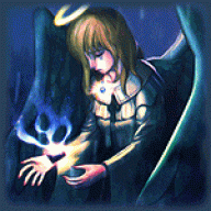
I'mma rate this one. Contrary to what many people seem to think, sometimes less is more. The large grey area doesn't really bother me, although I'd have used a different colour - perhaps a soft grey-green? In the context of being empty, though, that's good and fine. The little effects you've used around Link are nice and colourful, plus neatly arranged to boot. Nice little sparkles around as well - subtle, not too 'IN YO FACE'. I'd say 9/10.
This is, hmm. It's . . . I don't know if I'd call it a work in progress, because I tell myself I finished it. The font doesn't look that great - I personally don't like it - but it fits the best with the story it's advertising. I reckon the splatter could use toning down, too . . .
Aagh, the hell? I'm rating my own graphic. Here:
![[PokeCommunity.com] The Graphics Rating Thread [READ THE FIRST POST. D:<]](https://i690.photobucket.com/albums/vv263/Misheard_Whisper/Artificial.png "[PokeCommunity.com] The Graphics Rating Thread [READ THE FIRST POST. D:<]")
I'mma rate this one. Contrary to what many people seem to think, sometimes less is more. The large grey area doesn't really bother me, although I'd have used a different colour - perhaps a soft grey-green? In the context of being empty, though, that's good and fine. The little effects you've used around Link are nice and colourful, plus neatly arranged to boot. Nice little sparkles around as well - subtle, not too 'IN YO FACE'. I'd say 9/10.
This is, hmm. It's . . . I don't know if I'd call it a work in progress, because I tell myself I finished it. The font doesn't look that great - I personally don't like it - but it fits the best with the story it's advertising. I reckon the splatter could use toning down, too . . .
Aagh, the hell? I'm rating my own graphic. Here:
Oh, wow it looks really good.. :D I like the colours, and that eye is really awesome, tho what concerns me is the text, it doesn't look good, it doesn't blend in, and that goes for all the text, it just looks random, except for 91 and 78.. But I think you should have gone with another font type or a smaller size.. Also the text at the top really doesn't fit in.. And Artificial doesn't look good like that.. So you (and me) need to go find a good text tut.. (Yes I'm horrible with text myself).. Anyway overall 8/10 :D
So can someone please rate my banner.. ?
![[PokeCommunity.com] The Graphics Rating Thread [READ THE FIRST POST. D:<]](https://i695.photobucket.com/albums/vv318/angela1992123/Bub.png "[PokeCommunity.com] The Graphics Rating Thread [READ THE FIRST POST. D:<]")
Zebra Thunderhead
the avenger
- 3,159
- Posts
- 17
- Years
- Age 33
- Massachusetts
- Seen Jul 3, 2013
There's no depth, no flow, no real palette of colors. To be honest, it looks like a hot mess. I know you can do better than that. That stock is hard to work with since there's nothing dynamic about it. I suggest you scrap it, unless you can make a better manip of it. There's some manip tuts lurking around the internet.
------------
![[PokeCommunity.com] The Graphics Rating Thread [READ THE FIRST POST. D:<]](https://i601.photobucket.com/albums/tt95/citricbreakdown/spankthekrank.png "[PokeCommunity.com] The Graphics Rating Thread [READ THE FIRST POST. D:<]")
hurr hurr
------------
hurr hurr
Unforgettable
Melodies of Life
- 1,620
- Posts
- 17
- Years
- Kentucky
- Seen Jan 3, 2013
I have to say, I am in love with this. I would love to see a Tutorial on it, to be honest.
I'm not really fond of how the color did on her lips. And it could be a bit too sparkly for some people's tastes. But over all, this is one of my favorites of your's.
RATE ZEBRA THUNDERHEAD'S TAG.
I'm not really fond of how the color did on her lips. And it could be a bit too sparkly for some people's tastes. But over all, this is one of my favorites of your's.
RATE ZEBRA THUNDERHEAD'S TAG.
I'm really not good enough to rate this xD But I'm really loving on the concept of the tag, and the colours in it overall. Besides that, like Jared said, I'm not too fond of her lips, the colors look really choppy there, and the two glowing spots near her eyes are a bit irksome since they look exactly the same. It might be better if one had been eliminated, or at least sized down somehow, but at the same time, that might just be me ^^" To be honest though, this piece is really eye catching, and definitely interesting.
Mrehehe, Bill Kaulitz
I figured I might as well get this rated, since I haven't touched Photoshop for months and need critique (not to mention I was never that good to begin with >w<)
Version 1
![[PokeCommunity.com] The Graphics Rating Thread [READ THE FIRST POST. D:<]](https://i530.photobucket.com/albums/dd341/Tr0ubl3magn3t/Dreams2-1.png "[PokeCommunity.com] The Graphics Rating Thread [READ THE FIRST POST. D:<]")
Version 2
![[PokeCommunity.com] The Graphics Rating Thread [READ THE FIRST POST. D:<]](https://i530.photobucket.com/albums/dd341/Tr0ubl3magn3t/Dreams1.png "[PokeCommunity.com] The Graphics Rating Thread [READ THE FIRST POST. D:<]")
Mrehehe, Bill Kaulitz
I figured I might as well get this rated, since I haven't touched Photoshop for months and need critique (not to mention I was never that good to begin with >w<)
Version 1
Version 2
Empty Pot
a new beginning...
- 1,234
- Posts
- 15
- Years
- Age 29
- North America
- Seen Aug 5, 2023
I
Version 1
Version 2
I'm not someone that is skilled at rating, but I think both versions are great. On version one, the wing almost looked like there was a wing on the render. Overall, both versions are a 9.5/10.
With permission of Loki, I got the okay for me to put photography in this thread. I need some pointers and to know if this is good enough for a first attempt and with a cell phone. I only used Sharpen effect, so more ideas could work.
Spoiler:
![[PokeCommunity.com] The Graphics Rating Thread [READ THE FIRST POST. D:<]](https://i47.tinypic.com/23ho9wm.jpg "[PokeCommunity.com] The Graphics Rating Thread [READ THE FIRST POST. D:<]")
- Status
- Not open for further replies.