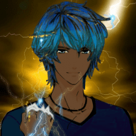
I don't mind archie and maxie's redesigns. Actually, I am digging the more pirate look of Aqua. Still, they messed up tabitha... It feels as if he was just found on the street, and they gave him a position in magma just for comic relief. To me, he feels like some kind of intern, not a villain.
Shelly should have kept her red hair. It made her unique, and broke up the monotony of the blacks, browns, and blonds that normally pop up in games. Now, even though her redesign is interesting, she doesn't have the same feel as she did in the originals.
Maybe, they changed her hair color so she wouldn't be mistaken for flannery? Meh
I hate May's redesign. The ruffles at the bottom of the shirt just feel mismatched, and out of place. The bow should have remained a bandanna. Her face looks...odd... And, hopefully there will be an option to change her hair.
Brendan looks...interesting. I wish they would have made the shorts a little less baggy, to give it a more streamline look. But, meh. I am also not very fond of his shoes. The look on his face is a little odd... I also wish that they would have made his hair darker, or white.
But, like with some other characters from previous gens, I am sure they will grow on me eventually~

![[PokeCommunity.com] Whose design did they ruin the most?](https://archives.bulbagarden.net/media/upload/9/9e/Tabitha.png "[PokeCommunity.com] Whose design did they ruin the most?")
![[PokeCommunity.com] Whose design did they ruin the most?](https://archives.bulbagarden.net/media/upload/5/51/Spr_RS_Tabitha.png "[PokeCommunity.com] Whose design did they ruin the most?")