• Our software update is now concluded. You will need to reset your password to log in. In order to do this, you will have to click "Log in" in the top right corner and then "Forgot your password?".
  • Welcome to PokéCommunity! Register now and join one of the best fan communities on the 'net to talk Pokémon and more! We are not affiliated with The Pokémon Company or Nintendo.

Map Rating/Review Thread

Status
Not open for further replies.
860
Posts
17
Years
I fully understand what both of you mean ;) To be honest I won't edit it because I don't like re-doing a map, I will then make a new one or something XD

ut off-this topic: Are there people who feel like adopting Breakdown?? I have to say that I will only give it away to an experienced hacker...
 

Thrace

@tion
1,048
Posts
16
Years
  • Age 33
  • Seen Oct 2, 2016
Been a while since I posted here.

Spoiler:

I guess I got left out :(
PLease rate everything exept the palette glich in the water grass!
Rating: 4/10
Reason: The tiles are really throwing me off on this. As are the palletes. Its just too boring. The grass is placed awkwardly. The paths don't look good.
Suggestions: Fix the paths. Remove the random hill thats in the middle. Add more grass.

8
Spoiler:

credit to fenderX and Alistar for the rom base.
Rating: 3/10
Reason: The river looks absolutely horrid. The mountains are set out awkwardly not to mention look completely unnatural. There is too much empty space and I'm not crazy about the tile selection.
Suggestions: Get better tiles. Fix the tile errors. Make the beach smaller. Make the map smaller. Maybe join some of the mountains together. You could try all those but I think it would be best just to start over.

Map Name: Undecided
Map Game: Pokemon Crimson Version
Map Shot:
Spoiler:
Spoiler:

Rating: 6/10
Reason: The path looks... nice, not great but nice. Why are the trees arranged like that? I guess its just personal preference but I think they look really bad like that. That small blue roofed house looks ugly.
Suggestions: Remove that small house. Use some flowers.
 
1,619
Posts
16
Years
name of map : route 1

using : fire red

comments : iv changed my mapping style and i want to see if it's better so please rate !

map:


credits to Disturbed for rombase
 

Thrace

@tion
1,048
Posts
16
Years
  • Age 33
  • Seen Oct 2, 2016
name of map : route 1

using : fire red

comments : iv changed my mapping style and i want to see if it's better so please rate !

map:
Spoiler:


credits to Disturbed for rombase
Rating: 6/10
Reason: It looks decent enough. The shape is OK, not amazing. The shape of the mountains don't look too good. Paths aren't made well.
Suggestions: Put the grass in bigger clumps. Remap the mountainous parts. Re arrange the paths. Look at some maps that you like and compare.
 

Dratii

Working on something new...
195
Posts
15
Years
  • Seen Oct 24, 2023
Another map by me...
Spoiler:

That map is great looking but.........
well.......
???? I don't know it just doesn't seem.....
maybe it is just no grass on the walking spots that makes it seem...
different
8.9/10

@~element your map has been rated further up
and I give it a 4.5/10
Reason: The whole map as a whole seems odd, mountain shape, lake shape, tree placement, and the trees have tile errors
 
Last edited:
860
Posts
17
Years
Another map by me...
Spoiler:

That map is great looking but.........
well.......
???? I don't know it just doesn't seem.....
maybe it is just no grass on the walking spots that makes it seem...
different
8.9/10
Hmm thanks ;), but I think the maps a bit confusing...
I'll explain it has to be some sort of school for a first map and the whole map is like the schools property so there's no grass in the walking area because it's some kind of town ;) lolz

More ratez on my map in spoiler above?
 

loitraitim

Hoài Niệm Dấu Yêu
60
Posts
16
Years
Sorry, new maps have been added hours ago! :P

Anyways:
Rating: 7.8/10
Errors: It still seems a little too square to me, and there are a few empty spots. I also don't really like what you did with the path near the Elite Four Building.
Suggestions: Fix what I just said. xD
Comments: This is still quite a nice map, and after seeing your other maps, I look forward to seeing more maps by you.

Okay... i remake it... so here:
crazyvie03ay2.png


Wind, you like it?
And everyone may be... rate for it ^^
 

Dratii

Working on something new...
195
Posts
15
Years
  • Seen Oct 24, 2023
A new map from me
Rom: FR
Comments: A maze like route.
Start-5.jpg
 

Ninja Caterpie

AAAAAAAAAAAAA
5,979
Posts
16
Years
dratii, that's a pretty good map!
8.5/10
The tree shading is near-perfect and the grass is placed pretty well...BUT!
Those mountains. Those mountains. They look really nice! Haha, you're doing really well, my young apprentice!
Not much else to say, really. :D
 
5,814
Posts
16
Years
  • Age 30
  • Seen May 19, 2021
Okay... i remake it... so here:
crazyvie03ay2.png


Wind, you like it?
And everyone may be... rate for it ^^

There is still a bit of empty space.
The path is nice, and the placement of the houses and people/Pokémon is nice too.
Though, grass in a town isn't a good idea, unless it's unreachable..in my opinion.
It's also a little square too, but overall, it's a very nice map. :)
6.2/10~
 

.Iramet

Banned
273
Posts
15
Years
There is still a bit of empty space.
The path is nice, and the placement of the houses and people/Pokémon is nice too.
Though, grass in a town isn't a good idea, unless it's unreachable..in my opinion.
It's also a little square too, but overall, it's a very nice map. :)
6.2/10~

If you notice on the top going to the next route that is the battle grass, what you see in the map is just a vegetation tile Wind~.
^_^
And as for the map I think it is a bit square but it still looks pretty good(anyway who made up this square thing).
I give it a 8/10.
I think you should try and maybe put in a new house(I never understood why their are little places in the middle of the woods with a lab and a house or two).
 

destinedjagold

You can contact me in PC's discord server...
8,593
Posts
16
Years
  • Age 33
  • Seen Dec 23, 2023
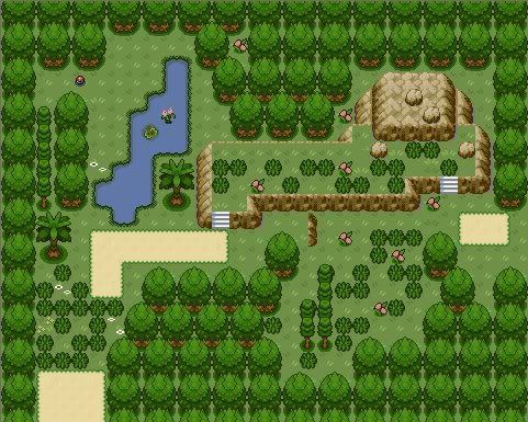
@ G@mbit's Forest/Route Map...
(Please add a name of your map next time...)

RATINGS: 7/10
REASON: It's really a nice map, though the green palletes are a bit dark and are those your grass tiles...? There a bit weird, though... :\
SUGGESTION: er......, nothing, I guess... :\
---------------------------------------------------------------------------
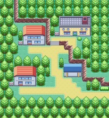
@ Xray's Undecided Map...

RATINGS: 8/10
REASON: Simple. I like it. :)
SUGGESTION: Add at least a window to that house with blue roof... :\
---------------------------------------------------------------------------
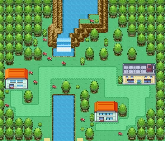
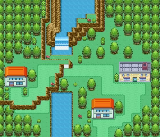
@ Satoshi Sugimori's maps...
(Please add a name of your map next time...)

The path with mountain road...

RATINGS: 5/10
REASON: Although the map is really complex and nice, the mountain road is a bit empty. Also, the palletes of both grass and mountains are very pale...
SUGGESTION: Maybe crowd the mountain road a bit? If it's full of TRAINERs, then no need to add something to it.

The big map with a mansion...

RATINGS: 8/10
REASON: A very very well-made map.
SUGGESTION: Add some grass tiles if it's not the home of the player...
---------------------------------------------------------------------------
@ loitraitim's town map...
(even if you repost it, still add the name...)

RATINGS: 9/10
REASON: I really really really like the map! Simple but it's very outstanding. ^^
SUGGESTION: Add a sign post to that lab building if it's an important building and remove the grass tiles if that's the hometown of the player... Also, fix those empty spaces...
---------------------------------------------------------------------------
@ dratii's maze-like route...

RATINGS: 8/10
REASON: Very nice. Though the path is a bit narrow, but it's nice. :)
SUGGESTION: nothing...
 

+Sneasel™

It's a meeee, itman!
1,032
Posts
16
Years
If you notice on the top going to the next route that is the battle grass, what you see in the map is just a vegetation tile Wind~.
^_^
And as for the map I think it is a bit square but it still looks pretty good(anyway who made up this square thing).
I give it a 8/10.
I think you should try and maybe put in a new house(I never understood why their are little places in the middle of the woods with a lab and a house or two).

A while ago a guide came out (much like neti's guide to mapping) and it like said that, and basically everyone in this section of PC read it...then everyone was all of the sudden against squareness (you should have seen some of the old threads).
 

Likewise

Bye.
724
Posts
16
Years
newmap-1.jpg

credit to Visual for the rom base


then again i really couldn't chose so............... here's another version xD
newmap2.jpg

well this was and old map of an old hack of mine I decided to redo.........
 
Last edited:

loitraitim

Hoài Niệm Dấu Yêu
60
Posts
16
Years
There is still a bit of empty space.
The path is nice, and the placement of the houses and people/Pokémon is nice too.
Though, grass in a town isn't a good idea, unless it's unreachable..in my opinion.
It's also a little square too, but overall, it's a very nice map. :)
6.2/10~

Uh, Thanks for the suggestion! I'll edit it, based on the principle of simple but beautiful ^ ^

If you notice on the top going to the next route that is the battle grass, what you see in the map is just a vegetation tile Wind~.
^_^
And as for the map I think it is a bit square but it still looks pretty good(anyway who made up this square thing).
I give it a 8/10.
I think you should try and maybe put in a new house(I never understood why their are little places in the middle of the woods with a lab and a house or two).

The grass looks like you correctly say, I'm going to milk them!
 
5,256
Posts
16
Years
Map Name: Mayflower City

Map Game: FireRed - Aquamrine

Comments: So, as stated above, this is a map in my hack, Pokémon Aquamrine Version. It's called Mayflower City, and the shop with the Cerulean Bike Store tiles is meant to be a flower shop, but becuase I haven't made the tiles yet, I just used those tiles. Note that it is big, so I linked to it (you may have to click on the picture to zoom in when it loads).

Mapshot: Clicky

Please rate!
 
Last edited:
Status
Not open for further replies.
Back
Top