• Our software update is now concluded. You will need to reset your password to log in. In order to do this, you will have to click "Log in" in the top right corner and then "Forgot your password?".
  • Welcome to PokéCommunity! Register now and join one of the best fan communities on the 'net to talk Pokémon and more! We are not affiliated with The Pokémon Company or Nintendo.

[Game] The Artistic Perspective #1 - Moonblast [voting]

Vote away!

  • Pink Cloudette

    Votes: 3 23.1%
  • Ribbons Intensify

    Votes: 5 38.5%
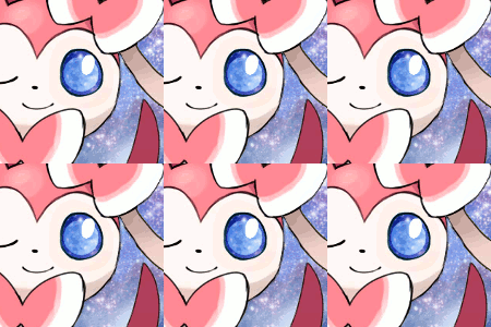
  • Starstruck Beauty

    Votes: 5 38.5%

  • Total voters
    13

Universe

all-consuming
2,237
Posts
10
Years
    • Seen Nov 17, 2016

    The Artistic Perspective #1
    The Moonblast challenge


    welcome to TAP
    Welcome everyone!
    This is the voting section of our TAP competition, where you can toss in your votes on our fabulous entries and give any comments you may have below!


    your guide to success
    ► No voting for yourself.
    ► You're allowed only one vote since there are only 3 entries.
    ► If you participated, you must vote.
    ► Try to post a little something about which tag you voted for.
    ► No overt negativity or harsh criticism.
    ► Anyone can vote! This is not limited to those who participated.
    ► You must vote within the allotted time frame.


    the entries

    Spoiler:


    the deadline
    So remember that you have until 07/1/2014 to vote.

    o7 / 1 / 2014

    All questions and comments regarding this contest may be directed via PM to Mario or Fairy. If you want more information about the voting stage, a recap on why you must submit your entry, or additional information regarding how this contest is being conducted; this is the place to address these issues.
    hosted by Mario & Fairy
    image credit to JaJaChanx3
    background image credit to Alex Davis
    CSS by Fairy
     
    Last edited:

    Aquacorde

    ⟡ dig down, dig down ⟡
    12,507
    Posts
    19
    Years
  • I voted for Pink Cloudette~ The stock stands out sufficiently and the background is cute, though I don't much like it as a standalone piece; it looks like it should be used in conjunction with CSS. And the half-border mystifies me a little. Ribbons Intensify has an interesting idea behind it but is a little all over the place with the blurring and again, doesn't strike me as a standalone piece. Starstruck Beauty is nice, but I think the background should have had more obvious animation or no animation at all- it's cool when you see it, but not eye-catching nor something I'd look at for more than a second.

    a2nem76.gif
     

    Flushed

    never eat raspberries
    2,302
    Posts
    10
    Years
    • Seen Nov 5, 2017
    You know, reading through the original thread, I was a bit skeptical about how different media (I can't think of the proper word right now, but tags, avis, css, etc.) could be judged equally, but I'm starting to see how each piece can bring its own merit.

    I voted Pink Cloudette as well. I think with the specific render it's a bit tough to get things going spatially (I did actually try, didn't submit though; definitely not trying to bash the render choice either). Anyways, it's just a simple, neat peace that has elements that work well in conjunction with Sylveon.

    I do like the other pieces as well though, nice job all around.
     

    Magistrum

    ☆The Fakemon Magister☆
    207
    Posts
    10
    Years
  • Nice pieces overall, but voted for starstruck beauty in the end. I read the other thread and felt that moonblast, as the theme, should be a noticeable element, or should leave a slight impression of the move itself in the submissions--something the other two interpreted poorly or made too subtle in my opinion.
     

    Loki

    x
    6,829
    Posts
    18
    Years
    • Seen Apr 4, 2024
    Woah really? oAo I guess I liked Ribbons Intensify myself-- the blurring job is definitely lacking, but Pink Cloudette feels even more unfinished than Ribbons Intensify. First of all, there's no color to it, it's just a hefty load of pink, and I find that the biggest hurdle a graphic artist should strive to overcome-- never never never with the monotonous colors. Second, that border is.... well, mystifying is a good way to put it LOL. Then the diagonal lines and the complete emptiness and lack of anything in the background or foreground just makes me think it was something finished as fast and with as little effort as possible. Also the placement of the focal could use work-- and that's a problem that Ribbons Intensify doesn't face...... as much.

    Not to say that Ribbon Intensify is much higher on the completed scale, but the blurring is halfway there-- it at least creates an illusion of depth at first glance until you realize the placement of the blurring doesn't make any sense LOL-- and there are some nice color adjustments. I also think that in competitions like this where the stock is provided, the graphic artist here actually used the stock itself in a clever way-- I'd like to say out of all the stock competitions I've seen in my time here at PC, it's one of the first times I've seen someone reuse the stock to make the BG but.... actually it might not be-- but it's definitely not lost it's novelty. It's just much more put together in my opinion, though it definitely seems just as unfinished as the other two entries. Needs more to it.

    Starstruck Beauty.... it's basically a blinkie with the stock on top of it-- needs blending of the background with the stock, the stock itself is too big, and the stars in the background have a realistic quality that clash with the cartoony feel of the stock, so a lot of work needed here too.
     
    Last edited:

    Blastin'Tyruntz

    Keeps blasting off again!
    1,094
    Posts
    14
    Years
  • I voted for Ribbons Intensify.
    I don't know much about about art, but this is the one that struck me as the most beautiful (in my opinion), The overall background looks great and the slight blurring makes it seem more authentic :p
     

    Universe

    all-consuming
    2,237
    Posts
    10
    Years
    • Seen Nov 17, 2016
    Oh man those votes are neck and neck. I know I'm supposed to close up the vote today but is there any chance anyone could put a tie-breaker vote or two in there?

    I mean vote for the one you like but I want to see if I can't break the tie for second place.. or first, even. So I'm going to extend the voting for another day!

    7/2/2014

    P.S. Those who competed might want to post in here soon with their own vote. Otherwise I'll have to disqualify you by the rules.
     

    DJTiki

    top 3 most uninteresting microcelebrities
    1,257
    Posts
    10
    Years
  • Okay, I like Starstruck Beauty, because I'm a sucker for astrology and stars in well-drawn out photos. But it was really hard to decide. They're all so good.
     
    Back
    Top