This is amazing. I'd actually say it's your best work, since the placement is great, the color scheme you decided on is tasteful, and it gives off a unique sense of flow. You blended in the render with the background effects exceptionally well, too; the piece as a whole looks very cohesive and it definitely really impresses me.
But even though I singled that tag out in particular, you have a bunch of other gems here too. First off, your smudge work is really notable. You seem to always experiment with it, and the results are incredible. The smudge tool is a difficult one to work with, to say the least, so the fact that you've been able to utilize it so well speaks to your ability.
The only nitpick I have (not smudge-related) is that some of your tags are a bit too bright. For example:
(and the two Madoka tags on top of that one)
Faces of anime characters can get very white very easily, so I'd suggest using a Curves layer or negative brightness in a Brightness/Contrast adjustment to darken things a bit whenever that happens. You preserve some face details that way, and the subjects don't come out looking like ghosts, haha.
Or at least paler than they were before.
(Otherwise, I'm a huge fan of that tag. It proves that you have a good sense of text placement, and the effects here are super interesting.)
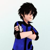
As for your icons, it's pretty clear that you have a go-to style for them, which is good. The pale, soft look that the majority of your icons have is great. Though if you do want to experiment more, maybe try out a more vibrant, bold coloring effect? Or maybe something dramatic, with enhanced lights and shadows?
Those are just suggestions though. With icons, the look to achieve is definitely completely up to the creator's preferences (moreso when compared to tags), so continuing with the style you have currently doesn't hurt at all.


![[PokeCommunity.com] アタシポンコツアンドロイド。。。](https://orig14.deviantart.net/6070/f/2015/283/5/6/smudge_tool_by_synchromanica-d9cnlpd.png "[PokeCommunity.com] アタシポンコツアンドロイド。。。")
![[PokeCommunity.com] アタシポンコツアンドロイド。。。](https://orig06.deviantart.net/acf4/f/2015/308/b/a/dream_time_by_synchromanica-d9fkr1l.png "[PokeCommunity.com] アタシポンコツアンドロイド。。。")
![[PokeCommunity.com] アタシポンコツアンドロイド。。。](https://orig06.deviantart.net/5a01/f/2015/307/9/d/stargazer_by_synchromanica-d9fgpy6.png "[PokeCommunity.com] アタシポンコツアンドロイド。。。")

![[PokeCommunity.com] アタシポンコツアンドロイド。。。](https://i.imgur.com/60FUJxx.png "[PokeCommunity.com] アタシポンコツアンドロイド。。。")
![[PokeCommunity.com] アタシポンコツアンドロイド。。。](https://orig01.deviantart.net/769a/f/2015/312/c/9/complication_by_synchromanica-d9g17y4.png "[PokeCommunity.com] アタシポンコツアンドロイド。。。")
![[PokeCommunity.com] アタシポンコツアンドロイド。。。](https://orig14.deviantart.net/af6f/f/2015/313/f/2/angel_smile2_by_synchromanica-d9g45ak.png "[PokeCommunity.com] アタシポンコツアンドロイド。。。")
![[PokeCommunity.com] アタシポンコツアンドロイド。。。](https://orig01.deviantart.net/5c01/f/2015/316/f/b/colorful_feelings_by_synchromanica-d9ggv4j.png "[PokeCommunity.com] アタシポンコツアンドロイド。。。")
![[PokeCommunity.com] アタシポンコツアンドロイド。。。](https://orig05.deviantart.net/b188/f/2015/317/4/4/ominous_by_synchromanica-d9gka1k.png "[PokeCommunity.com] アタシポンコツアンドロイド。。。")
![[PokeCommunity.com] アタシポンコツアンドロイド。。。](https://i.imgur.com/NrtZtd6.png "[PokeCommunity.com] アタシポンコツアンドロイド。。。")
![[PokeCommunity.com] アタシポンコツアンドロイド。。。](https://i.imgur.com/W4lvKPs.png "[PokeCommunity.com] アタシポンコツアンドロイド。。。")
![[PokeCommunity.com] アタシポンコツアンドロイド。。。](https://i.imgur.com/tr8rFat.png "[PokeCommunity.com] アタシポンコツアンドロイド。。。")
![[PokeCommunity.com] アタシポンコツアンドロイド。。。](https://i.imgur.com/RVVlGaQ.png "[PokeCommunity.com] アタシポンコツアンドロイド。。。")
![[PokeCommunity.com] アタシポンコツアンドロイド。。。](https://i.imgur.com/BZbPB9O.png "[PokeCommunity.com] アタシポンコツアンドロイド。。。")
![[PokeCommunity.com] アタシポンコツアンドロイド。。。](https://orig02.deviantart.net/2b61/f/2015/324/e/e/neverending_by_synchromanica-d9he7qj.png "[PokeCommunity.com] アタシポンコツアンドロイド。。。")
![[PokeCommunity.com] アタシポンコツアンドロイド。。。](https://orig14.deviantart.net/ce14/f/2015/336/0/8/susume_by_synchromanica-d9iswum.png "[PokeCommunity.com] アタシポンコツアンドロイド。。。")
![[PokeCommunity.com] アタシポンコツアンドロイド。。。](https://i.imgur.com/ZsT2X1G.png "[PokeCommunity.com] アタシポンコツアンドロイド。。。")
![[PokeCommunity.com] アタシポンコツアンドロイド。。。](https://i.imgur.com/Oeo2pB5.png "[PokeCommunity.com] アタシポンコツアンドロイド。。。")
![[PokeCommunity.com] アタシポンコツアンドロイド。。。](https://i.imgur.com/SArUbRa.png "[PokeCommunity.com] アタシポンコツアンドロイド。。。")
![[PokeCommunity.com] アタシポンコツアンドロイド。。。](https://i.imgur.com/K2n20Ju.png "[PokeCommunity.com] アタシポンコツアンドロイド。。。")
![[PokeCommunity.com] アタシポンコツアンドロイド。。。](https://i.imgur.com/jRIw5TD.png "[PokeCommunity.com] アタシポンコツアンドロイド。。。")
![[PokeCommunity.com] アタシポンコツアンドロイド。。。](https://i.imgur.com/idh8abN.jpg "[PokeCommunity.com] アタシポンコツアンドロイド。。。")
![[PokeCommunity.com] アタシポンコツアンドロイド。。。](https://i.imgur.com/uCObt1D.jpg "[PokeCommunity.com] アタシポンコツアンドロイド。。。")
![[PokeCommunity.com] アタシポンコツアンドロイド。。。](https://img01.deviantart.net/3a78/i/2015/336/4/9/in_the_mind_of_a_girl_by_synchromanica-d9iuvr0.jpg "[PokeCommunity.com] アタシポンコツアンドロイド。。。")
![[PokeCommunity.com] アタシポンコツアンドロイド。。。](https://img02.deviantart.net/8ba1/i/2015/336/e/4/romantic_now_by_synchromanica-d9iuxyt.jpg "[PokeCommunity.com] アタシポンコツアンドロイド。。。")
![[PokeCommunity.com] アタシポンコツアンドロイド。。。](https://i.imgur.com/TKItH9a.png "[PokeCommunity.com] アタシポンコツアンドロイド。。。")
![[PokeCommunity.com] アタシポンコツアンドロイド。。。](https://i.imgur.com/hmptzQi.png "[PokeCommunity.com] アタシポンコツアンドロイド。。。")