• Ever thought it'd be cool to have your art, writing, or challenge runs featured on PokéCommunity? Click here for info - we'd love to spotlight your work!
  • It's time to vote for your favorite Pokémon Battle Revolution protagonist in our new weekly protagonist poll! Click here to cast your vote and let us know which PBR protagonist you like most.
  • Welcome to PokéCommunity! Register now and join one of the best fan communities on the 'net to talk Pokémon and more! We are not affiliated with The Pokémon Company or Nintendo.

Rate The Signature Of the Person Above You

Status
Not open for further replies.
The colour of the text doesn't really go with the image, and I think maybe adding a bit of letter spacing to space it out would improve it a little more. I like the rounded effect, though~ 8.5/10
 
7/10

Quite nice again! But I'd say there's too much space between them, other than that it's pretty nice! :D
 
7/10

If I've said it once, I'll say it as many times as I have to: ALIGNMENT.

Other than that, "pair" looks really-out-of-place being the only word in that line that's all lowercased, and I personally think you have one line too many.
 
9/10 Because he/she has a play button in it. :D
 
I'll give it a 2/10

Where to start x] first off massively text based signatures do not look good spaced out. Try and keep it all nice and tidy and organised, a good example is your RPs. Try and keep them closer together and make the heading stand out, like this.
RP's I'm in
☼ War Between Pokemon & Humans
☼ Rockets Rising
☼ Pokemon: The Tournament to Beat All Others
☼ Fullmetal Alchemist: Divergent
☼ Years of Lies


Also it never hurts to throw in a pretty symbol at the start to make it look nice ;)

Another thing is the banner, I'm glad that you give credit to the person but it can kill the feel of the signature. So i'd recoment putting it into a title tag, like this
[PokeCommunity.com] Rate The Signature Of the Person Above You


The other things i guess are ok, but when you may want to work on the presentation as a whole. For example try using the RP's I'm in
☼ War Between Pokemon & Humans
☼ Rockets Rising
☼ Pokemon: The Tournament to Beat All Others
☼ Fullmetal Alchemist: Divergent
☼ Years of Lies


Now lets work the rest of it into the signature,
RP's I'm in
☼ War Between Pokemon & Humans
☼ Rockets Rising
☼ Pokemon: The Tournament to Beat All Others
☼ Fullmetal Alchemist: Divergent
☼ Years of Lies


PC Family
☼ Brothers: Aura.Lucario, seamon
☼ Sisters: Fearless Love, miley810
☼ Member of the ZLF PC Family.

(image no longer exists)

There i've added a title to your user bar to show what you are in the hacking team, also i've removed the emoticon from your PC family. Emoticons tend to look quite, for lack of a better word, noobish.

Feel free to use this new version btw x]" alt="" style="float: left/right;" />
 
Last edited:
I like the colors in the background, and the sprites doing the YMCA, and I like the text at the bottom. The three rounded edges look cool with the one corner. So overall I enjoy it! How long have you had to YMCA thing? It seems really old for some reason xD
anyways, 9/10
 
The sprites are okay, but Foongus doesn't look well done and Treecko looks off to me. +3
The text doesn't look very classic to me and doesn't fit the theme. -1
Links at the bottom are okay, but something more interesting than an x would be nice. -.5

1.5/10
 
I like it! It's nice and simple.
I wanted to say this, though. I don't know if you intended the space below the second row of sprites to be wider than the space above the first row, or not. Maybe it's like that simply because I'm seeing it from my /malfunctioning/ browser. XD

9/10
 
8/10.

I'm usually not fond of images with a drop shadow, but I think the vibrant colours in the drawing and your subtle font choices and colour gradient really makes a nice touch.
 
7/10

Simple and sweet, and I must say the devamps of the 3rd gen. through 5th gen. sprites are good. Same with the 2nd gen. Gold sprite. Still say you need to make the text classic-looking too, but to do that I guess you need to combine some images or so o3o
 
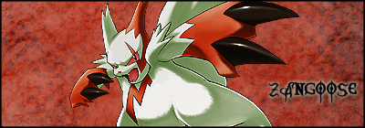
That is a decent banner, I suppose. The organization is nice, though. I like how you organized the text so that it looks really well. It'd help you if you get a better banner, though. :o

8//10
 
Ah, very nice. :3 The image is well chosen and I like how the colours return in your text.
I don't know if I like the logo though... it somehow seems a bit out of place.
Still, I think you deserve a 8,5/10
 
It's quite good. Maybe it's just me, but it probably would've been better if you placed Allen and Kanda more the the right, since they're not in the middle anyway. That Comic Sans font kind of ruins the feel of it. Other than that, it's organized well, and looks nice altogether. 8/10
 
I really like the signatures you make. And I absolutely adore the colours in this one. :3
You also used a very nice image. :3
The only thing I'm not too fond of, is the text. I think it kinda takes the attention of the image above it. =/

8,5/10
 
Status
Not open for further replies.
Back
Top