
-
Our friends from the Johto Times are hosting a favorite Pokémon poll - and we'd love for you to participate! Click here for information on how to vote for your favorites!
-
PokéCommunity supports the Stop Killing Games movement. If you're a resident of the UK or EU, consider signing one of the petitions to stop publishers from destroying games. Click here for more information!
You are using an out of date browser. It may not display this or other websites correctly.
You should upgrade or use an alternative browser.
You should upgrade or use an alternative browser.
Rate the THEME above you [v.4]
- Thread starter Mr. L
- Start date
More options
Who Replied?Rodriguezjames55
No Jokes #MegaCharizard
- 391
- Posts
- 13
- Years
- Age 28
- United states, New York, New York City, Bronx
- Seen Jul 24, 2024
square cool design but square 7/10
Last edited:
- 866
- Posts
- 13
- Years
- Seen Jul 16, 2014
8/10
The pics match but the sig is a bit...square.
The pics match but the sig is a bit...square.
Mononoke Hime
viva emptiness
- 252
- Posts
- 12
- Years
- Hell de Janeiro, BR
- Seen Aug 12, 2013
I like the signature, but the avatar is a little small I guess.
8/10
Don't match? My theme is always blue.
Also, I think Vaporeon and Suicune are very related to each other.
8/10
5/10
I think pics aren't match but they're good.
Don't match? My theme is always blue.
Also, I think Vaporeon and Suicune are very related to each other.
Last edited:
Dying Light
Pegasus Knight
- 330
- Posts
- 14
- Years
- Exiled
- Seen Oct 2, 2015
6/10.
Although the avatar and signature are both blue, it just doesn't quite match...
Although the avatar and signature are both blue, it just doesn't quite match...
Zayphora
Don't mess with the lights...
- 493
- Posts
- 13
- Years
- Somewhere beyond the Veil
- Seen Jun 8, 2024
I don't know this person but it seems well made. 7/10
Cosmotone8
the shadow returns
- 1,756
- Posts
- 13
- Years
- someplace
- Seen Jun 18, 2025
That watermark at the bottom of the image is bugging me, but you can't go wrong with Turbo. xD
8/10
8/10

TwilightBlade
All dreams are but another reality.
- 7,268
- Posts
- 18
- Years
- Age 33
- Florida
- Seen Jul 3, 2025
8/10 That's.. a lot of tennis balls. I like tennis.
OMG they're sold in 3s!
OMG they're sold in 3s!
Rodriguezjames55
No Jokes #MegaCharizard
- 391
- Posts
- 13
- Years
- Age 28
- United states, New York, New York City, Bronx
- Seen Jul 24, 2024
10/10 the new sig pic is to funny

- 11,359
- Posts
- 17
- Years
- Seen Jul 3, 2025
Who is he????? That's not a very flattering image for him!!!
7/10
7/10
Zayphora
Don't mess with the lights...
- 493
- Posts
- 13
- Years
- Somewhere beyond the Veil
- Seen Jun 8, 2024
That's cute but funny. :D 10/10 for Hikari-ness.
- 866
- Posts
- 13
- Years
- Seen Jul 16, 2014
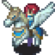
A bit creepy but looks cool.
9/10
9/10

Pokestick good times.
[i]cheeky[/i]
- 7,406
- Posts
- 16
- Years
- Age 29
- he/they
- Stockholm, Sweden
- Seen Oct 31, 2022
The lossy .jpg images are a major turn-off, but the overall look of the drawings isn't that bad. The style is cute, and fairly consistent between avatar and signature.
Clearly not much effort was put into creating something of your own with this, but that's of course not obligatory. And the complete lack of text or coding in the signature is fine since the image looks all right on its own.
The avatar feels a bit lacking; the given space is hardly used to its full extent, and the wide image with lots of empty space makes the icon look rather small; you almost have to squint with your eyes to see the image properly.
Though art style-wise I like it, it's moderately cute and the theme is fairly consistent. But I'm afraid that doesn't do a good enough job to carry the entire theme.
4/10~
TwilightBlade
All dreams are but another reality.
- 7,268
- Posts
- 18
- Years
- Age 33
- Florida
- Seen Jul 3, 2025
10/10 Very wonderful art and theme~