• Ever thought it'd be cool to have your art, writing, or challenge runs featured on PokéCommunity? Click here for info - we'd love to spotlight your work!
  • Our weekly protagonist poll is now up! Vote for your favorite Trading Card Game 2 protagonist in the poll by clicking here.
  • Welcome to PokéCommunity! Register now and join one of the best fan communities on the 'net to talk Pokémon and more! We are not affiliated with The Pokémon Company or Nintendo.

Two styles in two days!

  • 10,673
    Posts
    16
    Years
    • Seen Sep 29, 2024
    [PokeCommunity.com] Two styles in two days!
    [PokeCommunity.com] Two styles in two days!
    Snivy's Holiday
    [PokeCommunity.com] Two styles in two days!


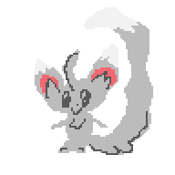
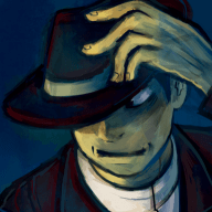
    Hey there guys! This is another style for you. This is the second style released in approximately 2 days, the first of which may be seen here. Now, I have been meaning to release this for some time, but with some help from Morkula, I was finally able to put my finishing touches on it. I really made this on a whim, as soon as I saw the art displayed in the header I had to go for it! You may see some familiar images in this style as it is inspired by the clean and modern The Stand Nexus. Thanks to ‎Hiroshi Sotomura for allowing me to use some of their images from it, after I edited them to suit this style of course. Also just to mention that this style isn't meant for any resolutions below about 1024x768. Since there aren't many people using anything below that now anyway!

    So I hope that you guys enjoy this style, I had fun making it!

    Switch to it:
    • Click here to change to Snivy's Holiday.
    • Click on the Quick Style Chooser at the bottom of the page to Snivy's Holiday from the menu.
    • Click the Smeargle icon next to the Quick Style Chooser and select Snivy's Holiday from the popup preview menu.
    • Go into your control panel. Select Edit Options from the pane and look for Themes. Select Snivy's Holiday from the drop down list.
    Best Wishes!

     
    Last edited:
    You guys just keep pumping out absolutely amazing styles! I'm in love with this one, though I do wish there was a version with a slightly smaller banner. Regardless, I'm tempted to switch over to this one! Just can't decide anymore since there's so many beautiful ones to choose from! ):
     
    I've seen this style before when it was more under construction much earlier on, but I really do like the clean aesthetic like you said you were going for. I'll probably give it a whirl later on, but it looks very good!

    Kudos, Gav!
     
    Well, the fact that it's Snivy automatically earns it a shipload of points, but it's, um . . . too plain and bright for my tastes, sadly. I'll be staying with Nimbasa's Shining Beauty (the very first style that made me even consider switching from Pichu2, lol) for now.
    But the Snivy and Whitlea header-thingy is lovely. :3 Great job~
     
    Last edited:
    The theme looks pretty awesome, I think. Think of it as a "fun" and "relaxed" theme! It'd be a great thing to have, and so, I have set it as the default. ^.^

    The Snivy looks a bit off-model, though. :P
     
    There seems to be an usability issue.

    I think you might need bigger, more descriptive icons for post actions, like quoting and such.
     
    There seems to be an usability issue.

    I think you might need bigger, more descriptive icons for post actions, like quoting and such.
    That's not a useability issue, that's a personal preference. The same icons have been used on previous styles to my knowledge also. I personally felt that smaller buttons would suit the style, and what I was going for better.
     
    That's not a useability issue, that's a personal preference. The same icons have been used on previous styles to my knowledge also. I personally felt that smaller buttons would suit the style, and what I was going for better.

    Smaller buttons = harder to click. Also, I do not think that the icons are descriptive enough. There has to be some way to get it looking fitting while being easily readable and clickable.
     
    It's nice <3333 But on Safari the text on the banner kind of goes on the light blue and thus makes it look weird. (Comparing it to your screenshot it looks bigger. But hey, what do I know about this stuff? XD;)

    Edit: Looks like this: https://i40.tinypic.com/nb6xdd.png

    Oh and loving the buttons; they remind me of LJ/DW <333
     
    I think there's a problem with the blog "bookmark site" buttons, like submit to Facebook and so, on blogs. Seems like the images are not yet uploaded.
     
    OMG! TOUKO!
    You guys are making it so hard to decide which new theme to use. v_v
    I'm just going to switch everyday so I can use them all.
    I love this!
     
    It's nice <3333 But on Safari the text on the banner kind of goes on the light blue and thus makes it look weird. (Comparing it to your screenshot it looks bigger. But hey, what do I know about this stuff? XD;)

    Edit: Looks like this: https://i40.tinypic.com/nb6xdd.png

    Oh and loving the buttons; they remind me of LJ/DW <333
    Strange, I think I know the issue, but, I didn't see that happen on my screen since it looks fine on Chrome & Firefox. So I'll fix that up, thanks!

    I think there's a problem with the blog "bookmark site" buttons, like submit to Facebook and so, on blogs. Seems like the images are not yet uploaded.
    Then hard refersh (ctrl +F5). And your note on the buttons is still personal preference, I don't find them hard to click nor decipher. They're in the same order as every other style. Regardless, I mean, if you dislike the buttons you have lots of other styles to choose from I guess, I personally felt they suited the style and some other seemed to have said they liked them. Sorry that you find them hard to click and so on though!
     
    Ahhh, I love it! I really love the order of the things on the side especially. Except would it be alright if you can find a way so people can disable the information (such as age, gender, etc) on the side? That's the only thing that bothers me right now, since I generally have those disabled, and yet I can see them on the style.

    Otherwise, great job! ♥
     
    It's nice. I like the fact that it's at least clean. Not to complex, but the banner is very big, a bit empty on the right. However, I like it.

    Nice job!
     
    Back
    Top