• Our software update is now concluded. You will need to reset your password to log in. In order to do this, you will have to click "Log in" in the top right corner and then "Forgot your password?".
  • Welcome to PokéCommunity! Register now and join one of the best fan communities on the 'net to talk Pokémon and more! We are not affiliated with The Pokémon Company or Nintendo.

[Brilliant Diamond & Shining Pearl] How would YOU improve the overworld/graphics (personal preference)

Somnus

- Silence Speaks -
  • 13
    Posts
    3
    Years
    • Seen Aug 26, 2022
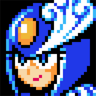
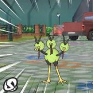
    I kinda don't like the character models. The hands and feet just rub me the wrong way. Personally, I would like it a lot better it they were ORAS style or at least FULLY embraced the tiny chibi style and made the limbs slightly shorter. I also feel that the chibi style is too sharp. Link's awakening is much better at it that BDSP and ILCA could learn a lot from them. Just take a look and see what I mean.
    Spoiler:

    Spoiler:

    Although I guess I shouldn't complain much since I can't 3D model to save my life.
     

    Nah

  • 15,965
    Posts
    10
    Years
    • Age 31
    • she/her, they/them
    • Seen today
    just gimme the SwSh art style and camera and I'd be good
     
  • 2,096
    Posts
    15
    Years
    Honestly I don't think I hate the chibi style that the new games have, what I do dislike is how bland and flat the colours look. I get that they were going for as close as possible remake, but I feel like this colour pallet doesn't translate to the dynamic lighting that the chibi models have. If they up the saturation a tad and maybe add some outlines to keep the cartoony look that pokemon is known for then I think it'd look perfect.
    It also wouldn't hurt to bring the camera up a little bit so we don't feel as squat.
     

    budube

    Hi I'm Cube
  • 2,767
    Posts
    5
    Years
    • Age 24
    • She / They
    • Seen May 21, 2024
    Chibis with fingers are so cursed ngkdkgksb lmaoooo. Id definitely get rid of that, and I do agree that the legs are weird too. I like what Sheep posted above about making the models smaller.

    My main issue with the graphics is not the artstyle but the illumination, though. A good example is Floaroma Town, it looks so dark and it's horrible. The problem with illumination also goes to the in-battle models. I'm not going through the trouble of posting pictures while on mobile, but to put an example you can't tell where Barry's hair even starts because the illumination and lack of contrast makes it seem like it has completely fused with his forehead.
     

    Somnus

    - Silence Speaks -
  • 13
    Posts
    3
    Years
    • Seen Aug 26, 2022
    Chibis with fingers are so cursed ngkdkgksb lmaoooo. Id definitely get rid of that, and I do agree that the legs are weird too. I like what Sheep posted above about making the models smaller.

    My main issue with the graphics is not the artstyle but the illumination, though. A good example is Floaroma Town, it looks so dark and it's horrible. The problem with illumination also goes to the in-battle models. I'm not going through the trouble of posting pictures while on mobile, but to put an example you can't tell where Barry's hair even starts because the illumination and lack of contrast makes it seem like it has completely fused with his forehead.

    Just compare it to LGPE. It's horrible. Is it even on the same console anymore?
    Spoiler:
     
    Last edited:

    Adam Levine

    [color=#ffffff][font="Century Gothic"]I have tried
  • 5,200
    Posts
    12
    Years
    Here's to hoping they let us move however we want, instead of limiting us to four directions.
     
  • 19,142
    Posts
    11
    Years
    they could've just gone with Animal Crossing style hands to make things look less weird. and i agree with Curly Brace. 3D worlds need 3D movements to operate best.
     

    Momoro

    I'm gonna put some dirt in your eye..
  • 269
    Posts
    4
    Years
    I was expecting a Sword/Shield art style (or at the very least, the Let's Go art style) but instead we got chibi- It's a cute concept, and feels like the little people walking around on my old DS screen again. But, nostalgia aside, I much prefer the Sw/Sh art style. IMHO, if it were ME improving the overworld, then I would return to the Sw/Sh art style, hands-down.
     
  • 13,364
    Posts
    6
    Years
    • Seen today
    I would have liked it if they had carried over the dream aesthetic from Link's Awakening. Right now the art reminds me of FF7.
     

    Palamon

    Silence is Purple
  • 8,175
    Posts
    15
    Years
    I'd add outlines and some more shading. But, please do remember that "game footage is not final" and that they'll probably tweak things before the games release.
     
  • 853
    Posts
    3
    Years
    • Seen Nov 9, 2023
    Was agreeing with you 100% until you said this part.
    But, please do remember that "game footage is not final" and that they'll probably tweak things before the games release.


    "game footage is not final" is what they stick on everything pre-release, has nothing to do with an any intent to change it, or an indication that they are still working on that aspect of the game.

    At this point its practically a standard game industry cop-out method for whenever they don't have anything good to show.
    I have never seen a game that showed bad footage in a trailer, that then went on to be good/or look significantly different at release.

    But rant aside, after watching tyranitartube's vid on it, I agree the chibis could be passable or even look good, if they had a border outline, better shading and Lighting. But they'd also need to shrink the arms, and the head.

    The arms stick out way too much, for a supposed chibi art style.


    But overall, I would prefer full sized models, but something sharper and far less cartoony than let's go.
     
    I typically don't expect many big changes in Pokémon games if there's a 'game footage not final' message. They've edited certain things before, like backgrounds and textures (example) in SwSh but it was nothing so major you'd notice it right away. I'm not expecting changes to the chibis at this point I don't think, if they planned to make noticeable changes they probably wouldn't have shown us a trailer with the initial art style. Now people know what to expect and plenty seem to like it, so to have it changed months after the original trailer is probably an odd look unless it's minor.
     
  • 853
    Posts
    3
    Years
    • Seen Nov 9, 2023
    So I went back and ended up watching the full snap trailer and besides better graphics,
    I realized it has PERFECT full scale character models, looks almost like something you'd see in the shows, but doesn't look dumb or too kiddy, it just looks really good. I know I said before that I thought they would just pull the great animations and pokemon designs from snap, but I never would have thought I'd be saying they should be taking human models too, for how little you actually interact with people in that series even the human models look better than both these other new games.

    Just look at this.
    Good shading. Proper Contrast. AND its actually expressive!!
    How would YOU improve the overworld/graphics (personal preference)
     
    Last edited:
    How would YOU improve the overworld/graphics (personal preference)


    How would YOU improve the overworld/graphics (personal preference)


    More changes were shown today in the new Switch model ad! These actually look more noticeable, and the decision of desaturating the game a little so it's not as colorful is actually really good to me. I definitely think it's a big improvement on the look of the game overall. Much more keen on the game now even if I wish we could see proper, updated trailers already. D: This is a lot closer to my ideal style of overworld/graphics.
     
    Last edited:
  • 10,179
    Posts
    18
    Years
    • Age 37
    • Seen yesterday
    Meanwhile, I think that it's a little too dull. I miss the brightness of how the games look.

    But aside from that, there's some improvement. I like Lucas's backpack now. It's an actual backpack with some details to it, rather than a yellow blob that was attached to his model. Also, maybe because he's the male model, but Lucas's arms are looking much thicker than Dawn's. They're less likely to snap if he throws the ball wrong.
     
  • 853
    Posts
    3
    Years
    • Seen Nov 9, 2023
    How would YOU improve the overworld/graphics (personal preference)


    How would YOU improve the overworld/graphics (personal preference)


    More changes were shown today in the new Switch model ad! These actually look more noticeable, and the decision of desaturating the game a little so it's not as colorful is actually really good to me. I definitely think it's a big improvement on the look of the game overall. Much more keen on the game now even if I wish we could see proper, updated trailers already. D: This is a lot closer to my ideal style of overworld/graphics.

    well dang, if this keeps up I might have to eat my hat!

    Wish I could have seen the changes for dawn as well, but that looks very good so far.

    Still hate the faces but that's just me.
    The blending is great, the detail in the background is back after that previous over saturated change.

    Slight model changes (well maybe more than slight) to make things more natural and less cartoonishly bulgy.
    The backpack looks great now. The hat also looks like an actual hat. (and lookin' mighty tasty if I do say so myself ;)


    The only nitpick I have is the shadows could use a little more oomph.
     
    Back
    Top