• Our software update is now concluded. You will need to reset your password to log in. In order to do this, you will have to click "Log in" in the top right corner and then "Forgot your password?".
  • Welcome to PokéCommunity! Register now and join one of the best fan communities on the 'net to talk Pokémon and more! We are not affiliated with The Pokémon Company or Nintendo.

Obligatory "logos are better" post

Sirfetch’d

Guest
  • 0
    Posts
    I LOVE the logos, especially the Japanese ones. The XY logos were currently my favorite ones but these take the cake by FAR now, especially the moon one. Excellent work done by the makers of these! :)
     
  • 50,218
    Posts
    13
    Years
    I really like these new logos, and given the new style of the Japanese logos it seems pretty much that Sun & Moon will be the beginning of the 7th Generation.
     

    GiovanniViridian

    A World Of Pain!
  • 439
    Posts
    10
    Years
    • Seen Sep 29, 2023
    I like all of them and in my opinion these are the best logos so far for me. I love the sparklings in these logos.
     

    TCB

    Tranquilo.
  • 565
    Posts
    14
    Years
    I like the flat style of the JPN logo over the 3D effect ones. Makes it looks a lot more sharp and pleasing to my eyes, especially with the effects they are showing.

    The English logo isn't half bad either, at least that is showing some effort over how bland the English logos for X and Y were.
     

    Starry Windy

    Everything will be Daijoubu.
  • 9,307
    Posts
    11
    Years
    As for me, I like Chinese version a little more, even though I'm also fond of English and Japanese logo of Sun and Moon as well.
     

    Lycanthropy

    [cd=font-family:Special Elite;font-size:16px;color
  • 11,037
    Posts
    10
    Years
    I love them! The Japanese logos look like more effort went in them if only because of the blue/yellow gem (that funnily enough looks just like a revive) matching the colors of the opposite version. It really gives them some unity.
     
  • 146
    Posts
    16
    Years
    The logo's have to be my favourite in a main series game yet. They actually look cool, and the symbols intrigue me on how they're going to relate to the games (if they do at all)
     
    Disagree! I think these new ones are pretty much on par with the Japanese logos. Though that has been the case in the past.

    I understand why you'd think so. Guess I'm just more of a stickler for originality than using the same logo which hardly changed over the last 20 years, as universally-recognizable as it is.

    Though I definitely won't argue these are some of the best logo sets we've had. <3
     

    pkmin3033

    Guest
  • 0
    Posts
    They're nice, I guess? I've never paid much attention to the logos to be honest. I like the consistency in the Japanese logos though - the new font in the more recent English logos doesn't really feel right to me, it feels a bit...tacky. They look almost like fan-made logos or something. I'm more interested in the symbols than I am anything else, though - I wonder what the mascots will look like, and if the symbols will have any relevance.
     

    Starry Windy

    Everything will be Daijoubu.
  • 9,307
    Posts
    11
    Years
    Do you happen to have an image for these? I can't find them anywhere online.

    The Japanese logos are my preferred choice because of the stylized Pocket Monsters text, whereas they just throw the Americanized Pokémon logo onto pretty much everything and totally kills it.

    I think it's right here, even though in video form: https://youtu.be/mWSCYwGkCkY?t=3m27s

    The logo is almost like Japanese one, with the diamond replaced the 口 inside of 可 letter.
     

    Necrum

    I AM THE REAL SONIC
  • 5,090
    Posts
    11
    Years
    I am so tired of the same Pokemon logo we have had in America for nearly 20 years. It's designed for children when that was their sole target audience. Those children have grown up, change it a little come on!
     

    El Diabeetus

    Amateur Voice Actor / ROM Editor ('Hacker')
  • 1,064
    Posts
    17
    Years
    • Age 30
    • Seen Jun 10, 2020
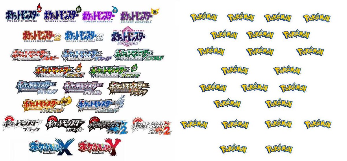
    I've been of the belief, the Pokémon logo itself could stay. It should just be colored like the Japanese version. Being inspired by the original logo rather than a blatant copy. Like the version names have been doing since HeartGold/SoulSilver. So, something like this, if I can do this with MS Paint, Nintendo could easily do the same thing but with a more professional result to it.

    Obligatory "logos are better" post


    Still have to do Black 2/White 2 and Omega/Alpha (and now Sun/Moon), but here are all the other games since Gen 3 and a few for fun ones that've been done. This could easily be implemented over the bland blue/yellow color scheme. That worked for the first 2 Generations, but looks super out of place now.
     

    OmegaRuby and AlphaSapphire

    10000 year Emperor of Hoenn
  • 17,521
    Posts
    14
    Years
    I wonder if the golden crystal in Moon and the silver crystal in Sun mean anything. Could it be like BW again? Moon legend in Sun, Sun legend in Moon? Do the crystals mean much? Perhaps they're connected to something similar to Mega evolution.
     

    Cherrim

    PSA: Blossom Shower theme is BACK ♥
  • 33,302
    Posts
    21
    Years
    I've been of the belief, the Pokémon logo itself could stay. It should just be colored like the Japanese version. Being inspired by the original logo rather than a blatant copy. Like the version names have been doing since HeartGold/SoulSilver. So, something like this, if I can do this with MS Paint, Nintendo could easily do the same thing but with a more professional result to it.

    Obligatory "logos are better" post


    Still have to do Black 2/White 2 and Omega/Alpha (and now Sun/Moon), but here are all the other games since Gen 3 and a few for fun ones that've been done. This could easily be implemented over the bland blue/yellow color scheme. That worked for the first 2 Generations, but looks super out of place now.
    These look so cool! I really wish they did this with the International logos because man that yellow and blue, while nostalgic, is just... kind of an eyesore nowadays. Seeing this makes me realize how much we could have had if they'd ditched the old logo colours long ago. :(
     

    El Diabeetus

    Amateur Voice Actor / ROM Editor ('Hacker')
  • 1,064
    Posts
    17
    Years
    • Age 30
    • Seen Jun 10, 2020
    I've been playing bi-lingually since Diamond (also bought Emerald in Japanese and later bought all the GB/C games). So, ever since seeing Diamond's beautiful looking logo and being decent with pixel art, I went on an endeavor to see what could've been done using existing materials. I still have to smoothen out Black/White and want to tackle BW2, but I want to retain the Poké Ball part of the logo (which looks slightly different from BW). May go an re-do the first two Generations. Even did an edit of the anime logo for the original series to look a little closer to the original Japanese. So colored Green and retaining the Pocket Monsters part of the logo in English, but switching the Katakana ポケットモンスター with the recolored English logo.
     
    Back
    Top