Ever thought it'd be cool to have your art, writing, or challenge runs featured on PokéCommunity? Click here for info - we'd love to spotlight your work!
Welcome to PokéCommunity! Register now and join one of the best fan communities on the 'net to talk Pokémon and more! We are not affiliated with The Pokémon Company or Nintendo.
MOD NOTE: I s2g if I get any more reports on people not following the rules (specifically actually giving a reason for your score in this thread) I am going to throw things. Those things will be yellow and red cards so please cease and desist. Thank you! ♥
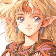
Refia! Really liked Refia and how most jobs looked on her. Anyways, the CSS is nicely done, everything is nicely spaced. But I'm seeing a white background for each image which could look weird on styles with black backgrounds. But regardless, still a great sig.